News   Apr 26, 2024
 2.3K     4 
News   Apr 26, 2024
 556     0 
News   Apr 26, 2024
 1.2K     1 

Star: Toronto Council approves new street signs

this was a waste of time and resources on the council's part. arguing about new street signs is so unnecessary. the new ones are not attractive.
 
I really don't understand the city sometimes. Those old street signs had charm and were distinctive. An updated version of that design would be perfect. These new signs are pretty forgettable.

The city (and the TTC) really need to do a better job in this area.

I agree Syn. If you think of London or Paris, as examples, street signs and street infrastructure in general become identifiable little symbols of the city over time. Updating them a little is okay but changing them drastically seems like an idiotic erasing of decades and generations of 'branding' that already exists and that you just can't get back again over night.
 
I agree Syn. If you think of London or Paris, as examples, street signs and street infrastructure in general become identifiable little symbols of the city over time. Updating them a little is okay but changing them drastically seems like an idiotic erasing of decades and generations of 'branding' that already exists and that you just can't get back again over night.

Perhaps this is just another example of Toronto's difficulty in creating an identity. If things are always changing and there's no constancy, how can we create a brand that sticks?

For example, should we be changing the TTC's logo and font every decade to keep it up to date? No. And it's good we haven't, because now the TTC is an identifiable brand with an image. The City of Toronto can't say the same thing.

ttc-emblem-1.gif

title.gif
 
Saw some of the street signs in my suburban neighbourhood of Markland Wood, in Central Etobicoke. Here, they are definitely an improvement, but in downtown, they should just have stuck to the old-style signs. I also noticed that they started putting the new benches inplace around my area too. They actually look quite nice, and some new bus shelters, they look like the normal ones, so no difference there.
 
Ganjavih, I agree:

9820d639a5f5d828


3639b3ff8e8b227a


Looking for a way to slightly adjust an iconic sign to brand a neighbourhood?:

f10c2c6e2d335f54


d0a1e7599ae0b570


2b997ee1068c8b72
 
One of the nicest things about London is the changing street signs from borough to borough...though some of them sort of suck (I'm looking at you, Camden!)...

Westminster, City, and RBKC are real winners though.
 
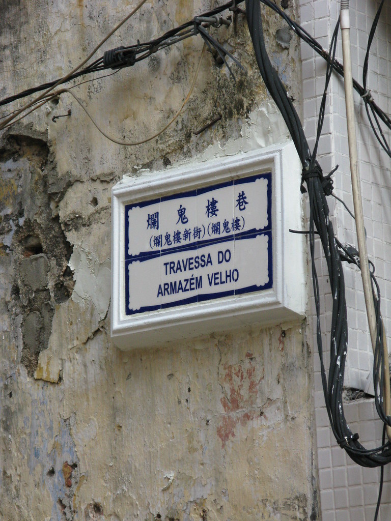
^ Very Portuguese. You see that type of sign in small villages around Portugal. I've yet to visit Macau but I'm getting that they're very influenced by their Portuguese colony days.

EDIT: Adma and I are thinking the same thing.
 
But the loss of the quality street signs of the old City of Toronto, which were elegant, sturdy, and timeless, and had the distinctive Toronto Acorn on them......is beyond contemptible!

I agree. As a society, we are way too quick to destroy historic elements that provide continuity and a link to our past.

I'm not sure about the "distinctive Toronto Acorn" bit, though. I grew up with same style signs in Ottawa. Toronto may simply have been the last place in Ontario to still use the acorn signs.
 
I agree Syn. If you think of London or Paris, as examples, street signs and street infrastructure in general become identifiable little symbols of the city over time. Updating them a little is okay but changing them drastically seems like an idiotic erasing of decades and generations of 'branding' that already exists and that you just can't get back again over night.

Exactly. The city has a lot of cool little historical brand identifiers (for lack of a better description), but they always manage to screw them up or get rid of them completely.
 
I say keep the acorn downtown, and use this new street sign everywhere else (Etobicoke, North York, etc).

In Mississauga they decided to switch to mixed case letters a few years ago. My street still has the old all caps letters and probably most of the smaller streets still have the old signs. I don't think the city is really going out of its way to replace the old signs since there's so many of them from over the years.
 
Wow, Azulejo-esque. Just what you'd expect from a former Portuguese colony.

Mexico is similar, Puerto Vallarta specifically.
 
Toronto's overhead at intersection street signs...

Everyone: When did Toronto begin putting up those overhead street signs - white on blue at intersections? From pics here they seem to be good for street ID instead of trying to look at a traditional posted sign. I do not remember them from 1990 on back. I do like them for obvious reasons...

-Observation from LI MIKE-
 

Back
Top