News   May 27, 2024
 262     0 
News   May 27, 2024
 487     1 
News   May 27, 2024
 3.1K     2 

111 Richmond St. W

I just don't see it on this one building. (not a knock on preservation in general) and I again I ask.....what is it you see that you find special? (I'm not asking to be convinced, merely wondering.) and by the way, if you'd like stuff like this preserved you do need to persuade other's of your cause; something far more likely to be achieved by a straight-forward and polite answer; rather than impertinent self-importance.

As mentioned, the link to the municipal document was said "straight-forward and polite answer".
 
I had a job interview for a company in this building 2 or 3 years ago, and at the time they said they'd probably be moving because there was a plan to gut or demolish the place. Occasionally I wondered about that, and here's the thread!
 
Well, "gut" would have been more likely, given how it was already pinpointed on heritage grounds a decade plus ago, as part of the whole Richmond-Adelaide scheme that was to facadectomy the Concourse. (But yes, it probably caught a whole lot of financial-district regulars by surprise that 111 Richmond was vacated totally.)
 
Yep but it's not as if all the tenants left ... no leases were extended ... this has been planned for sometime.

And for the last year or so they tried to lease the building - at this point I think only 30% of the space is left, again the main occupant being google.

It's about 250,000 square foot.
 
Oxford Properties Group Announces $65 Million Redevelopment at 111 Richmond W
Complete Redevelopment with Fall 2012 Occupancy; 60% Pre-Leased

TORONTO, ONTARIO, Sep 07, 2011 (MARKETWIRE via COMTEX) -- Editors Note: There is a photo associated with this press release.

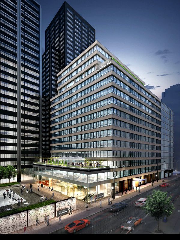
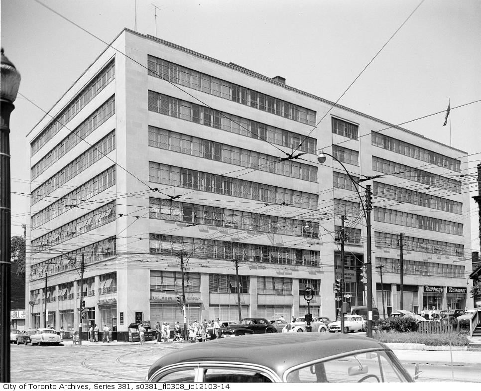
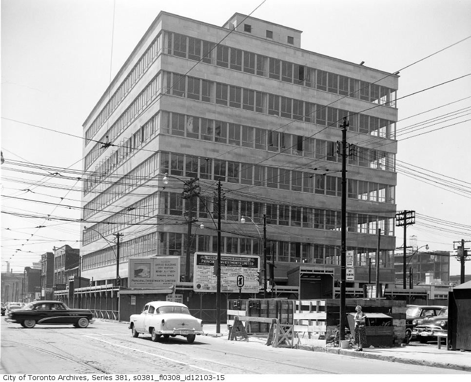
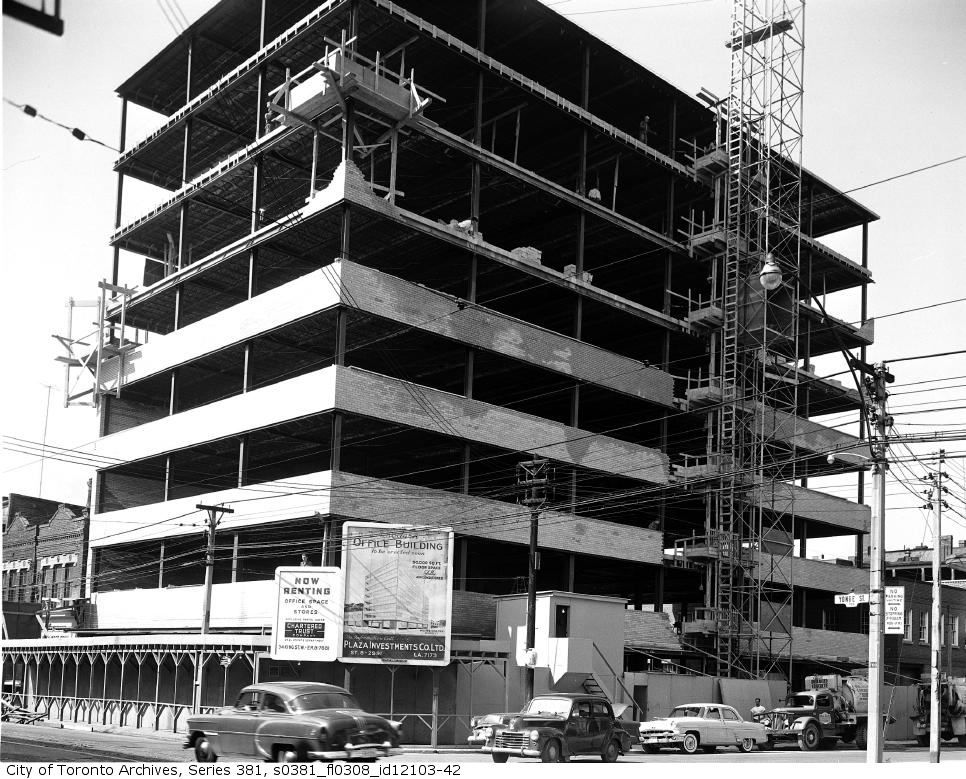
Oxford is pleased to announce the redevelopment of 111 Richmond W, one of Toronto's icons of architectural modernism. The 215,000 square foot office property will be completely redeveloped to the latest standards in technology and environmental specifications while preserving the design integrity of renowned architect Peter Dickinson. The building is 60% pre-leased, including a lease of 89,000 square feet to one of the world's largest technology companies and a lease of 40,000 square feet to a leading Canadian accounting firm.

"Oxford is delighted to present a dynamic workplace solution at 111 Richmond W and the Richmond-Adelaide Centre," said Blake Hutcheson, President and CEO of Oxford Properties Group. "111 Richmond W is a terrific example of a minimalist architectural period and its redevelopment will introduce leading sustainability features and revitalized finishes that build on the original architectural vision. The building will provide a unique boutique head office environment for these occupiers right in the middle of Toronto's financial core, all supported by Oxford's unparalleled service platform. We are really pleased to have been able to attract world class organizations to this great asset and to help them grow their businesses from this exciting new state-of-the-art space."

The redevelopment of 111 Richmond W will complement the recent redevelopment projects across the Richmond-Adelaide Centre, which have included new PATH amenities, office lobbies, sustainability initiatives including new systems and the recently completed public courtyard on Richmond Street West. Together, the projects at the Richmond-Adelaide Centre represent over $100 million of commitment by Oxford to the complex, and to the City of Toronto.

111 Richmond W is a key component of the Richmond-Adelaide Centre, a 1.6 million square foot, five building office complex in the heart of Toronto's downtown core. 111 Richmond W features a public plaza, period lobby and extensive use of natural light. It is being redeveloped to LEED Shell and Core standards. The redevelopment will be completed by Fall 2012.

http://www.marketwatch.com/story/ox...on-redevelopment-at-111-richmond-w-2011-09-07
 
I might well be more inclined to find something laudable in the style of one whose work I had a greater appreciation for.

That's perfectly reasonable, particularly since your critique of Dickinson in general, and this building in particular, is primarily made on aesthetic grounds. And you don't make the clumsy mistake of suggesting that the aesthetic appeal of this building can't possibly exist simply because you don't see it. And you're right to ask those of us who do appreciate the Dickinson aesthetic to attempt to explain ourselves, and it. And that's always the crux of these problems, isn't it? How to describe an aesthetic?
 
111richmond4-1.jpg

They've monkeyed with the descent to PATH level something fierce, unfortunately. It used to be quite the adventure, like Orpheus's descent to the Underworld, but now that it has been simplified all the romance and mystery has been taken out of it.
 
There was nothing 'cloaked' about my self-deprecation; rather I was sincerely asking what it is that some posters like about the building.

* The horizontal bands of windows and spandrels, stacked like a big sandwich. I particularly enjoy how the "bread" ( limestone spandrels ) extend out by about a foot from the windows.

* The corners: the windows wrap around, as do the spandrels ( there are no corner columns to define the edge of the building ), emphasizing the horizontality and stackable nature of the tower ( a bit like Casa condo ). This feature is also seen at 133 Richmond West.

* The window treatment, with the horizontal sections below the verticals as a nice little inversion of what one might expect. And how the detailing of the windows play off of the simple bands of limestone.

* How the simplicity of this machine aesthetic, including the horizontal banding, plays off of most neighbouring buildings ( but matches 133 Richmond ).

* How it brings something quite pure and new to that part of town, and how the simplicity of the design holds up well compared with the current neo-Modernism of Clewes, KPMB etc. now that applied decoration is creeping back in.

*The small overhang of the upper floors of the penthouse section over the lower floor of the penthouse.

* The small black bricks with white grout and the vertical panels of marble, at street level, especially the subtle bevel of the grey marble to draw the eye to the rust coloured marble that it frames.

Very well put, U.S. One might also add, that in the same way that Toronto (in the words of Eric Arthur) had a "late-flowering Georgian", I think it would be fair to say we also had late-flowering Modernism. Post-war architects like Dickinson explored themes originating in the 20's (and earlier) by Le Corbusier, the Bauhaus, Mendelsohn, et al, themes that manifested themselves in early 50's office buildings like 111 Richmond. The "5 Points" of Corb are particularly relevant:

MaisonDomino.gif


le-corbusier-five-points-of-architecture0001111.jpg


Some examples (from a wonderful site: http://www.ottowagner.com/special-exhibition/archive/2006-en-US/modern-greetings/)

Max Dernburg, Kaufhaus Wertheim, Breslau, 1928

moderne-gruesse-07.jpg


Jacob Koerfer, Westfalen-House Dortmund, 1929

moderne-gruesse-18.jpg


Eric Mendelsohn, Warehouse Schocken, 1930
moderne-gruesse-06-1.jpg


An early exploration (for Toronto) of some of these Modernist principles can be seen in the now-demolished 1937 Globe & Mail Building (though in a much more decorated Deco/Moderne idiom):

e7c1b14d.png


Later buildings (particularly those by Dickinson) are more explicit:

s0381_fl0308_id12103-14.jpg


s0381_fl0308_id12103-15.jpg


s0381_fl0308_id12103-42.jpg


f1257_s1057_it0735.jpg
 
Last edited:
Well done, The Charioteer. The Dupont building (the last photo) sure was a beauty.
 
* The horizontal bands of windows and spandrels, stacked like a big sandwich. I particularly enjoy how the "bread" ( limestone spandrels ) extend out by about a foot from the windows.

* The corners: the windows wrap around, as do the spandrels ( there are no corner columns to define the edge of the building ), emphasizing the horizontality and stackable nature of the tower ( a bit like Casa condo ). This feature is also seen at 133 Richmond West.

* The window treatment, with the horizontal sections below the verticals as a nice little inversion of what one might expect. And how the detailing of the windows play off of the simple bands of limestone.

* How the simplicity of this machine aesthetic, including the horizontal banding, plays off of most neighbouring buildings ( but matches 133 Richmond ).

* How it brings something quite pure and new to that part of town, and how the simplicity of the design holds up well compared with the current neo-Modernism of Clewes, KPMB etc. now that applied decoration is creeping back in.

*The small overhang of the upper floors of the penthouse section over the lower floor of the penthouse.

* The small black bricks with white grout and the vertical panels of marble, at street level, especially the subtle bevel of the grey marble to draw the eye to the rust coloured marble that it frames.


My sincere thanks to Urban Shocker and Charioteer for taking the time to explain their passion for this building and architectural style; it brought much to my attention that I may have overlooked previously.

I can't say that I share the same degree of appreciation for this building; but I do have more appreciation for it than I previously did.

I can see the appeal in the wrap-around windows; the detailing that US notes in the windows wasn't something that I had really seen (even if I looked at it) before.

In no way taking away from the opinions shared (again much appreciated); I think my difficulties with the building would be.....too grey/monotone; I find the massing bulky, I really don't like the way the main entrance is handled, its seems afterthought-ish (I assume it wasn't, I just prefer an entrance that makes more of a statement).

In reviewing Charioteer's photos I seem some examples of this style I can appreciate.

http://i200.photobucket.com/albums/aa112/thecharioteer/Photography/moderne-gruesse-07.jpg

The rounded corner, the apparent use of brick, the slightly lower height w/set-backs lower down on the building make this building seem more inviting to me. Though I'd still prefer the entrance on the 'corner'.

http://i200.photobucket.com/albums/aa112/thecharioteer/Photography/moderne-gruesse-06-1.jpg

Again the use of the round/arc shape here really works for me; and I find the more modest height works too.

Most of the others just seem too plain to me.

But I very much appreciate the time taken to explain their appeal, just the same.
 
I'm far more the preservationist than most on this board, and lament the lost of the old post office on Adelaide; the Board of Trade Building at Yonge/Front; and Uptown Movie theatre to name but a few.

But I don't wish they were around just because they used to be; or even because a particular architect designed them (if those are your reasons, that's fine); rather I lament their loss as an aesthetic one.

Now it's your turn, Northern Light! What, pray, is the aesthetic appeal of the Board of Trade building? To my eye, it's a grab bag of "more is more" applied ornament grafted onto a big curved frontage, trying reely, reely hard to make a reely reely big statement. When built, it served a similar boosterish, "iconic" purpose for the city as Ford's proposed giant Ferris Wheel would, located within a stone's throw of the lake at the foot of Yonge, and I find it as vulgar and inelegant as Toronto's Trump tower is today. There's also massive timidity ( like the Residences of College Park towers ... ) to it: instead of being dynamic form ( like the Confederation Life Building at Yonge and Richmond of more or less the same date, for instance ) it's skin-deep and superficial. I prefer the American Hotel that was on the site before the Board building was built, and the earlier Georgian Bank of Montreal across the street to the later version you admire. Heck, I prefer most of Georgian Toronto, which was built to Classical proportions, to these big Husky Boy late Victorian pseudo Goth / Richardsonian Romanesque commercial buildings.
 

Back
Top