News   May 29, 2024
 91     0 
News   May 29, 2024
 311     0 
News   May 29, 2024
 603     0 

1 Bloor East, DEAD AND BURIED (Bazis, -2s, Varacalli)

Status
Not open for further replies.
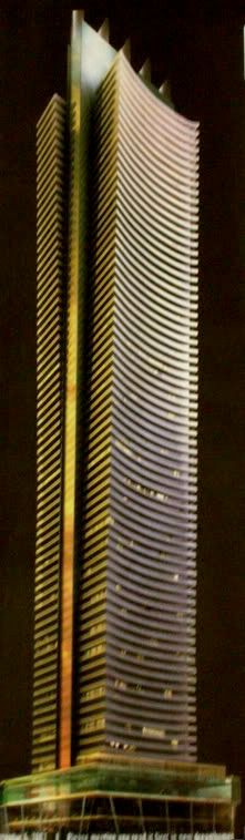
1BE does need a distinguishing skyline feature, but let's have a more distinguished one too. So far these things are five unarticulated, boring, concrete protrusions that do not reference any other part of the complex, and therefore look merely tacked on as opposed to thought-out. Why not repeat the look of the multihued band from the top of the podium for example (and not necessarily five times)? It currently looks too Sauron-Centre, or 'The Clippers' to me.

42
 
The fins look like something Roy Varacalli would wear in his hair

LOL....well, I like the fins - doesn't Roy Varacalli look a bit like Weird Al Yankovic???? hmmm......
 
It's not the material, it's the form. If there were *something* to them, maybe a change in size, or a curve, or if they tapered, or if they bore relation to the rest of the building, or if they were better proportioned, anything, then maybe there would be some saving them
 
The fins are at least an attempt at something different. A spire certainly wouldn't work with this design and removing them might make it a little boring.
 
From my office this afternoon:

DSCN0180.jpg


DSCN0181.jpg


DSCN0183.jpg
 
The top is boring and really has no redeeming qualities- but what can you expect from roy? He is a simple architect designing a simple big building, since when do you need details?

p5
 
I'm glad some people agree with me that the fins are a cheesy touch.

Over at skyscrapercity most people diasgreed with me and called me an idiot.

Here's to a bright future at UrbanToronto
 
Dan, you've got a (new!?) great vantage point for several projects!

I wonder, do they recycle all of those air conditioning units on top or do they get crushed in the demolition?
 
The top is boring and really has no redeeming qualities- but what can you expect from roy? He is a simple architect designing a simple big building, since when do you need details?

I think that a portion of the blame for the building's appearance should go to the City. The previous design, with the east and west halves tilting to the north and south, respectively, was quite well done in my opinion, but the City demanded the change to the current, straight-sided, version. I'm not exactly sure why the City decided it had the right to make the decision (safety?) but it was a definite step backwards. From earlier in this thread:

1bldark.jpg
 
I'm glad some people agree with me that the fins are a cheesy touch.

Over at skyscrapercity most people diasgreed with me and called me an idiot.

Here's to a bright future at UrbanToronto

Welcome to UT! There are still debates, but at least they are civil here
 
I think that a portion of the blame for the building's appearance should go to the City. The previous design, with the east and west halves tilting to the north and south, respectively, was quite well done in my opinion, but the City demanded the change to the current, straight-sided, version. I'm not exactly sure why the City decided it had the right to make the decision (safety?) but it was a definite step backwards. From earlier in this thread:

1bldark.jpg

I originally did not like this design, but compared to what it has evolved to I would have preferred the former over the latter
 
I agree.. there's a lot more substance to the original design than what's left over now.. the curves, the articulation in the facade.. we've really gone through the 'cheapening' with this one... (where's that graphic when you need it?)
 
Status
Not open for further replies.

Back
Top