3Dementia
Senior Member
CATHEDRAL SQUARE is an experiment that takes a huge blank canvas (Dalhousie/Shuter/Mutual Queen parking lot) and tries to create an immediate "place"
... unlike more traditional parks and amenities that may take years to mature into a sense of belonging.
The idea is create a gorgeous new urban square which would be animated by restaurants and retail...
and perhaps function as the climax to the "sculpture" route that has evolved in the neighbourhood.
Most of the density is stacked on Shuter Street, maintaining view corridors of
St. Mikes and glimpses of St. James to the south and the tower of the Metropolitan just to the west.
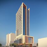
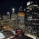
1. A few looks at the site (from Queen looking north):

2. Queen Street (south side):

3. SCALE (relative to Dundas Square):

4. MASSING:
this is the massing study that I did earlier (includes the existing study which appears to be 3 smallish towers in a park).
As you can see, the new square triangulates beautifully with NPS and Dundas Square.

5. SITEPLAN (each small square = 16' X 16'):

-------
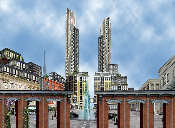
5. RENDERING - I used a wide angle POV because it allows a great deal more detail to be communicated:
READ ME FIRST
Disney denied:
- if executed poorly, ala the ridiculously simple facades tacked on to the east side of the Eaton Centre, this square will fail.
It will be a short-term novelty.
Think of a Mozo/The Morgan/Market Square hybrid with dash of Georgian.
The hodge podge of faux historical styles at grade is actually critical to the square's success.
Modern, sculptural "sameness" looks great on a rendering (that's where I began) but with a footprint this large... it fails in the "welcome" department.
Given it's length, I even thought of carving the site into two connected squares, however that approach severely
compromised sunlight conditions for the northern half.
With the exception of the massive fountain/waterfall, most of the square remains a blank canvas and
can host a variety of events in good weather: music, art shows etc.
Expanding the existing footprint:
-Mutual street would be narrowed to 2 lanes and on-street parking elimated (hundreds of space provided under the square
- the service lane (Dalhousie) would actually weather-protected since the structure on the western side cantilevers over top of the lane.
Key elements:
-restaurants/cafes with solariums would encouraged to provide indoor and outdoor seasonal animation.
Given the weather/wind protection provided (particularly from the north), sunny winter days should be down right pleasant in the square
- the eastern Mutual street elevations only accomodate small, shallow shops (Starbucks etc.) and offices on the 2nd level.
-fountain/waterfall is built of laminated glass: a pyramid/obelisk emerges from a random crystalline mass (beautiful in winter too)
-stoop and scoop in effect
-a solar in-ground promenade leads to the fountain, powering night-time illumination and all in-ground lights. There is no overhead lighting
but the ambient light from the sculpture/fountain and surrounding retail will provide plenty of light in the evenings.
-solar umbrellas - capture the sun by providing shade (adjustable - "turn me to the sun")
-live/work lofts above the western retail
-hundreds of parking spaces below the square
SCROLL>>>>>>>>>>>>>>

--
6. Queen Street:
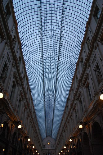
- something like this might be a fun way to "close" the square along Queen Street.

... unlike more traditional parks and amenities that may take years to mature into a sense of belonging.
The idea is create a gorgeous new urban square which would be animated by restaurants and retail...
and perhaps function as the climax to the "sculpture" route that has evolved in the neighbourhood.
Most of the density is stacked on Shuter Street, maintaining view corridors of
St. Mikes and glimpses of St. James to the south and the tower of the Metropolitan just to the west.
1. A few looks at the site (from Queen looking north):

2. Queen Street (south side):

3. SCALE (relative to Dundas Square):

4. MASSING:
this is the massing study that I did earlier (includes the existing study which appears to be 3 smallish towers in a park).
As you can see, the new square triangulates beautifully with NPS and Dundas Square.

5. SITEPLAN (each small square = 16' X 16'):

-------
5. RENDERING - I used a wide angle POV because it allows a great deal more detail to be communicated:
READ ME FIRST
Disney denied:
- if executed poorly, ala the ridiculously simple facades tacked on to the east side of the Eaton Centre, this square will fail.
It will be a short-term novelty.
Think of a Mozo/The Morgan/Market Square hybrid with dash of Georgian.
The hodge podge of faux historical styles at grade is actually critical to the square's success.
Modern, sculptural "sameness" looks great on a rendering (that's where I began) but with a footprint this large... it fails in the "welcome" department.
Given it's length, I even thought of carving the site into two connected squares, however that approach severely
compromised sunlight conditions for the northern half.
With the exception of the massive fountain/waterfall, most of the square remains a blank canvas and
can host a variety of events in good weather: music, art shows etc.
Expanding the existing footprint:
-Mutual street would be narrowed to 2 lanes and on-street parking elimated (hundreds of space provided under the square
- the service lane (Dalhousie) would actually weather-protected since the structure on the western side cantilevers over top of the lane.
Key elements:
-restaurants/cafes with solariums would encouraged to provide indoor and outdoor seasonal animation.
Given the weather/wind protection provided (particularly from the north), sunny winter days should be down right pleasant in the square
- the eastern Mutual street elevations only accomodate small, shallow shops (Starbucks etc.) and offices on the 2nd level.
-fountain/waterfall is built of laminated glass: a pyramid/obelisk emerges from a random crystalline mass (beautiful in winter too)
-stoop and scoop in effect
-a solar in-ground promenade leads to the fountain, powering night-time illumination and all in-ground lights. There is no overhead lighting
but the ambient light from the sculpture/fountain and surrounding retail will provide plenty of light in the evenings.
-solar umbrellas - capture the sun by providing shade (adjustable - "turn me to the sun")
-live/work lofts above the western retail
-hundreds of parking spaces below the square
SCROLL>>>>>>>>>>>>>>

--
6. Queen Street:
- something like this might be a fun way to "close" the square along Queen Street.
