


Solid Snake
Active Member
Happy new year to everyone!
I was reading the newspaper this morning and came across this article about ideas for a new Toronto logo. We can also expand the conversation on how Toronto can improve its image around the world.
http://www.theglobeandmail.com/news...presents-the-face-of-toronto/article16280351/
Matthew Daley
This idea was inspired by the view from my studio in my apartment. It’s an observation of the amount of cranes I see everywhere, due to the city’s present building boom and an exaggerated perspective of them crowding out the skyline. I wouldn’t call it a critique of the boom, especially considering that I live in a condo tower.

Matt Webb
Even before Crackgate, Rob Ford's Toronto was basically a circus (complete with dreams of a Ferris wheel!). We should probably just embrace the madness.

Max Young
The logo aims to pay tribute to Toronto’s past while incorporating the city’s modern values. The five-sided form comes from the city’s original five wards, (Toronto’s early neighbourhoods), and mimics the shape of Fort York, a structure that played an integral part in the founding of the city. The logo’s overlapping ‘ribbons’ symbolize modern Toronto’s multiculturalism.
Tones of blue are used in order to have a connection with Toronto’s past branding as well as its major sports teams. A splash of red is added to indicate the city’s important role within Canadian identity.

Clarice Gomes
This logo is based on ‘The Crystal Entrance’ of the Royal Ontario Museum, a museum of world culture and natural history. The structure appropriately represents Toronto’s multicultural population, but it also encompasses Toronto’s flare for the arts. The attraction brings more than one million visitors annually, and it is a historical building dating back to 1912. Today, the museum is Canada's largest field-research institution, with research and conservation activities that span the globe.

Matthew Blackett
Toronto is known for its neighbourhoods. Officially, the city recognizes 140 neighbourhoods, so there are 140 circles in the logo representing each of those.
I used the grid format for the circles because the city is laid out in a grid pattern, and I chose circles to play on the idea of Toronto as a “city within a parkâ€, a current tagline (in landscape-design plans, a tree is represented by a circle). Lastly, the colours used are traditional Toronto blue colours used by the Leafs, Blue Jays and Argos.
I like the idea of the neighbourhoods (circles) making up the letter T. What I often hear — but also believe — is that our neighbourhoods often blend into one another. This is why I chose to use a gradient blend with the cyan/royal blue colours.

Mark Ruivo
The main objective for this logo design is to show how multicultural a city like Toronto really is. The use of different rainbow-coloured letters was chosen to captures this. A striped path crossing the entire logo symbolizes a new beginning, peace and fortune.

Kait Bos
I moved here nine years ago and have had various feelings towards Toronto, ranging from confusion to love, which I think is a common newcomer’s experience. I wanted to create a logo that reflected my feelings, Toronto’s diversity, as well as fit within the Canadian landscape. So I combined well-loved symbology. The layering of the leaves and colour differentiation show the intricacy of Toronto and the layout shows how we all come together as one city.

Matthew Bambach
The shape of the logo itself is a more geometric version of Toronto’s boundaries, and I randomly connected a bunch of points within the boundary like a network. I meant for this to symbolize how the city doesn’t really seem to have a central identity, and yet there are lots of random influences that are still interconnected. Blue was an obvious choice, since it’s the city’s unofficial colour and I chose various shades to represent the different cultures blending together in the city. I chose Futura font for the word mark since it is close to the TTC subway font, which I’ve found to be a unique visual signifier.

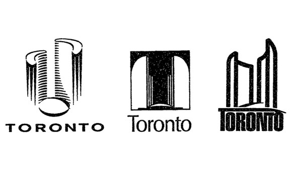
Current Logo
Status Quo
I was reading the newspaper this morning and came across this article about ideas for a new Toronto logo. We can also expand the conversation on how Toronto can improve its image around the world.
http://www.theglobeandmail.com/news...presents-the-face-of-toronto/article16280351/
Matthew Daley
This idea was inspired by the view from my studio in my apartment. It’s an observation of the amount of cranes I see everywhere, due to the city’s present building boom and an exaggerated perspective of them crowding out the skyline. I wouldn’t call it a critique of the boom, especially considering that I live in a condo tower.
Matt Webb
Even before Crackgate, Rob Ford's Toronto was basically a circus (complete with dreams of a Ferris wheel!). We should probably just embrace the madness.
Max Young
The logo aims to pay tribute to Toronto’s past while incorporating the city’s modern values. The five-sided form comes from the city’s original five wards, (Toronto’s early neighbourhoods), and mimics the shape of Fort York, a structure that played an integral part in the founding of the city. The logo’s overlapping ‘ribbons’ symbolize modern Toronto’s multiculturalism.
Tones of blue are used in order to have a connection with Toronto’s past branding as well as its major sports teams. A splash of red is added to indicate the city’s important role within Canadian identity.
Clarice Gomes
This logo is based on ‘The Crystal Entrance’ of the Royal Ontario Museum, a museum of world culture and natural history. The structure appropriately represents Toronto’s multicultural population, but it also encompasses Toronto’s flare for the arts. The attraction brings more than one million visitors annually, and it is a historical building dating back to 1912. Today, the museum is Canada's largest field-research institution, with research and conservation activities that span the globe.
Matthew Blackett
Toronto is known for its neighbourhoods. Officially, the city recognizes 140 neighbourhoods, so there are 140 circles in the logo representing each of those.
I used the grid format for the circles because the city is laid out in a grid pattern, and I chose circles to play on the idea of Toronto as a “city within a parkâ€, a current tagline (in landscape-design plans, a tree is represented by a circle). Lastly, the colours used are traditional Toronto blue colours used by the Leafs, Blue Jays and Argos.
I like the idea of the neighbourhoods (circles) making up the letter T. What I often hear — but also believe — is that our neighbourhoods often blend into one another. This is why I chose to use a gradient blend with the cyan/royal blue colours.
Mark Ruivo
The main objective for this logo design is to show how multicultural a city like Toronto really is. The use of different rainbow-coloured letters was chosen to captures this. A striped path crossing the entire logo symbolizes a new beginning, peace and fortune.
Kait Bos
I moved here nine years ago and have had various feelings towards Toronto, ranging from confusion to love, which I think is a common newcomer’s experience. I wanted to create a logo that reflected my feelings, Toronto’s diversity, as well as fit within the Canadian landscape. So I combined well-loved symbology. The layering of the leaves and colour differentiation show the intricacy of Toronto and the layout shows how we all come together as one city.
Matthew Bambach
The shape of the logo itself is a more geometric version of Toronto’s boundaries, and I randomly connected a bunch of points within the boundary like a network. I meant for this to symbolize how the city doesn’t really seem to have a central identity, and yet there are lots of random influences that are still interconnected. Blue was an obvious choice, since it’s the city’s unofficial colour and I chose various shades to represent the different cultures blending together in the city. I chose Futura font for the word mark since it is close to the TTC subway font, which I’ve found to be a unique visual signifier.
Current Logo
Status Quo
