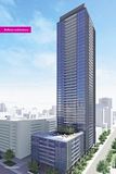
Toronto X2 Condominiums | 160.93m | 49s | Lifetime | Wallman Architects

Pink could be aiming at women as well. I know a bunch of lesbians that bought in X...their friends are impressed with the way X looks and want in X2.

Hmmmmmm this bring up another interesting point.

Anyone have an educated guess as to how many purchasers at X1 are gay/lesbians?
 
After seeing the marketing for X2 and their choice of colour for the sales centre, it's clear to me who they are marketing this building to. By that I would guess that X probably has a very high concentration of homosexuals, as will X2. It's practically right in The Village, so that's not surprising. Church Street is the commercial centre of The Gay Village but Jarvis is quickly becoming the residential centre for the community.

And YES, many homosexuals still love the colour pink! (including myself) I like my pink in the flaming side.
 
I think it's much more likely, judging from the use of black and white photography, that they're trying to attract colour blind purchasers.

I mean c'mon, it's 2009 and you guys think there's still a binary in marketing circles that pink is gay/feminine? I mean, really?!

What happened with the Verve then? How come so many gay people ended up there? Their marketing colours were Black and Red; I would expect it'd be filled with heterosexual dudes...
 
Here's a novel idea: 99% of buyers don't give two shits about the colour of the ads. They buy when location and price is right.
 
i'm sorry but that pink is too over-the-top.

will the marketing of X2 will be geared primarily to stylish flamboyant gay men?

i'm actually offended that they used that shade of pink to subliminally associate itself with pink triangle.

Maybe it's just the colour of the month for presentation centres

m5vpink.jpg
 
or it could be that Lifetime Developments like PINK ... they are JV partners in both the X2 and M5V projects afterall ~ :p
 
Click to Enlarge
th_X2_building.jpg


It's interesting to note that despite no apparent colour in any of the renderings so far, the brochure reads differently:

"This is X2. X2 completes the gateway to Yorkville/Bloor. Twin peaks, black with master strokes of primary colour reminiscent of a Mondrian painting. Clean lines. Spectacular city views. Sexy space. Addictive amenities. X2. Move up."

"We were too lazy or too cheap to design another building, so we're really just doing the same thing here to save money, not that our bottom line is in any trouble anyways. That said, we're still going to try and sell the hell out of this polished turd by referencing the original, more elegant version across the street when really, this ill-proportioned knock-off will make that building far less special."

I guess in that vein, this will make the X/X2 duo far more like the many tainted Miesian complexes which litter the skylines of several North American cities.
 

Back
Top