Toronto Waterfront Innovation Centre | 53.03m | 11s | Waterfront Toronto | Sweeny &Co

I agree with TR. if Ryerson and this look similar what about all the glass box condos going up with such similar green glass? Who are on these people and how does one get on a design review panel?
 
I agree as well. This isn't meant to be your standard condo tower though.
 
I think there's room here creating a more unique building still. The panel were particularly critical of the rectilinear eastern two thirds of the building with that stinging rebuke the for a building called the Innovation Centre, it wasn't particularly innovative. Sweeny &co are responsible for some of my favourite Toronto buildings as of late, all of which are handsomely appointed and proportioned boxes with good details. I'm not against a box if it's done well, but I get too that a building called the Waterfront Innovation Centre needs to stand out more.

Cities around the world are moving towards less timid, more innovative exterior expressions and to bring attention to this building by sticking 'Innovation' in the name here begs for that response or risk mockery. Oh yeah, and it's on our waterfront where we tend to let our hair down a little more and where our buildings should too.

Here's hoping Menkes loosens the purse strings enough to allow something more innovative for this city and that Sweeny &co are set loose to loosen up a bit more. I want to see a design that stops making me regret the Diamond Schmitt loss in the competition.

42
 
Haven't seen these before. Seems like the centre will have a pedestrian bridge connection with the future building to the East
Screen Shot 2016-04-13 at 7.57.51 PM.png


Screen Shot 2016-04-13 at 7.56.04 PM.png
 

Attachments

  • Screen Shot 2016-04-13 at 7.57.51 PM.png
    Screen Shot 2016-04-13 at 7.57.51 PM.png
    1.6 MB · Views: 1,481
  • Screen Shot 2016-04-13 at 7.56.04 PM.png
    Screen Shot 2016-04-13 at 7.56.04 PM.png
    588.3 KB · Views: 1,416
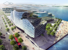
I've got to be honest - the massing makes zero sense to me and the sectional perspective doesn't have me convinced, either.
 
Those stairs just seem so intrusive. Why make the existing bottleneck caused by the hill a permanent one? I appreciate that it preserves that elevated vantage point in some form, but if anything that part of the promenade should be widened for future demand instead of being permanently narrowed.
 
Ya the stairs are bad, why not have the stairs twist to the street front to the north, and keep the path to sugar beach wider.
The stairs really look like they would make the beach area feel less accessible. Also if the stairs were taken away or significantly altered this would not feel like a snoheta ryerson student centre rip off.
It definitely has character though, I appreciate that.
 
This thing looks like a lizard gobbling up people. Let's hope it gets a serious redesign before we see this monstrosity on our shores.
 
It's an intriguing design - nice to see them thinking outside the box.

So? Intriguing design or outside-the-box thinking does not necessarily equate to massing that makes sense for the site. We can't just go "oh, they did something that looks different from __________, therefore it's great." That's how gimmicky architecture happens.
 
So? Intriguing design or outside-the-box thinking does not necessarily equate to massing that makes sense for the site. We can't just go "oh, they did something that looks different from __________, therefore it's great." That's how gimmicky architecture happens.
Agree. Both massing and site planning seem unfortunate in this case.
Like the massive stair 'spitting' people straight into water?! .. where is some breathing/gathering room?
Also completely ignored is the play of angles related to the park design.
Not much regard for the context and surroundings in my opinion.

I don't share some of the concerns about the westernmost portion of the design with the exception of the intrusive stair placement (which needs to be addressed). As someone else mentioned, I appreciate that they've been a little architecturally daring in a sort of Ryerson SLC-way; this area is so new and relatively devoid of structures that I don't consider there to be much precedent at all (and both Corus Quay and the GB building are basically rectangular boxes).

I do hate the massing and basically everything east of the bridge seems a lazily designed afterthought. I thought the developers were instructed to revise that portion of the building by the DRP—surely, this can't form the response to that criticism (can it?).
 

Back
Top