Toronto Waterworks Building Redevelopment | 47.55m | 13s | MOD Developments | Diamond Schmitt

Diamond Schmitt and MOD. Again featuring the same conceptual treatment that has disappointed a number of times now (think Aukland House and Whitehaus most recently)...Let's see if they can finally make it work.

C'mon @thecharioteer!

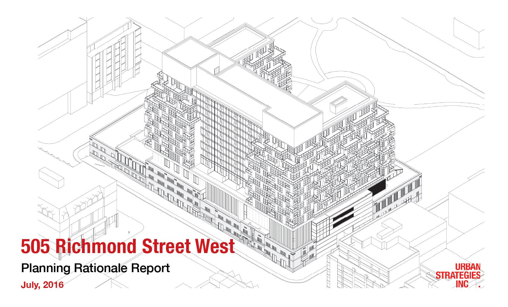
2.JPG

Axo2.JPG

Axo1.JPG
 

Attachments

  • 2.JPG
    2.JPG
    190.5 KB · Views: 2,420
  • Axo1.JPG
    Axo1.JPG
    270.2 KB · Views: 2,434
  • Axo2.JPG
    Axo2.JPG
    313.6 KB · Views: 2,403
The treatment here does not look remotely the same to me as the one that was first proposed for Whitehaus or Aukland House. This exterior with the divided light windows is meant to reflect the existing windows of the Waterworks Building which is located at the base.

42
 
I'm disappointed that they won't be maintaining the permeability of the site by leaving the courtyard open to public access. On such a big site, I do wish that the ground floor had some passageways running through it, like Honest Ed's, The Well, Artist's Alley, Daniels Waterfront, etc. There is potential for interesting interior spaces that this plan doesn't take advantage of. The single monolithic ground floor also obscures the history of the site as a conglomeration of smaller buildings.

I also wonder whether the density would have been better accommodated by a coupler of taller, more slender point towers (similar to the Distillery towers), rather than this giant wrap-around slab. The big mechanical box on top also worries me.

I don't want to be a complete downer about this proposal, so I'll just say that there is promise in the window design, and I hope the cladding is high quality -- maybe brick to complement the heritage buildings below.
 
Last edited:
The treatment here does not look remotely the same to me as the one that was first proposed for Whitehaus or Aukland House. This exterior with the divided light windows is meant to reflect the existing windows of the Waterworks Building which is located at the base.

42

I was speaking more to the recessed windows and randomized solid sections and less about the window shape / design (which, yes, is different). This idea has appeared on some DSAI proposals several times now (the above projects most-recently) but has never made it past the conceptual stage.

And it's not even that difficult to do. Quadrangle / TAS are doing precisely this at DUKE in the Junction. Teeple / Symmetry have something slightly different but similar at Origami.

If what's going to happen is a flat window/spandrel wall, then show that. Don't hide behind an idea or concept you know will get costed out when things move forward. Or spend the time to work out the damn details to find a way to actually get it done...
 
We will know more about the plan for the exterior—and the interior—in a couple of weeks, but we do have more information about the building now on our front page, including its interesting history. dataBase file established now too, linked at the top of the page.

42
 
I have to say, I think this site would have been better cleared and added to St. Andrew's playground to create a larger park. I know it's a heritage building, and it's great that the area will be getting a new community centre, but, forgetting about real world concerns, a park would have been nice. With the redevelopment going on in the area (Brant Park, Ace Hotel, etc.) and the slow formation of a ~10 story street wall around it, the new park would have had the potential to be quite urban, unlike any of the other parks in the city (that come to mind, anyway).

Oh well. I can still hope for an improved design at least.
 
I really don't mind the look. Though i wonder how much my tolerance is based on the fact I just am not a huge fan of this particular heritage property.

Not to say I hate it, or that I don't appreciate elements of it.............but it was low enough on my list I would not have seen it as a tragic loss.

That said, the scale and massing are much more reasonable that what has recently been much discussed, @ Front/Sherbourne.

The attempt to convey an industrial-ness or a deco-ness through the window design......ok..........I get the linkage, I kind of appreciate it.

Black over blonde? Hmmm, while I'm unconvinced, I'm not offended either.
 
I'm scared to see D+S behind this project. They've had a lot of clunkers lately.

Definitely so, but I have faith that Woodcliffe will ensure that it doesn't get too bad.

Still a missed opportunity to have the courtyard filled in- it might have been an interesting space.
 
The watercolour rendering is very flattering and it looks great. But that's the thing - it's an impressionist take on it.

The actual drawings themselves look very stiff and inelegant and remind me of how projects look when someone first starts doing work in REVIT. I don't know how else to describe it.
 

Back
Top