Toronto Wallace Walk Towns | ?m | 4s | The Somerset Group | KFA

AlbertC

Superstar
Member Bio
Joined
Apr 24, 2007
Messages
23,216
Reaction score
63,761
Location
Davenport
362 Wallace Ave - Official Plan Amendment, Zoning Amendment and Subdivision Applications - Preliminary Report:

http://www.toronto.ca/legdocs/mmis/2012/pg/bgrd/backgroundfile-43438.pdf

The application proposes to amend the City of Toronto Official Plan to convert lands
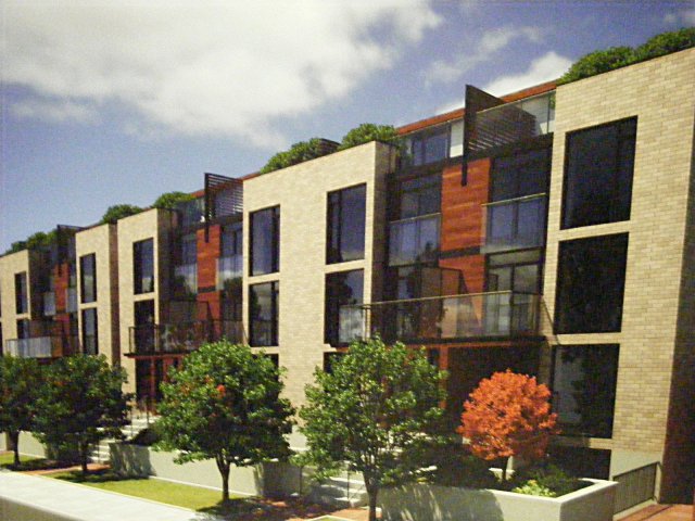
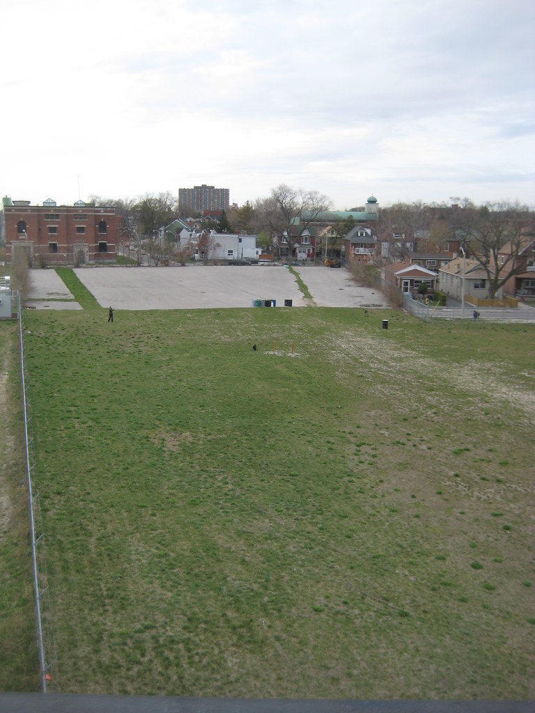
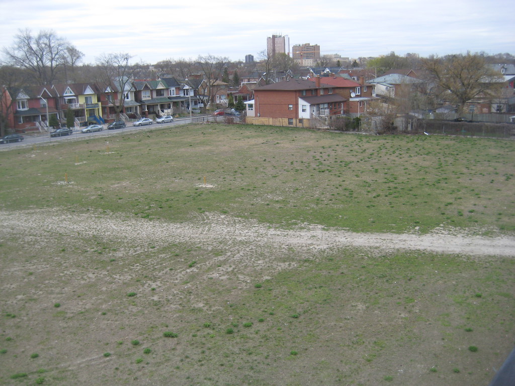
currently designated Employment Areas to permit 169 stacked townhouses on a portion of the lands at 362 Wallace Avenue. A Zoning Amendment application to change the zoning from Industrial to Residential has also been submitted. A new public road is proposed to run parallel to the rail corridor on the west side of the site from Ruskin Avenue to Wallace Avenue. MaCaulay Avenue is proposed to be extend from its current terminus to meet the new north/south public road.
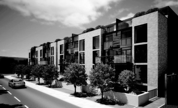


wallace by Traavis007, on Flickr
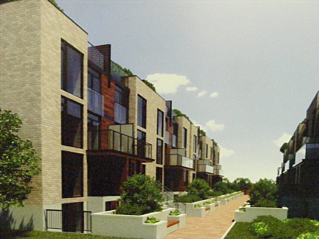
 
Renderings and more info: http://www.junctiontriangle.ca/node/1202

Architect info: http://ca.linkedin.com/pub/kregg-fordyce/13/382/320 Kregg Fordyce at KFA Architects

2011-07-26_362WallaceMeeting4.preview.jpg


2011-07-26_362WallaceMeeting3.preview.jpg
 
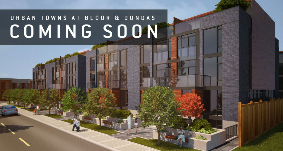
i'm glad they went with a contemporary design for the stacked townhouses.

the same could have been done in LV to Strachan/King over the past 10 years while glass towers were being sold/constructed, but instead, the typical faux victorian style for the stacked townhouses there
 
It's interesting to note that they're marketing the walkability of our neighbourhood. Though I wish they put a bit more of an immediate local focus, rather than hyping up High Park (1.2km away) and Bloor West Village (2+km away!). Also, it's not in "Bloor by The Park" (that's the BIA on Bloor between Dundas and Keele), but the Junction Triangle! Wish they'd give some love to our stretches of Bloor and Dupont.

But agree that one of the awesome things about our 'hood is the walkability and close proximity to so many shops, services, and attractions. This site's location next to the Railpath and Wallace Bridge is awesome (apart from increased diesel train traffic...)
 
I heard some interesting news at the Railpath festival last Saturday that there might be a community-oriented building that will front onto the Railpath to avoid the banality and ugliness of a blank wall or backyard fences. That would be great. Also, events like the Clean Train and Railpath festivals at the west end of Wallace Avenue are also starting to suggest a need for a landscaped space for events. A small public square with brick or stone paving where the dead-end of the roadway is presently might be a worthwhile project.
 
I heard some interesting news at the Railpath festival last Saturday that there might be a community-oriented building that will front onto the Railpath to avoid the banality and ugliness of a blank wall or backyard fences. That would be great. Also, events like the Clean Train and Railpath festivals at the west end of Wallace Avenue are also starting to suggest a need for a landscaped space for events. A small public square with brick or stone paving where the dead-end of the roadway is presently might be a worthwhile project.

Yeah, the north-west corner of the property, next to Ruskin and the Railpath, will have some kind of community space, etc. via section 37. I think councillor Bailao's office is talking to the YMCA and others about that.

Also, I think more recent plans for the site show a walkway connecting the Railpath to MacAuley. This would break up the "wall", provide an additional access point to the path, etc.

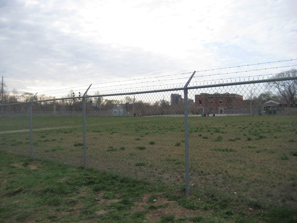
To their credit, Somerset Homes has been cool about allowing events like the Railpath festival and the Railpath Run (Sept. 30 2012) use their property. It also functions as an off-leash dog park, when people cut through the fence. :) This will be lost when the site if fully developed. So yeah, you make a good point about needing space for events. Maybe Ruskin could serve that purpose, if Toronto Hydro can play along (they would still need access to their building).
 
I am so &%#@ing sick of all this black brick. Seriously, it's dreadful. They were much more charming with the light brick in the early renders. Now they looks so uninviting. Plus, I couldn't imagine having an all black home would be great for your electric bill to cool the thing in the summer.
 
Yeah, the north-west corner of the property, next to Ruskin and the Railpath, will have some kind of community space, etc. via section 37. I think councillor Bailao's office is talking to the YMCA and others about that.

Also, I think more recent plans for the site show a walkway connecting the Railpath to MacAuley. This would break up the "wall", provide an additional access point to the path, etc.

To their credit, Somerset Homes has been cool about allowing events like the Railpath festival and the Railpath Run (Sept. 30 2012) use their property. It also functions as an off-leash dog park, when people cut through the fence. :) This will be lost when the site if fully developed. So yeah, you make a good point about needing space for events. Maybe Ruskin could serve that purpose, if Toronto Hydro can play along (they would still need access to their building).

The community should really push for a good architectural approach to the Railpath to avoid blank walls and fences altogether. On their own, they will be ugly. But they'll also end up being graffiti magnets. It's also good to have architecture that will allow for both "eyes on the street" and "eyes on the path" from a community safety perspective.

Xray_Crystal_Junkie said:
I am so &%#@ing sick of all this black brick. Seriously, it's dreadful. They were much more charming with the light brick in the early renders. Now they looks so uninviting. Plus, I couldn't imagine having an all black home would be great for your electric bill to cool the thing in the summer.

I don't have a problem with black brick, but it's overused. Red brick would look great, or using different colours in a pattern. There are so many kinds of brick available that all the black brick looks like an absence of creativity, especially since it can also be used in combination with other materials. I wouldn't mind seeing some clinker brick. To me it suggests a certain design timidity--that a brick-clad building can't be modern unless the colour of the brick is grey or black. But contemporary architecture is about a certain design language that can work with a large variety of cladding materials, both modern and traditional.
 
I'm trying to figure out how someone familiar with this area could say it has too much black brick. This area is a sea of red and brown brick for blocks and blocks. I'm trying to think of the nearest black brick building and cannot (unless you count a couple retail storefront paint jobs).

I also dislike the yellow brick, wherever it is used. I think it makes buildings look instantly 20 years old. I'm willing to accept however that this is a matter of taste and not a value judgment.

We're commenting on new projects in general, not this area. (What an odd assumption.) But this lot is a fairly large piece of land, so that will mean a lot of black brick rowhouses. I think that the black brick is better than using yellow for this particular project, but more variation would be welcome. A streetscape with a short block of yellow brick rowhouses between two blocks with black brick would look more dynamic. But there are a lot creative possibilities to avoid monotony.
 
Last edited:
Why are we not talking about this area? You say that black brick is overused, and say red brick would look great. In this area, new projects and old, red brick is everywhere. Walking over the Wallace bridge this evening I looked and could not see a black brick building. The only possible basis for objecting to black brick rather than red brick is that you like red brick better. That's fine, maybe it does fit the area better, but it fits the area because it is everywhere, not because black brick is overused. The fact that there is a lot of black brick in King East, or on the bases of Fort York condos, is irrelevant to what makes sense in the Junction Triangle (and in any event, I would be very surprised if there are more buildings in the city going up with black than red brick right now). I personally like black brick. Given that the black brick render is fronting the street and the yellow brick render is facing the path, there may even be the variation you are interested in.
 

Back
Top