News   Apr 24, 2024
 312     0 
News   Apr 23, 2024
 2.6K     5 
News   Apr 23, 2024
 638     0 

Toronto Urban Sprawl Compared to Other Cities

Back then, the ridership projections of Don Mills supported LRT, and it was logical given the ROW available.

It was only after Metrolinx released their Yonge North Relief Study that we learned both that Don Mills had subway level ridership potential, and that only Don Mills subway would provide relief to Yonge from the east.

In hindsight, it was pretty obvious how much bus ridership would be the intercepted via Relief Line North. Not sure why it took so long for that to become self-evident.
Yeah, I think it's very important to take into account how rail expansion projects fit in to the greater network.

A few years ago, I looked on google maps to see what it recommended for the fastest transit route to Yonge & Bloor from various points in the east end of the city, to see which neighbourhoods fell into which routes catchment areas when it comes to Sheppard Subway vs Scarborough RT vs Danforth Subway.
Screen%2BShot%2B2015-12-04%2Bat%2B1.41.11%2BPM.png


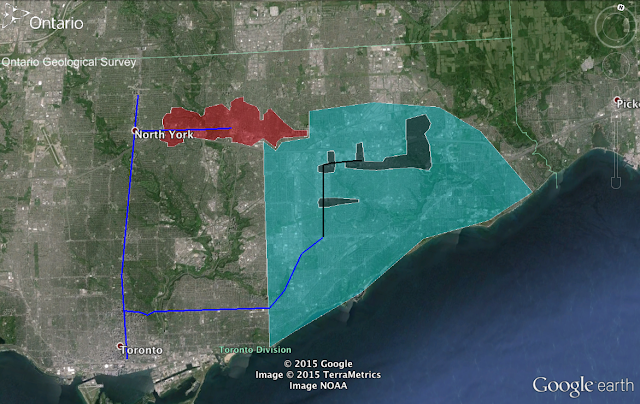
Since the Sheppard Subway and Scarborough RT are quite short, that means that if you take an intercepting bus route to transfer onto them, you'll have to transfer a second time onto the Yonge or Danforth Subway after just 1-2 stops, so it's not really worth it. Instead, google recommends that you take the bus directly to the Yonge or Danforth lines. It's only the people living within walking distance of the Sheppard Subway that are recommended to use it, hence the much smaller catchment area (in red) compared to the Danforth Subway (light blue).

With the Scarborough RT, it's even worse (in black). South of Ellesmere, even people within walking distance of the RT are often recommended to just take the Kennedy or Midland bus down to Kennedy Station. It's only further north that it makes sense to board the RT, once you can take it for more than 1-2 stops before transferring again. Buses along Brimley and McCowan also curve West to take riders directly to Kennedy or Warden Station. Scarborough Station doesn't just get twice as much ridership as the other RT stations combined because of the mall and condos, but also because it actually makes sense to take the RT if you live in those areas and in some parts of Malvern and Morningside too.

If you do the same experiment, but with the Financial District as the final destination rather than Bloor-Yonge, the catchment area of the Scarborough RT and Sheppard RT shrinks even further, as google recommends taking GO bus or GO rail lines.

A Scarborough extension probably could have drawn decent ridership from the Lawrence East buses however, thanks to the elimination of the transfer at Kennedy, and many bus routes would likely have been reconfigured a bit to feed into subway stations at Lawrence, or Ellesmere.

Similarly, the DRL would also intercept and redirect a tonne of transit users, to a significantly greater degree than even a Scarborough subway extension would have. Streetcar riders from East Toronto, subway riders from the Danforth line, buses from East York, the Eglinton East LRT, and even extending it to Sheppard would drawn a lot of riders as they would rather take the East-West routes to the DRL than N-S buses to the Danforth line or Yonge or Sheppard lines. I can easily see it getting 20k+ boardings at all stations. Past Sheppard you'd probably get significantly diminishing returns as those areas can be better served by upgrades in the GO rail and bus system when it comes to regional transit, and TTC buses should be able to handle the remaining local transit needs.
 
Why your sprawling, low-density suburb may be costing your local government money

From link.

Despite its desirability to many, suburbs cost, and not only to residents in terms of more expensive transport costs, but also to local authorities, according to new research from Christopher Goodman. By studying 30 years of data covering public spending on metropolitan counties, he finds that compact developments are less costly in terms of public services, while denser developments cost more. Spreading development out, he argues, drives up the cost of providing services, despite fewer being needed to service a relatively smaller population.

Even with the recent resurgence of urban living, the United States is a country of suburbs. There is plenty of debate about the full extent of this suburbanization, but some of it is clearly sprawl. Sprawl has an even more complicated definition, lending itself to a “I know it when I see it” interpretation. My working definition is excessive suburbanization; development that likely wouldn’t have taken place if developers and/or residents had to internalize the costs they impose on society. But does this kind of development induce higher spending on the part of local governments than it otherwise would have? In general, the answer is yes; however, it is complicated.

What are some of the reasons that normal suburbanization might turn to urban sprawl? In general, there are three reasons. First, developers may fail to consider the social value of open space. This leads an overzealous conversion of land from open space (like agricultural land) to residential or commercial uses. Second, individuals may fail to consider the social cost of their commuting patterns leading to housing being built far from employment centers. Finally, developers may fail to consider all the public costs of their developments. This last reason is the connection to local government spending. It has been suggested that it is costlier to provide public services in areas of sprawl because this type of development pattern fails to capitalize on economies of scale, often fails to optimize the location of costly capital facilities and leads to duplicative service delivery. More compact development patterns can help to contain these costs.

Densification, one potential remedy for sprawl, comes with its own potential impacts on local government spending. There could be economies of density whereby public costs are lowered because development and people are clustered closer together. There is another possibility, however. Because of physical proximity, providing public services could become more expensive; a concept referred to as “urban harshness.” The general logic is that dense urban areas require more “stuff,” traffic lights, police officers, teachers, than less dense areas to provide a similar level of public services. It is somewhat unclear which of these two views of sprawling (or not) development will impact public spending.

I examine this relationship between urban development and public spending in metropolitan counties areas in the United States from 1982 to 2012. I examine sprawl in two dimensions: horizontally and vertically. To measure the horizontal aspect, I use the USDA National Resource Inventory data to calculate the percentage of a county that is considered urban. In general, if small or very large percentages are found, that is an indication of more compact development. In the vertical dimension, I use population plus jobs density (population plus jobs divided by urban land). The idea for this is that urban or suburban areas exist for multiple uses. Some purely residential, some purely commercial, and others a mixed of the two. Only measuring one aspect gives a false sense of density, especially as it relates to public finance. Those office towers that are largely empty at night still require public services.

In general, I find that more compact development (think mixed-use medium rises) is less costly to provide public services; however, more dense development (think skyscraper offices and apartments) is more costly to provide public services. The relative size of the effects are not equivalent. More compact development has significantly more potential to reduce public spending than any associated increase in density could offset. In the average county area, if density increased from the 25th percentile to the 50th percentile, per capita expenditures would increase by $5.26. If the percentage of developed land was reduced from the 50th percentile to the 25th percentile in the average county, per capita expenditures would decline by $60.86. This finding suggests that if development patterns were to shift to more dense and compact development, there will be a reduction in public spending on average.

Moreover, some spending categories are more affected by development patterns than others. Education, police, fire, libraries, sewerage, and solid waste management would all see likely reductions in per capita expenditures if development was more compact. This shouldn’t be too surprising as all these services require traversing space or efficiently locating a building. In the case of education or libraries, it can be difficult to efficiently locate facilities when students or residents are spread out. For the others, spacing development far apart means needing more “stuff” to effectively provide public services; more police cars, fire trucks, miles os sewer lines, or garbage trucks.

So what?

My results suggest that more compact and dense development can pay dividends in lowering public expenditures. The key policy question is how to achieve that. Effectively designed impact fees that internalize the social costs of sprawl on developers (and are likely passed along to new homeowners) are one mechanism. However, our ability to do this effectively appears somewhat lacking. Statewide growth management or local urban containment policies may be a mechanism to reduce growth on the urban fringe and thereby reduce expenditures. Promoting infill development is another mechanism to stem growth on the urban fringe. All of this is to say that there are policy options to reduce sprawl and, to the extent those policies are successful, a secondary effect is a likely reduction in local public spending.

 
How Cars Waste Space — In Six Simple Images
Remember these the next time you hear someone complain that there's nowhere to park.

From link.

Wander into your average American coffee shop, and you won’t see a sedan ordering a latte. So why are the owners of diners often forced to devote the majority of the land upon which their business sits to the storage of privately owned vehicles, rather than cafe tables and kitchen space?

Diner-Lot-vs.-Dining-Area.png


A classic chart from Graphing Parking went newly viral on Twitter this week, but it illustrates the persistent paradox of restaurant parking minimums. Most cafe owners don’t get into the food industry to lay asphalt, but city ordinances often require them to build a minimum number of parking stalls that varies based on the square footage of their building. Austin, for instance, requires restaurants under 2,500 square feet to build one spot for every 75 square feet of building area. When you take into account that the average parking space takes up a staggering 180 square feet, it’s no wonder that a typical American restaurant has more SUVs in the lot than appetizers on the menu.

The problem with that jumbo lot, of course, is that it represents valuable land that could be devoted to far better things — and not just a few extra burners on the cooking line. Sometimes it represents a sorely needed affordable apartment building that was never built. Or an office building that would make it possible for a worker in that neighborhood to commute on foot rather than schlepping to an office park on the edge of town. Or it might just represent a few thousand square feet of pavement that an overworked chef-owner doesn’t have to spend his or her money and time to maintain — money which can be devoted to, say, the actual work of running a restaurant rather than tending to pavement.

And that beleaguered chef isn’t the only one who would benefit from devoting less of our private land to cars.

Worship-Spaces-vs.-Lots.png


Another classic image from Graphing Parking shows one of the worst offenders in the parking lot wars: worship spaces. According to Graphing Parking, the average church, mosque or temple devoted a whopping 29 square feet of real estate to parking for every six square feet of actual worship space in 2014, a number that’s unlikely to have budged much. Given that most of those lots are only used on days of worship — and even then, might still have lots of space —so much parking seems even more egregious.

Perhaps the only place where cars eat up more city space is on the roadway itself. Back in 2014, Copenhagenize brilliantly illustrated the near-total dominance of the automobile in a single Paris intersection, in three images:

Copenhagenize-1.png

Copenhagenize-2.png

Copenhagenize-3.png


And that’s on a posh European street with a generous pedestrian plaza and some pretty dreamy piano key crosswalks. Imagine performing this exercise on the eight-lane state highway astride your neighborhood strip mall.

Of course, no roundup of graphics that illustrate the incalculable stupidity of the amount of space we devote to cars would be complete without this classic poster from way back in the 1960s from a London public transit organization:

bus-london.png


Cars aren’t only horrible because they take up too much public space. They’re also dangerous, which inspired this visual poem about what it’s like to be a pedestrian in an American city

Cars-holes-in-ground.jpg


Let’s hope 2020 is the year when graphics like these finally fall out of date.
 
^Nice one. Let me be straight. I'm a driver. A daily driver, in fact, due to the nature of my occupation, but I'm all for minimising the impact and inefficiencies of catering to cars.

Because, whilst I love driving (I'm a bit of a "motorhead/gearhead/petrolhead" and enjoy driving as sport) I sure as hell know bullshit when I see it and I hate ugly, inefficient and wasteful things.
 
Car-Dependency Makes City Life Too Expensive
When you factor in transportation, Detroiters pay more of their income to meet their basic needs than New Yorkers do.

From link.

Three of the nation’s poorest cities are actually the most expensive places to live — when you factor in how much it costs to get around, and not how much it costs to pay the rent.

That’s the takeaway from a new report from the Citizens Budget Commission that looked at median combined housing and transportation costs as a percentage of area median income, instead of housing costs alone. When it comes to that expanded affordability metric, transit-rich, but housing-dear New York City actually ranks as the eighth most affordable metro among 20 peer cities. The Center for Neighborhood Technology says spending 45 percent of your household income on housing and transportation combined is a good rule of thumb; New Yorkers are paying just a touch more, at 45.3 percent.

Meanwhile, three of the nation’s most car-dependent cities fall to the bottom of the list: Miami, Detroit and Phoenix.

Housing-and-transportation-affordability-as-a-percentage-of-income.png


The Citizens Budget Commission is not the only group pointing out that transportation costs deserve a bigger place in our conversations about making our cities more affordable to more Americans. The H+T Index has been mapping the metric since way back in 2006. Their site is a treasure trove of fact sheets about what it costs to live and get around in communities across America — and according to their data, not many places are doing much better than Phoenix and Detroit.

In this map, the yellow spots indicate a region where median combined housing and transportation costs are 45 percent of the median income, or less. All the dark blue swaths represent communities where they’re more,

Screen-Shot-2020-01-15-at-11.50.34-AM.png


If you consider only the cost of housing without transportation costs, by contrast, most of America meets the 30 percent affordability threshold accepted by most housing advocates, at least on a birds-eye view. In this map, yellow represents places where the average Joe can afford his rent; blue zones are where the average Jane is struggling to pay the landlord.

Screen-Shot-2020-01-15-at-11.50.58-AM.png


(By the way: if you’re in the mood to waste some time today, the “fact sheets” tab of the H+T index allows you to zero in on which places make the affordability grade, simply by entering a ZIP code, city name, or state. Just in case you were looking for a reason to never move to Wyoming.)

And before you ask, no: the cities at the bottom of the list do not have secret expensive-yet-well-used public transportation systems.

The top city on CBC’s list, Washington, DC, also has the third highest rate of transit ridership, with 37.4 percent of Washingtonians using public transportation; only about 4 percent of Phoenicians do, and that helps land the Arizona capital at the bottom of the rankings. A one-day unlimited pass in the nation’s capital will run you $13; in Phoenix, it’s just $6.50. It’s not hard to extrapolate that the Americans who pay the most for transportation are often doing so because they’re driving — and they’re often driving because the autocentric development pattern of the cities where they live functionally forces them to get behind the wheel if they want to make it to work.

If we truly want to reckon with our national poverty crisis, we don’t just have to build more affordable apartment rentals. We also have to take a hard look at what it will take to make going car-lite or car-free a feasible possibility for more people — or else we might leave a lot of low-income Americans behind.
 
I was just exploring some imagery of random rural and suburban towns in England, and I was struck by how dense they are compared to North American suburbs, while still not being overwhelming. The fundamental road layout in these rural and suburban towns aren't any different than what is seen in London.

Below is the town of Fordinbridge, which has a population of 6,000. This road layout would fit seamlessly within London.

Screen Shot 2021-11-24 at 4.28.47 PM.png

Now here is in London, where despite being in one of the world's largest cities, the road layout looks pretty damn similar to Fordinbridge.
Screen Shot 2021-11-24 at 4.32.59 PM.png

While the road layouts are similar, London does feature more duplexes, triplexes, multiplexes and other "missing middle" buildings.

In Toronto's context, it would be as if the inner (416) suburbs and outer (905) suburbs were laid out the same as Toronto's historical "streetcar suburbs", with the City of Toronto featuring more missing middle buildings.
 
I was just exploring some imagery of random rural and suburban towns in England, and I was struck by how dense they are compared to North American suburbs, while still not being overwhelming. The fundamental road layout in these rural and suburban towns aren't any different than what is seen in London.

It isn't just the rural towns that are much denser compared to what we have here. Rural farmland areas are a level of density that is probably higher than even some of our suburbs.

Compare rural Poland:

1637866121934.png


To rural southwestern Ontario (Haldimand county):

1637866207316.png


Remarkably, the rural density of the first example allows for enough local residents to maintain various service and shopping amenities in the countryside that you would otherwise have to commute further distance to local county towns to find. They even have enough density to allow for an infrequent bus service in some of those longer rural roads.
 

Back
Top