Toronto U of T: Centre for Civilizations, Cultures, and Cities | 42.75m | 9s | U of T | DS + R

Would look a lot better stepped back from the ROM and not over powering it through height. Could do with being a story or two lower even then.
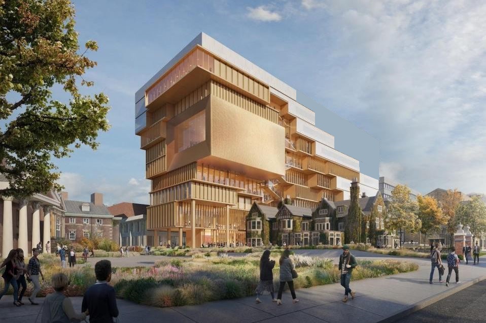
174913
 
Better not disagree with Alex Bozikovic about it on Twitter. For him, you either like it, or you're wrong. But I digress.

The reality is, the architects may have done a valiant job, but it's still a small and difficult site with too much program and various faculties competing for space in the new building. On first glance, it appears that the challenges outweighed the way they were resolved in this case. I have yet to speak to anyone else from the architecture world who sees this project as a victory.

It's not an issue of incapable architects or lack of talent, that's certain. It's an issue of client demands / client's brief (with site and program under that umbrella).
 
Could this be better? Yeah, I think so - it feels a little clumsy.

This probably just speaks to how low the bar is in the city, but I'll basically get excited about anything that has a warm colour, materials other than glass and spandrel, and that tries to do something adventurous. The imposing scale of it is kinda cool to me as well. I really like the juxtaposition with the heritage and this will become an interesting part of a lot of different vistas.

It may not end up perfect, a lot of university buildings aren't, but it has character and nice materiality and will probably end up looking pretty cool. Could it be better, Yeah! But there's a lot to like here as well and so many worse, boring buildings so it's hard for me to think negatively about this on the whole.

Plus, the theatre will likely make all of this worth it on its own.
 
Would look a lot better stepped back from the ROM and not over powering it through height. Could do with being a story or two lower even then.
View attachment 174913
It already looks far better, but I would swap the massing around so the bulk of the height lies towards the ROM, with the building stepping down towards Queens Park- they could even compensate for some of the lost density with a few additional floors. That way, the building is far more contexturally appropriate, plus there's also the potential for continuous terraces with awesome downtown views that will never be obstructed.

TBH, the auditorium box isn't doing much for me and feels like an tumorous intrusion into the overall design language, I would replace that volume with the same detailing as the rest of the building, but maybe as a void space. Sort of the way D+S did it with their Vagelos Building at Columbia.

 
Better not disagree with Alex Bozikovic about it on Twitter. For him, you either like it, or you're wrong. But I digress.

The reality is, the architects may have done a valiant job, but it's still a small and difficult site with too much program and various faculties competing for space in the new building. On first glance, it appears that the challenges outweighed the way they were resolved in this case. I have yet to speak to anyone else from the architecture world who sees this project as a victory.

It's not an issue of incapable architects or lack of talent, that's certain. It's an issue of client demands / client's brief (with site and program under that umbrella).

This is a perfectly reasonable criticism -- the one about the project, that is.

FWIW I think people's views of this will be more positive once more drawings are released. The renderings are not helping.
 
I may be wrong about this, but this is what I think happened. That big blank block on the east side that is the concert hall was originally a backdrop behind a Falconer Hall that was going to get chopped in the back. The concert hall was planned to be on the second floor.

To appease HPS and to help this building move quickly thru planning process, in exchange for tearing down the planetarium building, they kept pretty much all of Falconer Hall. There was no longer space for the performance hall now after this change, and so then that blank wall moved on up.
 
I'm not sure... I imagine the idea for the theatre overlooking the skyline because that's a sick idea came first rather than it ending up there as an accident born out of compromise because they weren't allowed to demolish part of Falconer Hall.

I'm not even really sure why people see the blank wall there as a downside. It appears to have a pleasing texture for one, but also it functions as clean negative space in the design in contrast to the very busy rest of the building. The simple geometry of the theatre portion is one of my favourite aspects of the design and it didn't even occur to me that some would see it as a problem in the design. If I were adjusting the design of the building I'd likely lean into highlighting it even more.
 
Docs are now online for anyone wanting to take a closer look at the plans:


Back
Top