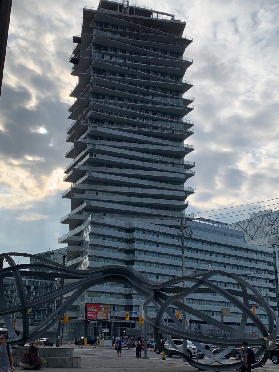
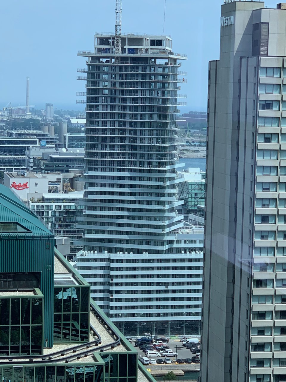
Toronto Tower at Pier 27 | 114.9m | 35s | Cityzen | a—A

Two photos from today.

197920


197921
 
different colour (think red, yellow and blue) balcony glass would've gone a long way in breaking up the monotony and mass and supplementing the playfulness of the shifted balconies
 
I don't think 'monotony' when I look at a tower where every second or third balcony slab is angled differently. I do think 'eyesore' when I picture it with three shades of glass on it.

42
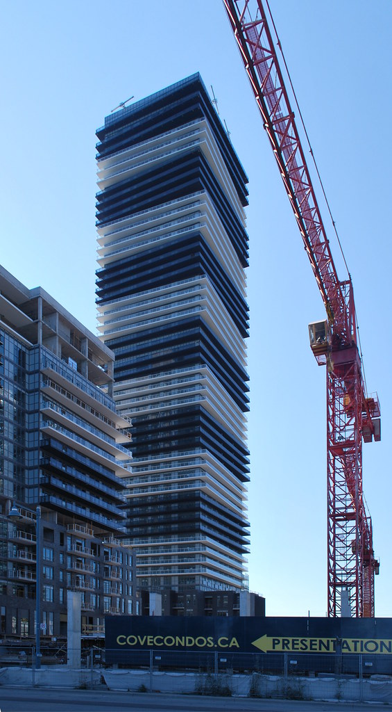
 
I don't think 'monotony' when I look at a tower where every second or third balcony slab is angled differently. I do think 'eyesore' when I picture it with three shades of glass on it.

42
29426607956_016307eec3_b.jpg


From the weekend:

DSC08838.jpg
DSC08840.jpg
DSC08842.jpg
DSC09537.jpg
DSC09540.jpg


42
 
Am I the only person who has never liked these projects?
They come across as cheap glass slabs with balcony arrangement nonsense that should have never been at that strategic location at the waterfront

The “cheap glass slabs” you’re referring to actually costs a fortune in today’s window wall world of condos. This project specifically has a bypass balcony detail (where the glass is hung covering the slab edge) in which by code requires it to be two pieces of laminated glass with a minimum thickness. The glass is fritted to appear more transluscent (hiding the window wall millions behind). There are additional rails that catches both top and bottom of the glass to keep it in place (as per post falling railing incidents). The glass itself has to withstand a 100lb weight ball travelling at a certain speed from inside the balcony.

The cheaper alternative would have just to put a clear glass panel on the slab (approx 2” in) this way you would only need one piece of glass however the horizontal band would appear less singular.

By alternating and cantilevering balcony slabs, not only it is adding complexity to structural load, it also demands a more sophisticated window washing anchor and track system at the mph level and each of the balcony slab. All this costs $$$$. Balconies are inherent in Toronto’s condos. Marketing will tell you they cannot sell a unit without balconies despite how impractical it may be especially given a waterfront location.

What appears effortless is actually a lot of thinking and work behind trying to fulfill a market driven program and budget at the same time making a building least bit interesting to look at.
 
I really like it. The shadow play of the varying balconies against the fritted railings is only going to become more apparent as they climb higher and looks cool as the sun and lighting changes throughout the day. I think they did a pretty good job here re; keeping things simple. I’d rather have a well executed this vs something like the Daniels towers down the street or having it end up looking like Alter or Form which are just bungled executions of interesting designs.

In my fantasy world the parking lot to the west becomes a new park making this appear to rise out of a sea of green from the water, but I’m guessing it’s destined to be a building or a parking lot even longer.
 

Back
Top