Toronto Royal Ontario Museum | ?m | ?s | Daniel Libeskind

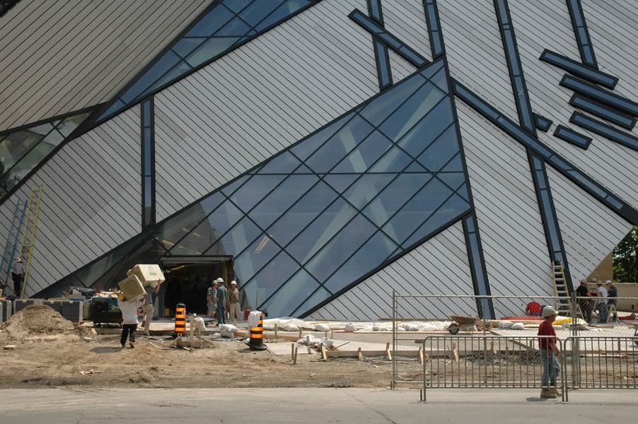
I must say... as much as I like the form of the crystal, the cladding has turned out to be very disappointing. I was willing to overlook the fact that it looks more white than the metallic-looking cladding from the renderings, but the discolouration just looks ugly. Actually, it's not so bad if you're looking at one of the sides at an angle... it blends into a white-grey blur that looks natural. Looking at a side head-on, it just looks sloppy. Everyone I've shown the Crystal to since the cladding began to be applied has asked about the discolouration, and at first I thought it was protective film. Very disappointing to learn this is what we'll be stuck with - I can't imagine Libeskind is happy. Oh well... hopefully with time the contrast will be less prominent. Still a very nice addition, but the execution could have been handled better.
 
I expect there will be a lawsuit over the cladding: the ROM is not paying the contractor chump-change for a crappy job. If there isn't a lawsuit there will be some 'splainin' to do at the ROM's next AGM.

42
 
I think mixed cladding shades would look great if there were no gaps...it would be a very interesting texture. It looks pretty good from certain angles as is...although it seems obvious it's not intentional.
 
Just walked past the site a few hours ago and I can confirm that there are piles of stone (dark grey/black granite) paving waiting in the plaza.

AoD
 
Thanks for the info on the stone paving Alvin.

I also think that the discolouration looks awfully non-intentional and denotes how each line of the cladding was applied with individual smaller slats.

As I said in a previous post, in a building with virtually no 90º angles, this cladding stands out like a sore thumb. It looks like it just doesn't belong.

I hope Thorsell has a good explanation, and none of this "that is how we intended it to be" shit.
 
At the War Museum, Libeskind had to scale back his design and substitute metal cladding for concrete because of financial cutbacks. At the ROM, the cost has been rising steadily even though the Crystal is smaller than the original design.
 
Interesting, too, how earlier renderings ( posted on page 1 of this thread ) appear to show that the frames outlining the windows will be the same neutral grey colour as the cladding. But later renderings show them as a contrasting black - as visits to the construction site indicate they will be. Perhaps this has been done to make the windows stand out and appear larger, deflecting criticism that they're smaller than everyone expected?
 
I like the windows and the black for contrast. I would have preferred the argyle patterned cladding as is displayed in the rendering outside the ROM.
 
Hate to pee on everyone's parade but they really screwed up on the cladding. However, that's just the badly made icing on what was already a wretched, misconceived cake. Plagued by budget shortfalls, poor decision making (the winning design), and lousy public relations (the planned condo) this project is morphing into our own version of the Olympic Stadium. In similar fashion it will be a long running source of civic embarrassement and quite likely the most despised building in Toronto. And the lawsuits and leaky ceilings haven't even started. *shudder*
 
Paving Pics From Today (May 15)

rompavingdet2.jpg


rompavingdet.jpg


On a side note: I'm surprised at all the anger and attention on here about the slight value differences in the cladding. Personally, I like it, or at least I don't give a fig. To me it gives some subtle interest to the facade, marking the seams and handicraft of assembly. It think the facade might be more bland for being 'perfect'. If it had come out that way, it would have been grounds for a set of different complaints.

The building is strong and in-your-face. It shocks. It's both arbitrary and awfully precise, playful yet nearly inhuman all at once - a confusing hard clash of qualities, with the soothing mask of respectability and history removed. I think a lot of the anger felt towards it is because it is not deferential, submissive nor 'practical' by any common definition. All the better.It is a brave building, and makes me feel braver looking at it.
I guess to me the surface of this thing is it's least defining truth. Though IMO it looks great.
 

Back
Top