Toronto Regent Park: Block 27 | 94.18m | 29s | TCHC | RAW Design

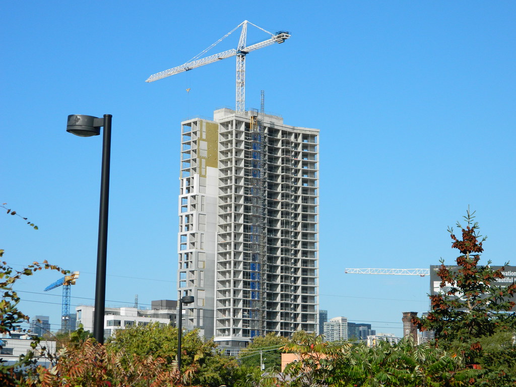
I'm liking the tower. I think the shift in tone is successful, and I appreciate how narrow it is.

However I don't love all the light grey mullions on the shorter portion. Which I assume will be he same on the taller as well.
 
Last edited by a moderator:
From yesterday evening:

DSC04059.jpg
DSC04072.jpg
DSC04073.jpg
DSC04074.jpg
DSC04075.jpg
DSC04076.jpg


42
 

Attachments

  • DSC04059.jpg
    DSC04059.jpg
    360.7 KB · Views: 629
  • DSC04072.jpg
    DSC04072.jpg
    292.5 KB · Views: 643
  • DSC04073.jpg
    DSC04073.jpg
    723.3 KB · Views: 599
  • DSC04074.jpg
    DSC04074.jpg
    648.5 KB · Views: 643
  • DSC04075.jpg
    DSC04075.jpg
    783.2 KB · Views: 597
  • DSC04076.jpg
    DSC04076.jpg
    484 KB · Views: 635
I often find the spacing between mullions on spandrel to be very off in a proportionate sense on buildings going up here (going against the golden ratio and Fibonacci sequence and all that jazz). The spandrel and mullions on the mid rise portion on this building feels much more pleasing to me, in terms of spacing. I don't mind it.

One thing that would be interesting to see on a building is the inverse of the mid rise cladding here, where a building was almost all the coloured parts that are sticking out with only a few indentations.
 
Yesterday

A78451F1-8EE3-498E-ABD9-B4C663140FB6.jpeg


3686DF06-75FF-4E21-A952-78CB447EDFF7.jpeg


A93AE7CD-5043-45AB-B332-765944B3CDF6.jpeg


7BA029BC-249B-46A2-BAD2-CC3F292227CA.jpeg
 

Attachments

  • A78451F1-8EE3-498E-ABD9-B4C663140FB6.jpeg
    A78451F1-8EE3-498E-ABD9-B4C663140FB6.jpeg
    443.2 KB · Views: 585
  • 3686DF06-75FF-4E21-A952-78CB447EDFF7.jpeg
    3686DF06-75FF-4E21-A952-78CB447EDFF7.jpeg
    484.6 KB · Views: 602
  • A93AE7CD-5043-45AB-B332-765944B3CDF6.jpeg
    A93AE7CD-5043-45AB-B332-765944B3CDF6.jpeg
    741.9 KB · Views: 611
  • 7BA029BC-249B-46A2-BAD2-CC3F292227CA.jpeg
    7BA029BC-249B-46A2-BAD2-CC3F292227CA.jpeg
    1 MB · Views: 611

Back
Top