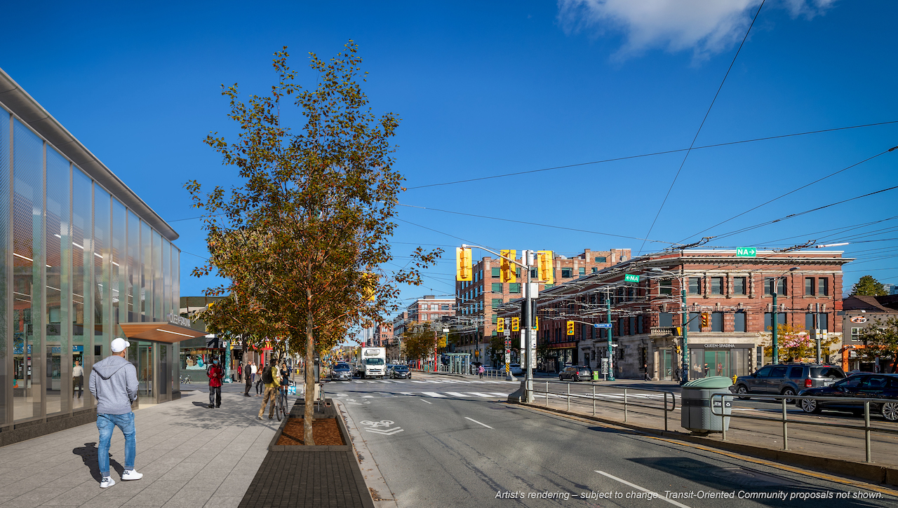
Database file coming soon, but here are the first renderings:


Here's the neighbourhood context map for the station:

42
Here's the neighbourhood context map for the station:

42

It'll be a Metrolinx "T" with the operators symbol in it, likely TTC.I really hope there are gonna be TTC signs
Unlkess Metrolinx does another consatlation process that decided that they will do somethig ele, becuse they deced that the T isn't going to be used anymore.It'll be a Metrolinx "T" with the operators symbol in it, likely TTC.
But they haven't 'decreed' that, so don't suggest that they have.Unlkess Metrolinx does another consatlation process that decided that they will do somethig ele, becuse they deced that the T isn't going to be used anymore.
I'm not really sure how sold they are on the T logo. They have only used it at go bus stops and on the crosstown line, they have opened up there new projects since it was decided on and yet they didn't use it in any of them. For example they were asked why the signage in the bus terminal at Kipling didn't use any of the new wayfinding and they responded with "it would be charged at a later date" it shows that they don't really have any plans at all with regards to it. The T logo is meaningless and tells you nothing at all, nobody knows that it's supposed to mean anything unless they either work for metorolix or have read their stupid wayfinding study.But they haven't 'decreed' that, so don't suggest that they have.
Yes, the TTC logo will be used alongside the T - Metrolinx is paying the bills, so the TTC has to jump when MX tells them
I don't really get why we need a redundant symbol. I honestly think that when the crosstown opens there will be people who will be confused about it being a separate cost or not part of the TTC because they don't see a TTC streetcar stop pole or a large TTC logo outside of the underground stations.I wish the City/Metrolinx would develop a symbol specific to the rapid transit system. Both the T and the TTC logo are used to identify everything from subways to streetcars to bus stops.
I mean the TTC could also adopt that symbol as their branding on stations, the classic logo will inevitably be updated eventually even though that's painful to type. Hopefully people could figure out that it stands for Toronto Transit, and even though the TTC logo is awesome and it's classic, it doesn't really match the new architecture styleI don't really get why we need a redundant symbol. I honestly think that when the crosstown opens there will be people who will be confused about it being a separate cost or not part of the TTC because they don't see a TTC streetcar stop pole or a large TTC logo outside of the underground stations.
A separate logo for rapid transit stations used across the GTA would make stations more identifiable at a glance. The TTC logo on a pole might be fine for people who know the system but to visitors or even people not familiar with a particular station it's ambiguous and could be identifying anything that the TTC happens to run. That's not useful.I don't really get why we need a redundant symbol. I honestly think that when the crosstown opens there will be people who will be confused about it being a separate cost or not part of the TTC because they don't see a TTC streetcar stop pole or a large TTC logo outside of the underground stations.
The Metrolinx T was suggested to them by a "wayfinding expert" and chosen by a committee of city council members and random people. So far no public transit agencies have said that they have any plans to use it at metorolix intends for it to be some sort of universal transit symbol for the GTHA, and i highly doubt it will be used except for metorolix and will not do anything other than have people wonder as they are now what does this T symbol mean. If people want to drink Metrolinx's kool aid and believe that it's such and important and amazing thing to have a generic transit symbol then go ahead but I'm not sold on and i think they just waisted money on it along with all of their other pointless studies they didSame with the Metrolinx T.