You are using an out of date browser. It may not display this or other websites correctly.
You should upgrade or use an alternative browser.
You should upgrade or use an alternative browser.
Toronto One Rainsford | ?m | 6s | The Riedel Group | Richard Ziegler
- Thread starter digitalcabana
- Start date
Hipster Duck
Senior Member
Nice! This is how we real cities ought to evolve.
urbandreamer
recession proof
Maybe... But those little houses are rather cute and on the other side of Woodbine I see a mighty large empty lot! Hmmm.....
digitalcabana
Active Member
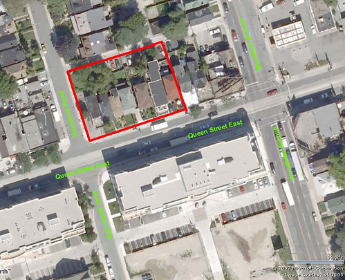
1866 Queen East
The existing dwelling at 1866 Queen Street East.
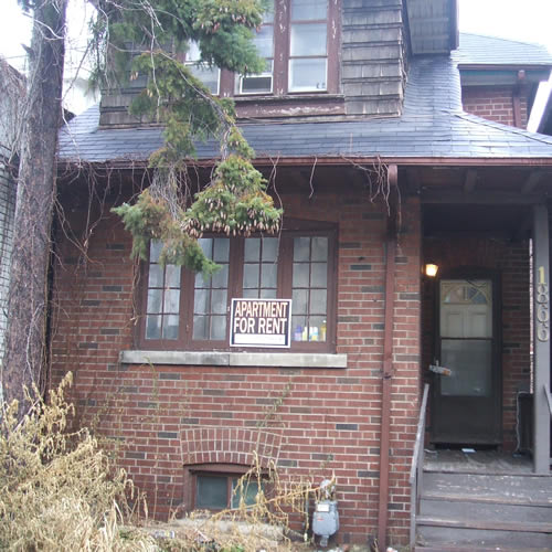
The existing dwelling at 1866 Queen Street East.

Maybe... But those little houses are rather cute and on the other side of Woodbine I see a mighty large empty lot! Hmmm.....
That's a Shell gas station.
42
mysteryman
Active Member
That looks great. I know some people don't like change but I'd be happy if more of our mainstreets were transforming like this...houses on mainstreets are inappropirate urbanistically.
Conrad Black
Senior Member
The existing dwelling at 1866 Queen Street East.

There's litterally thousands of houses like this in the city. There would be no downtown if we saved all of these in the past. No big loss and a nice boost for Queen at the same time.
xizhimen
New Member
I live on Rainsford and I'm quite happy to see this development. It'll match the newish condos on the south side of Queen and hopefully extend the Beaches a little bit further to the west. It'll also be nice to see the shack at the corner of Queen and Rainsford finally bite the dust.
billonlogan
Active Member
The Riedel's own the entire block to Woodbine. I would not be surprised they do the same on the corner where the Holy Chow is located. This type of development compliments the surroundings. I just hope the retail portion is not bland like the one's across the street.
urbandreamer
recession proof
So essentially they are slumlords; they let their rental stock slide into disrepair (typical) then propose an ugly eyesore to capitalize on their land! Wonderful
billonlogan
Active Member
So essentially they are slumlords; they let their rental stock slide into disrepair (typical) then propose an ugly eyesore to capitalize on their land! Wonderful
Happy Capitalism.
A
averagejoeinthebeach
Guest
Hmmm
Thanks for posting my pictures. A few thoughts.
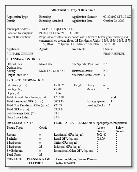
1. The development is higher than any other building on Queen Street in The Beach. It's not change that's the issue, it's the scale of it and the precedent it will set for the rest of Queen Street East in the Beach, which is designated an Avenue in the Official Plan.
2. That ugly building on the corner, 1864 Queen Street East, that xizhimen refers to has been there since at least 1905. It may have been there before anything else. What is it? It's not a house. It's not a commercial building. It's a wooden structure. Before we pull it down, wouldn't it be nice to know what it is?
I live on Rainsford and am opposed only to the height, period. The Riedels have made their livelihood off the backs of renters and poor folk, but they'll find it harder to do it at the expense of other property owners, including people who currently enjoy a nice view north from their spanky condos on the south side of the street.
unimaginative2
Senior Member
The whole thing's actually cladded in stone. I'm guessing these are going to be pretty high-end units.
Dane
Active Member
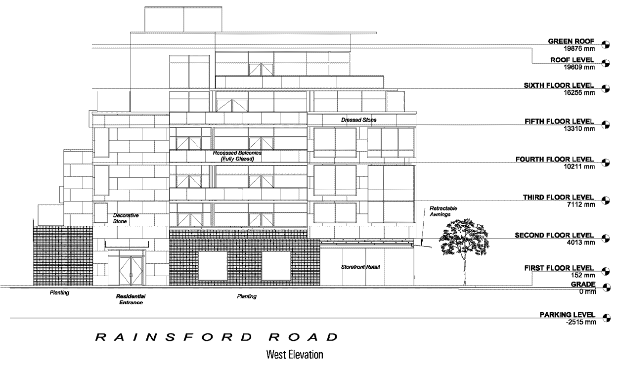
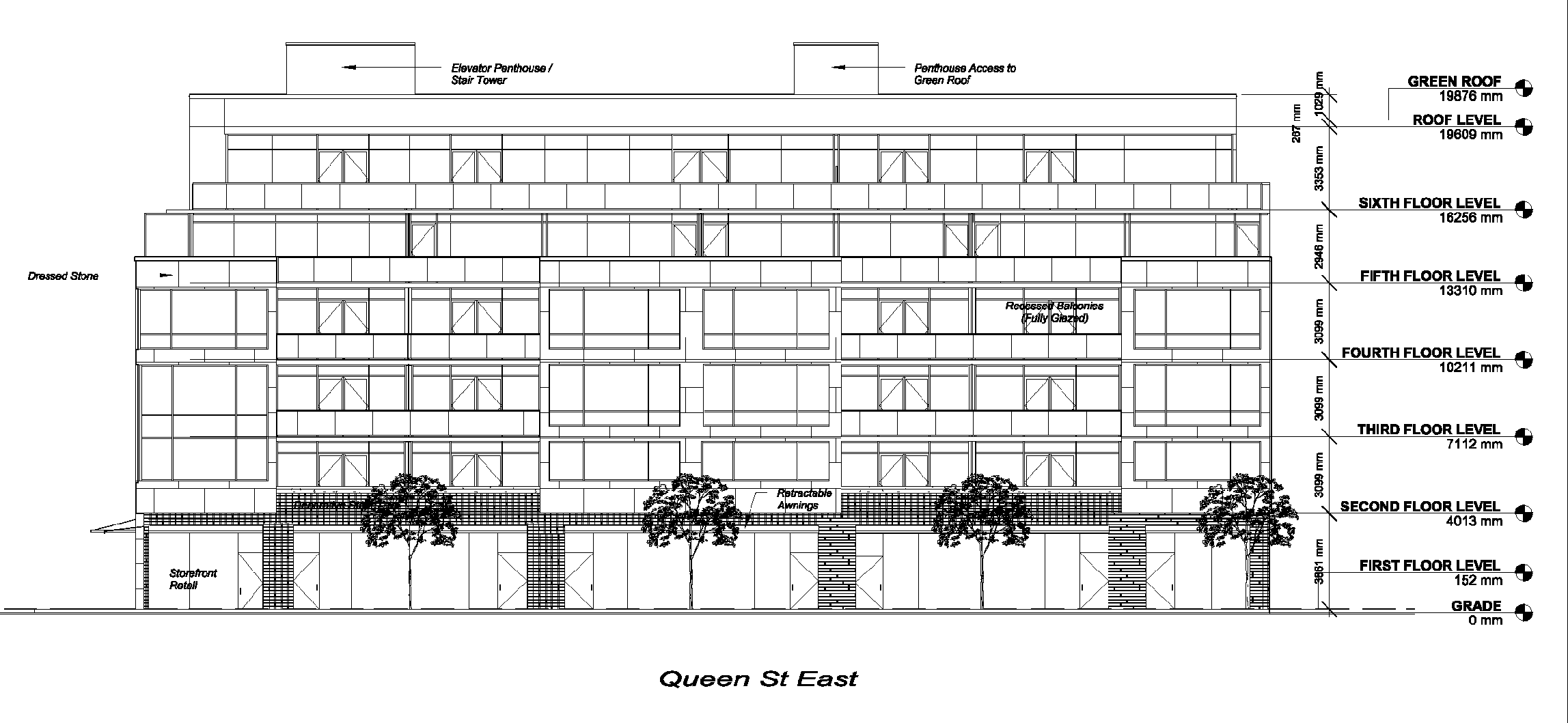
Judging from the elevations, the architecture doesn't look like anything spectacular, but the height, scale, and and inclusion of retail fit perfectly for this part of Queen Street East. I think that more of these smaller-scale condo projects should be replacing our 1,2,3 story buildings, as opposed to having thousands of 2-floor buildings and then a HUGE tower. but thats just my opinion.
A
averagejoeinthebeach
Guest
I think that more of these smaller-scale condo projects should be replacing our 1,2,3 story buildings, as opposed to having thousands of 2-floor buildings and then a HUGE tower. but thats just my opinion.
I agree, but in this case a four-storey structure would be more appropriate for the context and create a better transition into the established low density neighborhood to the north. Instead, the idea is to have a five- and six-storey building facing each other across Queen.
With four floors, the site would go from two and three-storey buildings to four with only a minor variance to the existing height limit.
The building across the street is new. It's a five-storey building that has a very large setback from the low-density neighborhood to the south. It was supposed to be four floors, but a certain talented individual named Jakobek made a crazy Section 37 side-deal with the developer which ended up costing rate payers money.
So in this new development the sixth-floor is all about being able to claim lake views from the penthouse and maximizing profit. It's nothing to do with good urban design.
