Toronto New Park at 229 Richmond West | ?m | ?s | City of Toronto | Gow Hastings

Top choice for the New Park at 229 Richmond Street West


  • Total voters
    42
  • Poll closed .
Public Art can be wonderful; but in Toronto we spend too little on each piece, and too much on too many pieces.

I'm not typically a fan of sculpture as an enticing addition to City space; though I've seen some great ones.

But I think water features/fountains could be viewed as public art and are often quite popular; to do properly, they take a lot more budget than what is typically allocated.

I think in addition to budget, there's often this tendency to cram art into every space whether there's any rhyme or reason or not; and whether there is sufficient space. Such that public art often feels like a forlorn appendage just tacked onto a project, instead of being an integral part of same.

I think some of the best public art we've seen in the City was some of what was integrated into the architecture of the original Spadina Line.

Some of the worst is some of the random art tacked on accessibility projects in stations.

Example, Coxwell Station:

View attachment 512440
Taken from: https://upload.wikimedia.org/wikipe...ll_station_-_art_-_Forwards_and_Backwards.jpg
Agreed pretty much in full, my statement was a bit broad. Fountains and water features I am absolutely on board with; Love Park and Berczy Parks are fantastic recent examples. Perhaps my issue is exactly what you've noted here, much of our public "art" seems to be ill-conceived or half-baked pieces that do nothing more than serve a mandated component.

In that sense, I would expand my statement to include art that is an integral, well thought out portion of the greater project. Spadina line is a great example; the mosaic and decorative tiling, the lighting features; these were both functional and essential elements that also serve as art.
 
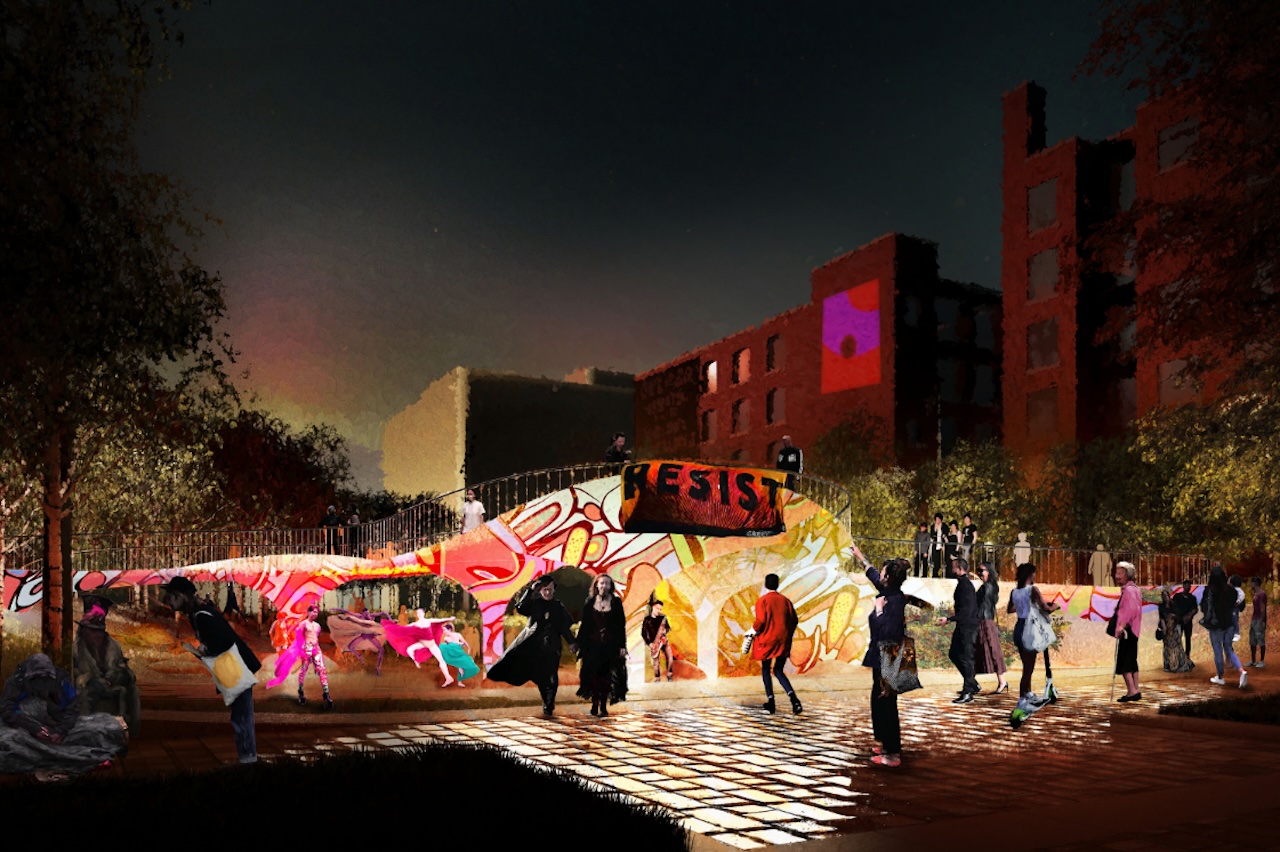
Public City's big idea "The Electric Forest" creates some interesting conversations/tensions between the digital and natural worlds... but it's just not a welcoming place at all.

Would probably work as a temporary installation somewhere (like under the Gardiner or a clear-cut Ontario Place ;-).
 
Thanks, @Northern Light. I always appreciate you keen eye to park design.

Based on the proposals, which one do you think will require the lowest amount of upkeep? Knowing PFR, I'm concerned about broken lightning and overgrown plants. It's a sad day where "ease of maintenance" is a key criteria for grading proposals, but this is Toronto, after all.

Also, I notice there are no ugly and clunky waste bins in the renderings. We can only hope!

It's difficult to say in some respects, because we not only lack the full material palette at this stage, we also lack drawings that show how certain structures are to be built.

That said, it's fairly easy to spot the potential weaknesses.

Let's start w/the hardscape.

1) Any structure is a potential source of maintenance, but if you want washrooms, you'll have at least some structure. The question then, is, how susceptible to vandalism is it, and vulnerable to other issues (roof leaks), and how easy to fix is it?

We lack sufficient detail here to be clear w/each proposal; but washrooms tucked under a landform and structural seating in the PMA proposal do have extra risk factors attached in terms of potential leaks and difficulties with remediation.
The same will be true for the balcony structure in the West 8 proposal. Free standing washrooms buildings will at least be easier to fix.

That said, if the structures are well built, maintenance may be low.


2) Moving parts; The Electric City proposal has in-ground misters. I would be highly suspicious of how well these will be maintained. Very susceptible to damage and clogging; a royal pain to clean-out regularly.

3) Lighting, I can't speak to the vulnerability of any of the designs, and I don't know who the proposed vendors are..........I assume/hope it will all be LED.

But, I would look at two things, the height/location of lighting, stuff closer to the ground is more likely to be routinely impaired by moisture, incidental physical contact, vandalism, or even being buried under leafy debris in planting zones. The other thing I might consider is how critical is the full or substantial operation of the lighting to the design. Obviously if the park is mostly dark at night, that's a problem for any design, I'm thinking more if say 1/2 your electric trees don't light up or don't light up fully that probably has a more adverse effect than does 1 or 2 or 3 fixtures burning out; equally I expect it may be a more specialized fix. When I see all the lighting in the PMA design under the seats, I have thoughts about how it will be circuited (if one light fails, does the entire strip?) .

Again it's tough to draw firm conclusions w/o more detailed information. I would not want to see designs all dumbed down to being idiot-proofed.

***

Softscape:

Other than the issue w/the Birch monocultures....

The lawns are an obvious weak point in a couple of designs. I would prefer these either become paths, with additional landscape around them, or become a clear landscape feature, but be protected from intrusion, if softscaped.

I also think the Electric City design will likely be trampled due to the inconvenience of the row-based layout.

***

Of all the designs, the DTAH is probably the lowest risk; but its landscape design remains an issue both in terms of soil volumes and trample risk. * ( I don't have any soil volumes yet, it's a concern based on the renders)
 
Last edited:
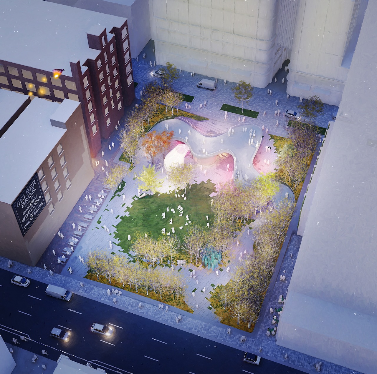
OneSky by PMA Landscape architects & SLA absolutely stands out compared to the rest. What a big city park looks like. Looks like the excellent NYC & London UK designed parks. Very busy but relaxing w warm charming sightlines. Looks like a few parks in one. Not so open~some privacy added. Lots of green. A number of rain gardens to be specific. Lots of cool seating. An amphitheater w seating steps within “Theatre District”. Every design should have an amphitheater in some form. That rousing large blue structure looks sharp & even an art piece. There’s not even a close 2nd imo. And also the pavement & pathways of oneSKY is an off white. Not grey. Some other designs have grey pavement & it doesn’t do a thing to enhance the space. It downgrades it. A+
 
The only proposal worth spending the money and using this valuable land as a park is the 'oneSKY'

The other proposals aren’t inviting at all. They provide mostly hard surfaces, no sense of meeting place, relaxation, entertainment or nature, they add nothing local residents would feel welcome to hangout there, and out of town visitors wouldn’t see it as a destination either.
overall, these shortlisted options are beyond underwhelming. I wish we saw a Cormier option, this area and park deserved 5 great proposals not just 1 option worth choosing.
 
I don’t much care for any of these proposals. A central theme based on a prominent structure (a fountain, sculpture, etc.) would help. Lacking that, I think a comfortable low key “square” would be fine. Some small sculptures and unique furniture could be included. The proposed themes look forced and lack a sense of purpose. Cormier + Associates are great at creating spaces that have charm, which none of these proposals possess.
 
Was surprised to see "Sook-Yin Lee" as one of the designers for the Electric Forest submission - wasn't sure if it was the Sook-Yin Lee from MuchMusic/Shortbus, but apparently it is!

Sadly, even though I am a fan of hers, I'm not a fan of the submission. Northern Light and the early commenters captured my feelings: nothing very exciting about any of the submissions. Some very busy, over-designed spaces that will not fare well in the long term. Lots of theory-drenched ideas but little thought of how the average person will find the space special.

The PMA one is the best option, just because it has the most green space.
 
Was surprised to see "Sook-Yin Lee" as one of the designers for the Electric Forest submission - wasn't sure if it was the Sook-Yin Lee from MuchMusic/Shortbus, but apparently it is!

Sadly, even though I am a fan of hers, I'm not a fan of the submission.
Very weird. The last time I saw her name pop up was when she deputed against pedestrianizing Kensington Market a few months ago. I'm thinking she should maybe leave the urban design to the experts.
 
The winning design has been announced, and it is 'Wàwàtesí,' from West 8 and team. Front page story is here.

54832-166378.jpg


54832-166379.jpg


42
 
Sigh.............

Wasted opportunity.

Look at the poll result above.......I would love to see the City's poll results (they took one)..........
Well, at least they went with our second place pick!!!

42
 

Back
Top