yylover
New Member
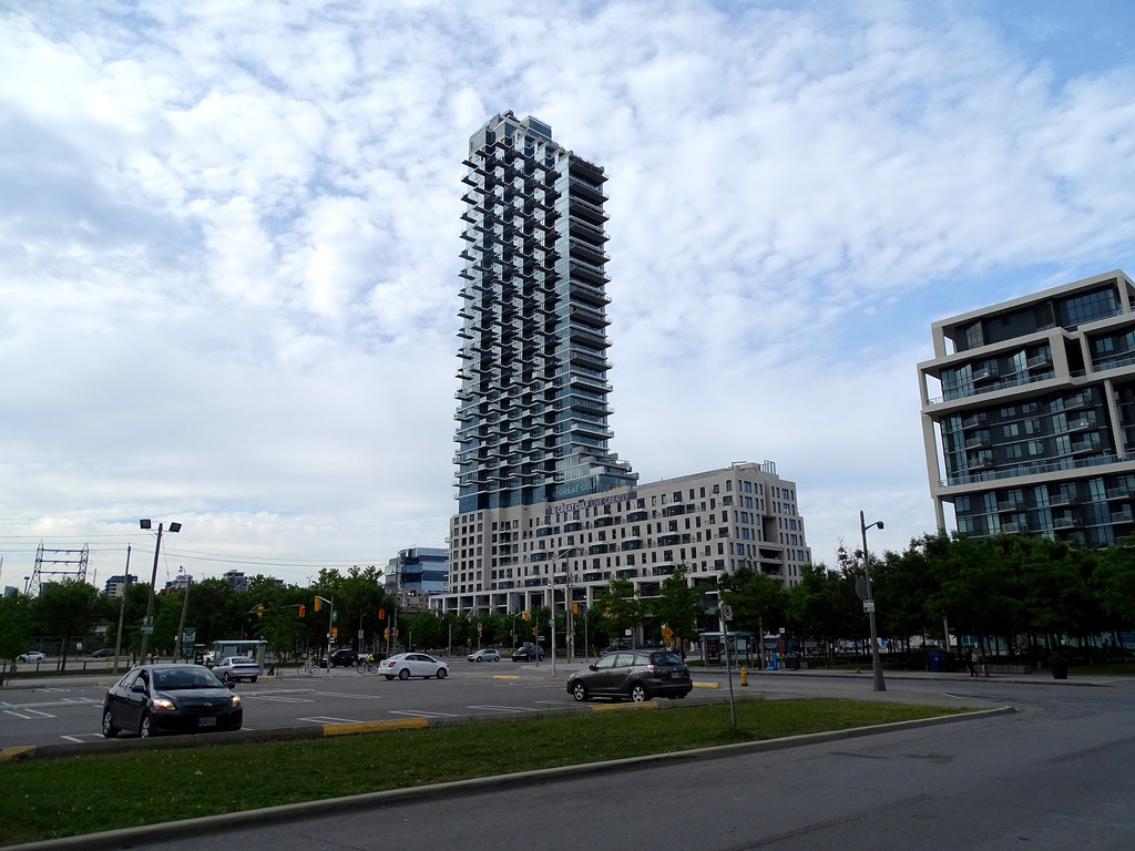
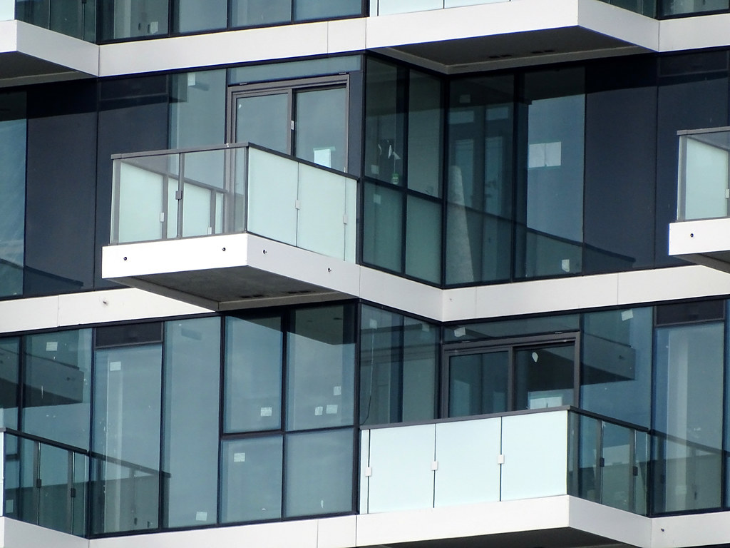
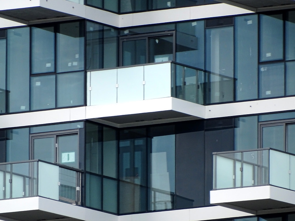
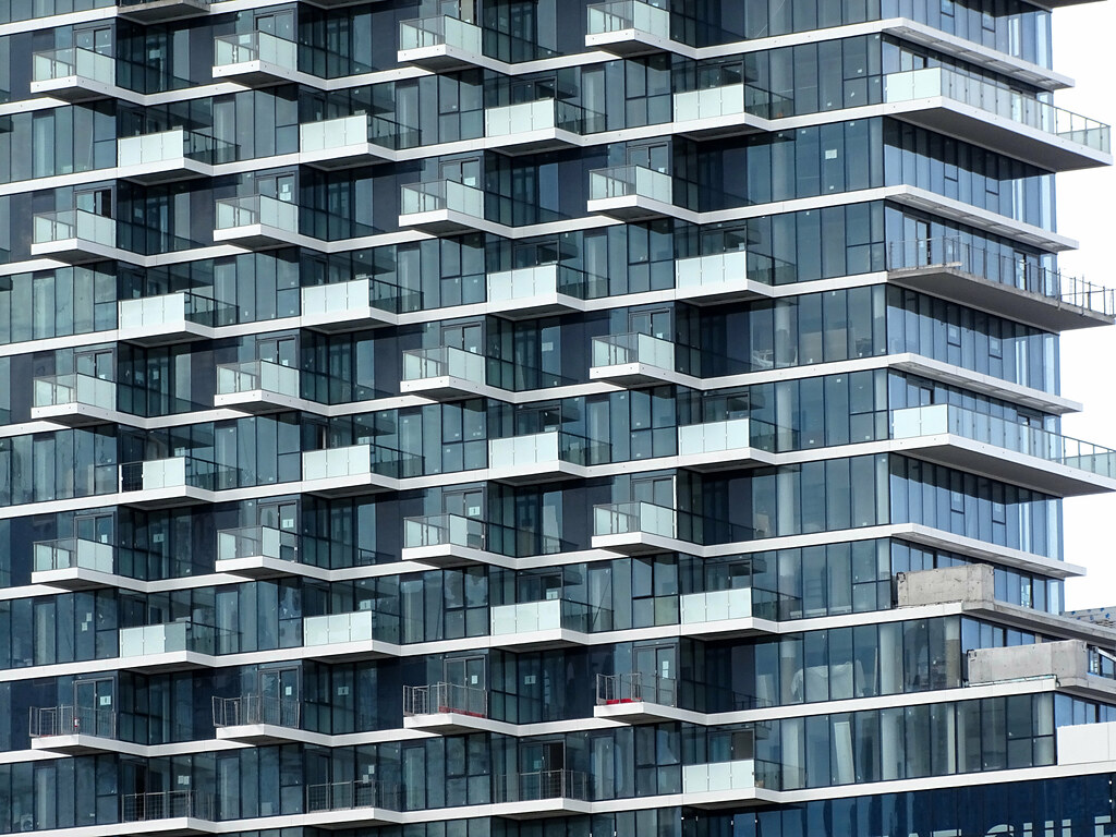
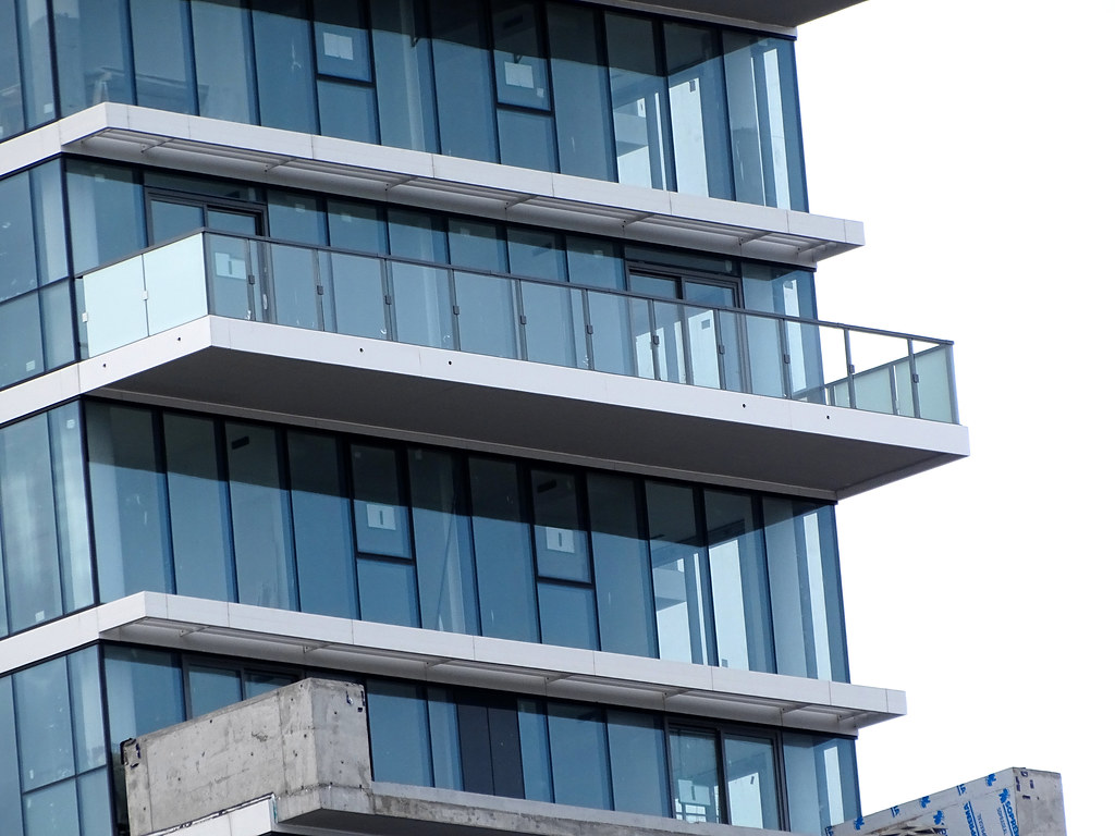
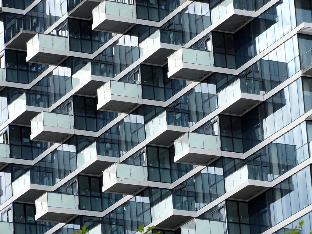
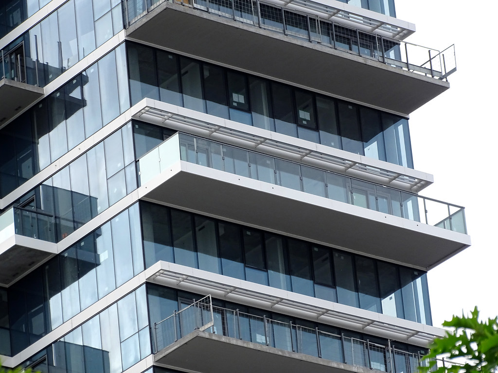
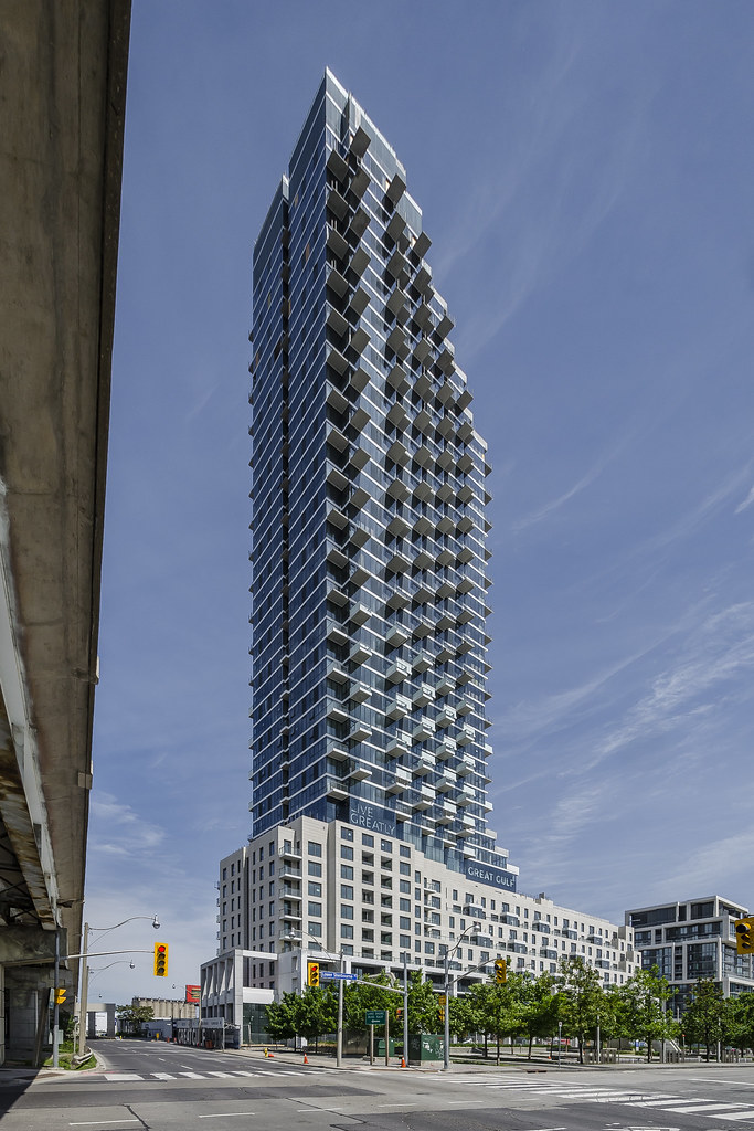
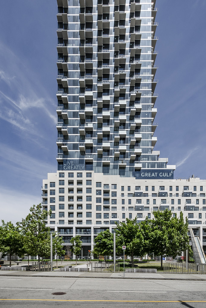
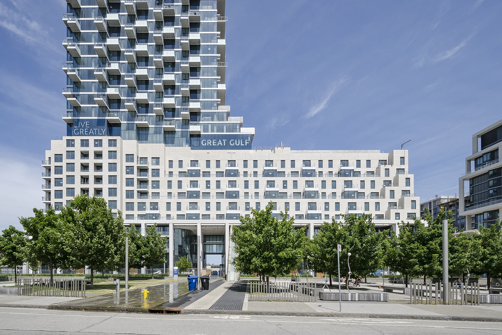
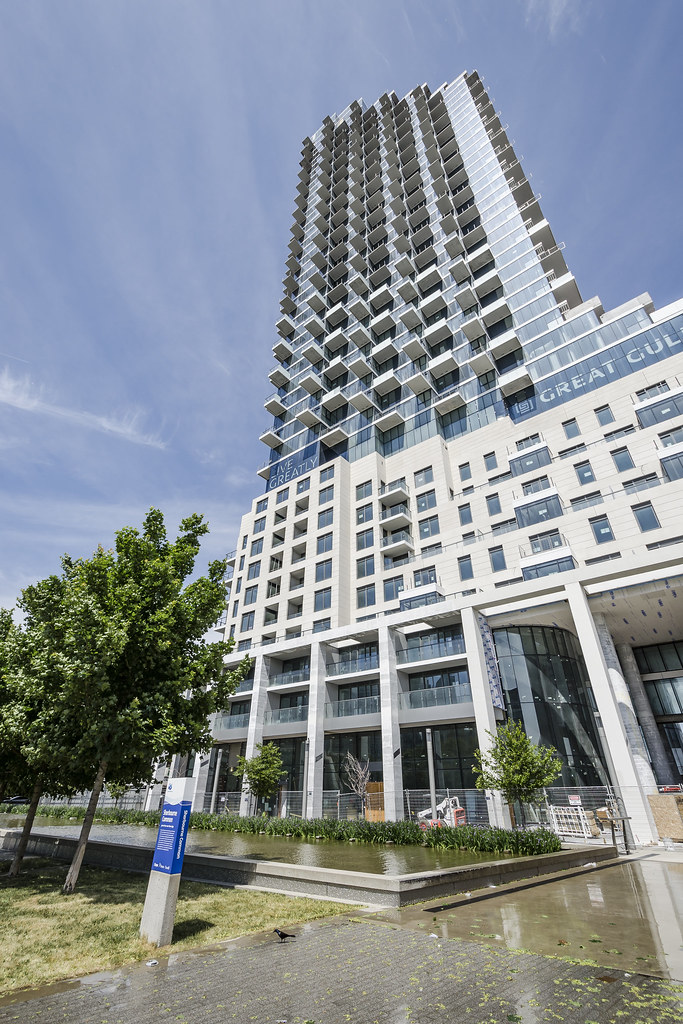
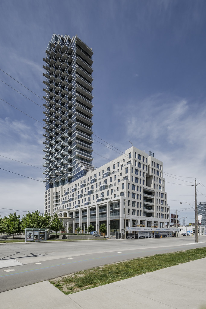
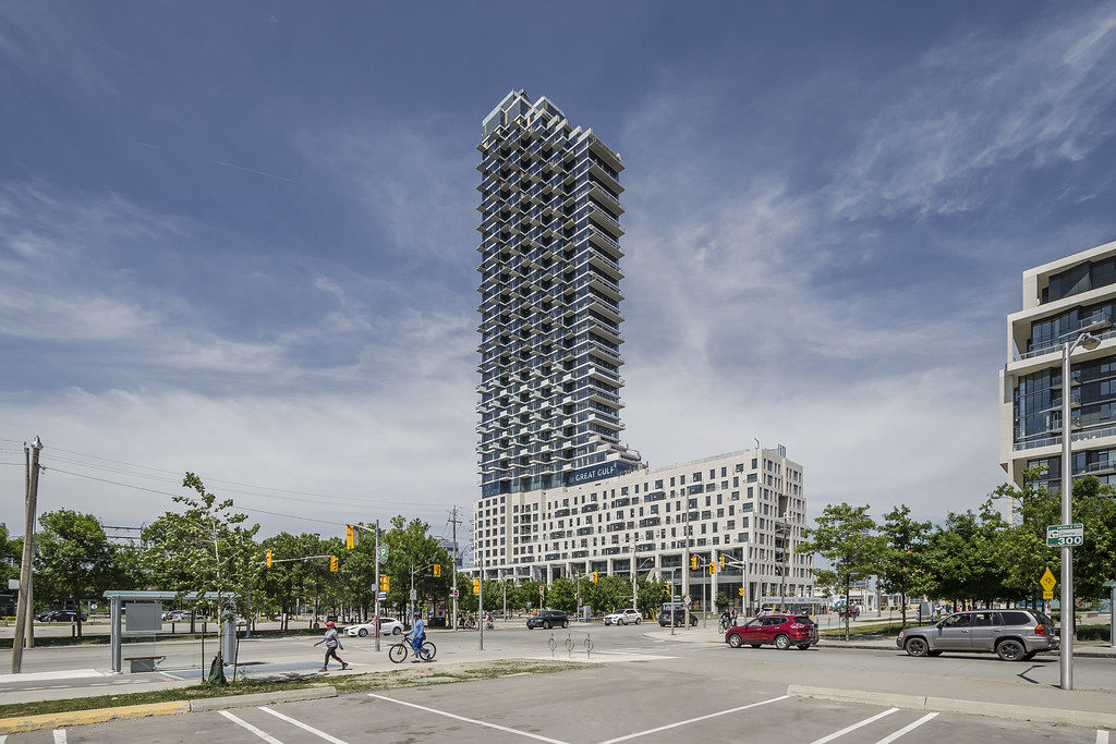
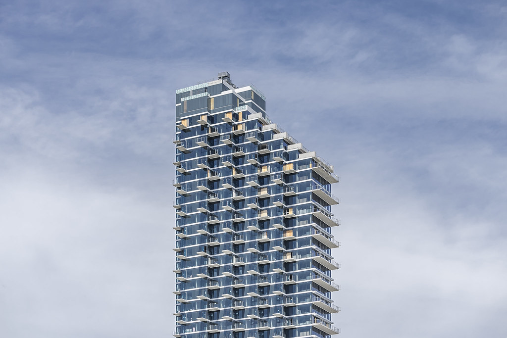
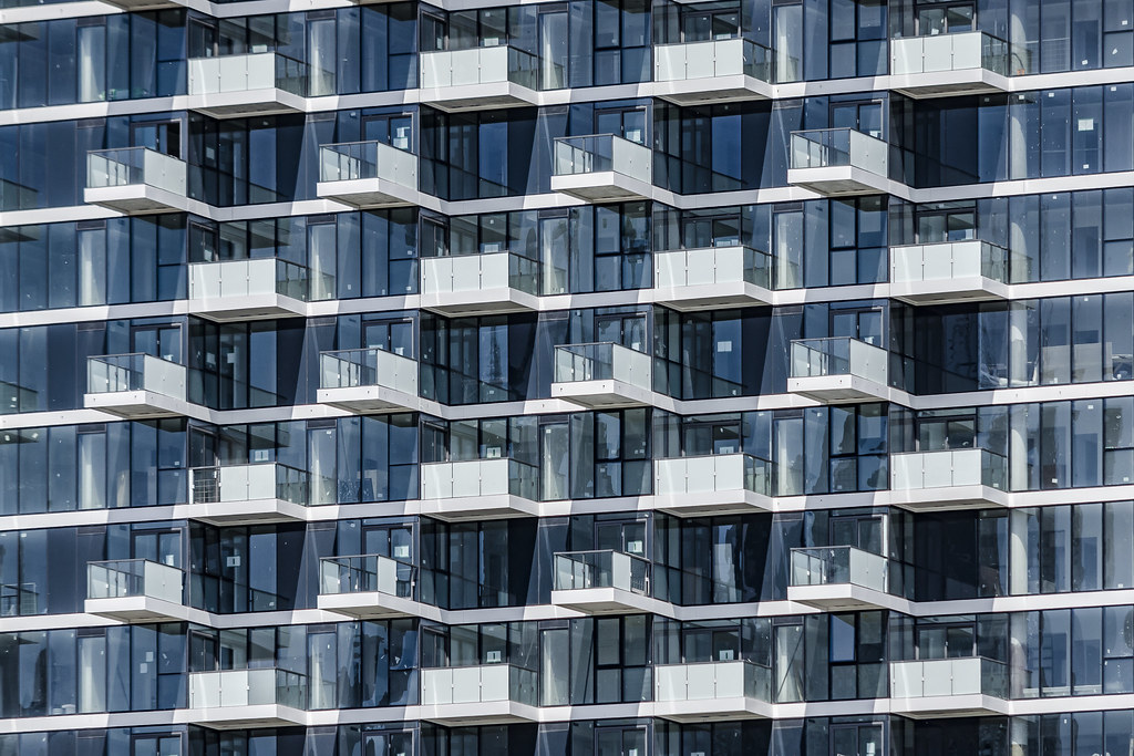
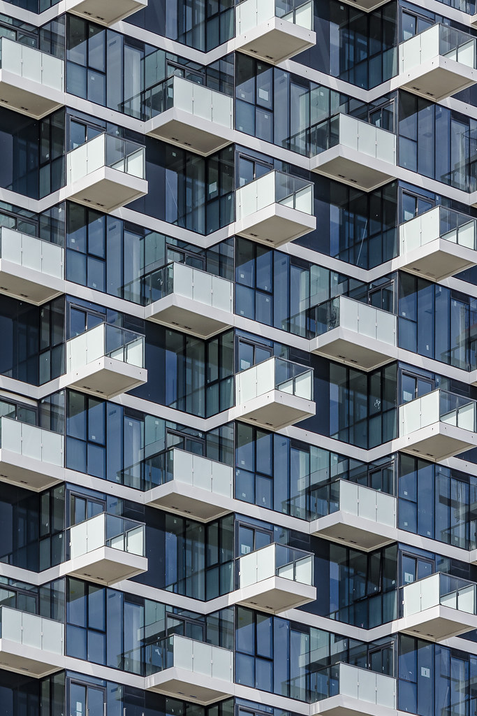
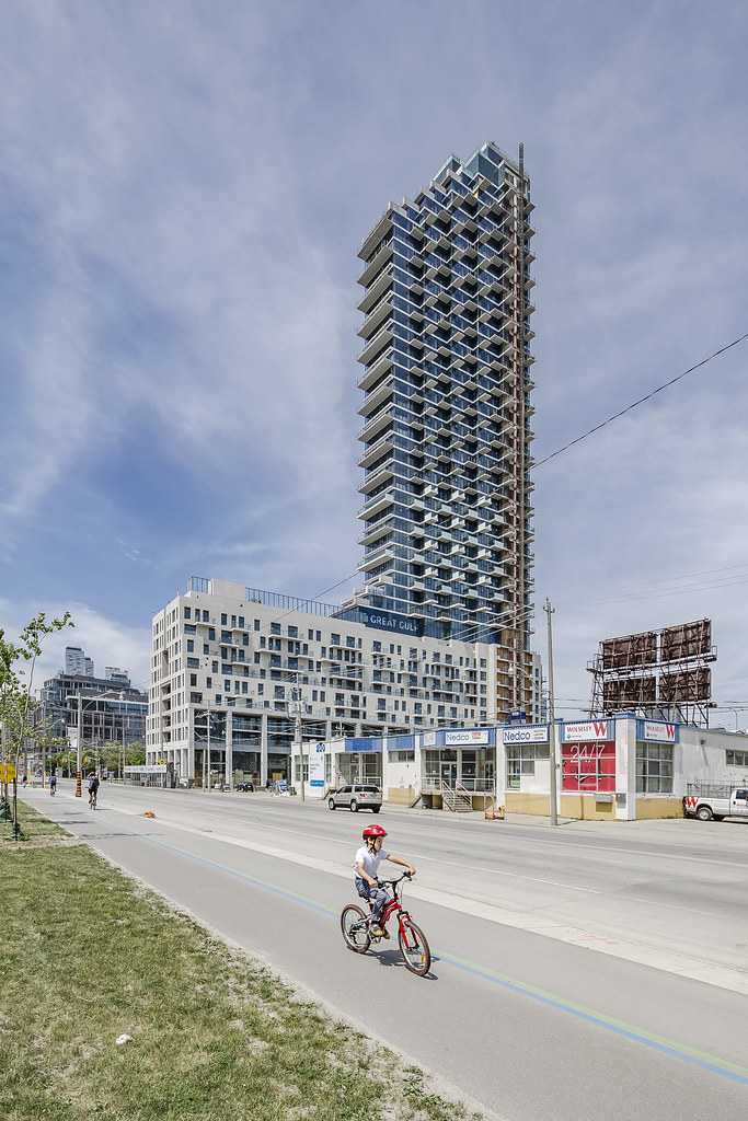
I really love how the balcony style changes with every adjacent floor (i.e. alternates between the traditional-style vs. the plank-style). This essentially makes the balcony's "ceiling" two-storey high. It'd make the balcony more open and enjoyable vs. the traditional one-storey height like in Aqualina, which feels crammed.

So the plank-style design actually also benefits the odd floor number traditional balconies.

So the plank-style design actually also benefits the odd floor number traditional balconies.
Attachments

Last edited by a moderator:
")


 Toronto Downtown Skyline


