yyzer
Senior Member
from today's Daily Commercial News:
Context Development plans to break ground on Market Wharf project in fall 2009
PATRICIA WILLIAMS
staff writer
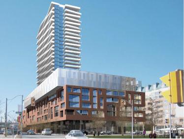
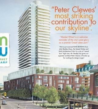
Toronto’s Context Development is gearing up to break ground by fall 2009 on Market Wharf, a high-rise condo and retail project on lower Jarvis Street. Construction costs are estimated at between $90 and $100 million.
Designed by architect Peter Clewes of architectsAlliance, the project will comprise a 25-storey tower on top of an eight-storey podium. It will occupy a gateway site, now a parking lot, where Jarvis Street meets Lakeshore Boulevard.
The development also will fill a gap in the streetscape of the St. Lawrence neighbourhood, a district of mid-rise commercial and housing that has become a model for the planning of new urban communities across North America.
Lewis Poplak, director of planning/development manager at Context said the project is in the early stages of design development.
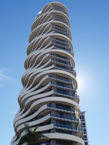
The 480-unit tower will rise from an “amoeba-shaped†amenities area.
Gently curving balconies will “flip†every second floor and give what Context describes as “a playful, billowing†effect.
The project has been designed to be “a good neighbour†whose scale and detailing engages its urban context, Context says. The podium’s massing, materials and “muscularity†draw on the historic warehouse style of buildings in the area.
The tower also relates to the contemporary nature of the residential high-rises along the waterfront.
At street level, the project showcases “an innovative and aesthetically pleasing†way to treat above-ground parking. A random play of wall openings, resembling the apartment windows, will screen the cars and visually break up the large mass of the podium.
The project also will provide “an enhanced pedestrian experience†to a stretch of Jarvis Street that at rush hour can seem like little more than an on-ramp to the Gardiner Expressway, Context says.
The project team includes structural engineering consultants Jablonsky Ast and Partners, electrical and mechanical engineering consultants MV Shore and landscape architect Scott Torrance Landscape Architect Inc.
A construction manager is expected to be retained, Poplak said.
Context Development was formed in 1997. Adaptive re-use of existing buildings and conversions of existing brownfield sites has been a key focus in addition to urban infill projects.
Context Development plans to break ground on Market Wharf project in fall 2009
PATRICIA WILLIAMS
staff writer
Toronto’s Context Development is gearing up to break ground by fall 2009 on Market Wharf, a high-rise condo and retail project on lower Jarvis Street. Construction costs are estimated at between $90 and $100 million.
Designed by architect Peter Clewes of architectsAlliance, the project will comprise a 25-storey tower on top of an eight-storey podium. It will occupy a gateway site, now a parking lot, where Jarvis Street meets Lakeshore Boulevard.
The development also will fill a gap in the streetscape of the St. Lawrence neighbourhood, a district of mid-rise commercial and housing that has become a model for the planning of new urban communities across North America.
Lewis Poplak, director of planning/development manager at Context said the project is in the early stages of design development.
The 480-unit tower will rise from an “amoeba-shaped†amenities area.
Gently curving balconies will “flip†every second floor and give what Context describes as “a playful, billowing†effect.
The project has been designed to be “a good neighbour†whose scale and detailing engages its urban context, Context says. The podium’s massing, materials and “muscularity†draw on the historic warehouse style of buildings in the area.
The tower also relates to the contemporary nature of the residential high-rises along the waterfront.
At street level, the project showcases “an innovative and aesthetically pleasing†way to treat above-ground parking. A random play of wall openings, resembling the apartment windows, will screen the cars and visually break up the large mass of the podium.
The project also will provide “an enhanced pedestrian experience†to a stretch of Jarvis Street that at rush hour can seem like little more than an on-ramp to the Gardiner Expressway, Context says.
The project team includes structural engineering consultants Jablonsky Ast and Partners, electrical and mechanical engineering consultants MV Shore and landscape architect Scott Torrance Landscape Architect Inc.
A construction manager is expected to be retained, Poplak said.
Context Development was formed in 1997. Adaptive re-use of existing buildings and conversions of existing brownfield sites has been a key focus in addition to urban infill projects.