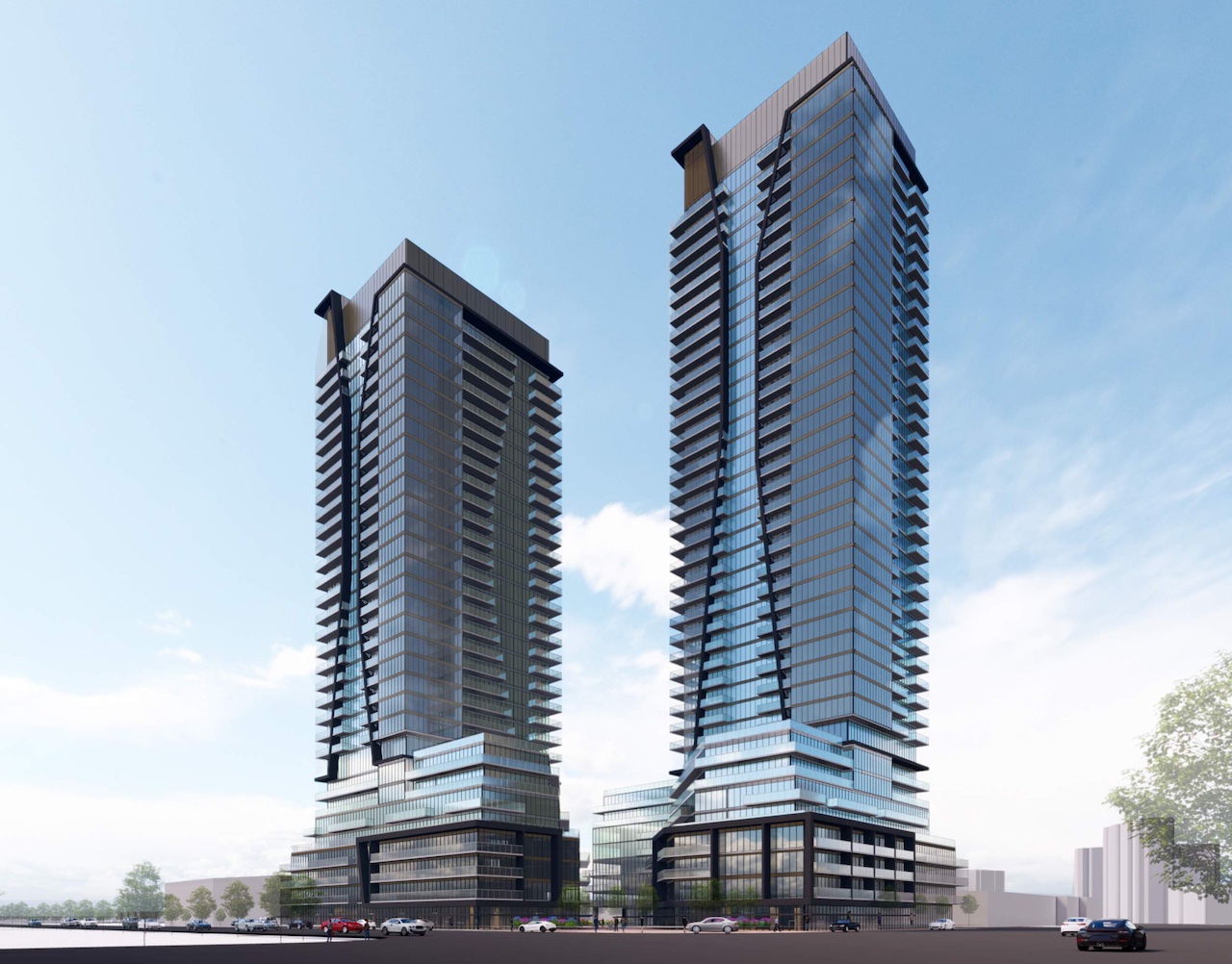
Toronto Malvern Town Centre Redevelopment | 130.2m | 39s | Davpart | IBI Group

artyboy123

Senior Member
Member Bio
Joined
Feb 1, 2021
Messages
2,250
Reaction score
6,770
Location
Midtown
Taken from DevApp:

" Official Plan Amendment and Zoning By-law amendment proposal in order to redevelop the Malvern Town Centre using a Phased approach. The Official Plan amendment seeks to establish a Master Plan for the subject site and the Zoning By-law Amendment (the Phase 1 ZBA) seeks to amend the existing zoning of Phase 1sites, to permit a mixed-use development consisting of a 32 storey and 39 storey building. The total gross floor area is proposed to be 62,387 square metres of which 60,348 square metres will be residential gross floor area, and 2,039 square metres is proposed to be used for grade-related retail uses. An overall density of 9.68 times the lot area is proposed."

DevApp Link: http://app.toronto.ca/AIC/index.do?folderRsn=JESfkj8bMCzptX4AkHwL8A==

Renderings are taken from the architectural plan via Rezoning:

PLN - Architectural Plans - JUN 28  2022 (1)-2.jpg


PLN - Architectural Plans - JUN 28  2022-4.jpg


PLN - Architectural Plans - JUN 28  2022-5.jpg
 

Attachments

  • PLN - Architectural Plans - JUN 28  2022-2.jpg
    PLN - Architectural Plans - JUN 28 2022-2.jpg
    569.6 KB · Views: 193
Elevation Drawings:

OMG is this massing awful; and the podiums..........where would one even start?


1659114439816.png


1659114478968.png


From the Planning Rationale Report:

1659114600669.png


1659114698398.png


5,755 Units of this type of drek?

Hasn't been Malvern been through enough?

1659115062831.png

1659115085266.png
 
See, this is why we need to bring EELRT here ASAP, so the residents can be quickly whisked away from this dystopian development.
Thank goodness this is way out in the Scarberian 'burbs and not close to our dynamic, liveable downtown.
 
Yikes.

I've changed my mind.

If this what they're building, Scarborough deserves all the subways they can get!
 
Last edited:
I get the sense this is a decade out at least, they just want to get their licks in zoning wise.
 
Much as it pains me to cause harm to the visual cortex of my fellow UTers, I feel we should add the new renders to the thread:

1664051510852.png


1664051537313.png


OMG.......the design is bad enough, but the almost anime quality to the render below is just..........something:

1664051624039.png


The renders above, and the commentary below come from the Front Page story here at UT, found here:


(Andrew Ferancik, quoted below is a principle at WND)

1664051775649.png


****

With apologies to Mr. Ferancik I see little foresight here, and a great deal that will prompt hindsight.

I see bad layout, bad siting, bad massing, excessive density, poor at-grade experiences........ugh.
 
Last edited:
This is just appalling and disgusting. Every single thing about this is just horridly designed so I wont rehash what @Northern Light has mentioned.

It's filth to the highest degree.
 
It looks like what you’d see outside of Toronto or the GTA, really. This looks right at home in Hamilton or KW. Not a complement (edit: or insult), just commentary. It’s about what I’d expect for the area all things considered.
 
This is just 1.appalling and 2.disgusting. Every single thing about this is just 3.horridly designed so I wont rehash what @Northern Light has mentioned.

It's 4.filth to the highest degree.
Lol... I worry about your heart some times.

Take these 💊💊 and call me in the morning.
 

Back
Top