Toronto LSQ Block 2 | ?m | 35s | Almadev | Wallman Architects

PMT

Senior Member
Member Bio
Joined
Jul 13, 2016
Messages
4,076
Reaction score
8,988
Location
Turanna
2550 VICTORIA PARK AVE
Ward 17 - North York District


http://app.toronto.ca/DevelopmentAp...4563456&isCofASearch=false&isTlabSearch=false

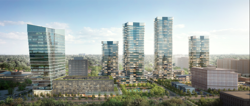
Rendering:
184077


184078


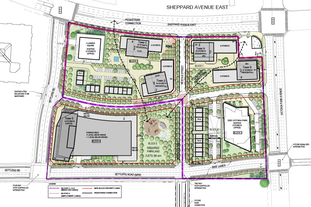
Site Plan:
184080


Article from RENX:

Currently home to four office buildings with about 437,000 square feet of space, the development at the 15-acre site at Victoria Park and Sheppard Avenues will include “everything we do in our master-planned communities,” including condo towers, a retail component and a park.

Plans call for the 12- and eight-storey office buildings at 2 Lansing Square and 2550 Victoria Park Avenue buildings to remain and to be improved. However, two low-rise, two-storey buildings at 4 and 6 Lansing Square – dubbed the “propeller buildings” because of their shapes – would be demolished and replaced with “higher-level” offices.
 
Interesting development, although personally I would have loved to have seen the propeller buildings preserved, with the residential towers moved to the back of the site on the now surface parking lots.
As with a lot of brutalism, the propellers don’t “meet the street” very well, but they are certainly interesting and street-level concerns might have been mitigated somewhat by hardscaping the forecourt fronting Sheppard.
 
It's early, but i'm loving this proposal so far: the spacing between buildings, the thoughtful placing of parkland and pathways, as well as new street placements. However what i'm not liking are the townhouses: they seem like they are completely out of place altogether. The scale of the above ground parking garage is something else i'm concerned with.

Heck, i'd say it's a much stronger plan than the embarrassing Golden Mile Secondary study that city planners have spent years on for a certain arterial road just a few KMs south of here. Whoever came up with this should draw up that entire plan over again.
 
Interesting to see this site redeveloped. Won't be long before Consumers Road Business Park is lined with towers along its perimeter.

On a more tangential note, looking at that siteplan, they are setting a very low bar for what one can reasonably call a "pedestrian connection", especially when it criss-crosses over active driveways and loading areas. Arrows in a diagram do not a design strategy make...
 
This is well-done for the suburbs. Agreed re: this is more of what the Golden Mile should be planned like.

I guess this does make the argument of the Sheppard Extension stronger, especially if more of Consumers develops in a similar pattern.
 
Glad to see the low-rises being demolished. The design (which I don't like) is being preserved with 2 Lansing Square, so it's not like anything of value is being lost. The townhouses feel out of place in this development, though, since there are so few and they are also being dwarfed by the towers right next to them. I would instead use that space for surface parking and shrink the parking garage a little.
 
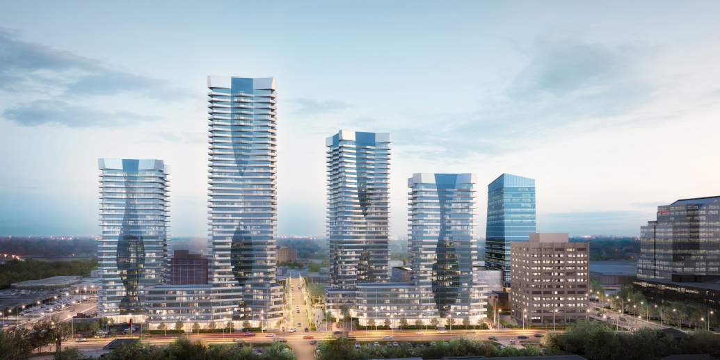
Updated renderings:

3wfafasd.JPG
4tefgw.JPG


It's not all podiums. There are townhouse blocks. Everything else is typical to high density subdivision plans. The blocks are too large. The feminine inspired designs are used for all the towers.
 

Back
Top