You are using an out of date browser. It may not display this or other websites correctly.
You should upgrade or use an alternative browser.
You should upgrade or use an alternative browser.
Toronto Lillian Park | 84.73m | 28s | Collecdev | Kohn Shnier
- Thread starter AlbertC
- Start date
jje1000
Senior Member
They look so dated already, and all because the spandrel colour was improperly spec-ed.
Can we put this in the Colour Choice case studies section of “How to Destroy Your Architectural Design After It’s Approved” book, published by Urban Toronto?
Can we put this in the Colour Choice case studies section of “How to Destroy Your Architectural Design After It’s Approved” book, published by Urban Toronto?
Yegger
Active Member
I used to live in the area and would shudder every time i walked past those old white buildings. I would think to myself "well, they're a product of their time, but we've learned a lot since then". Clearly, we have not.
DavidCapizzano
Senior Member
Those old white buildings have some of the most spacious units for rent in the city inside them, and at a bargain $ compared to something new. They were a product of their time and it’s a shame we don’t build more buildings like them today.
drum118
Superstar
Dec 27
More up on my site


More up on my site
ADRM
Senior Member
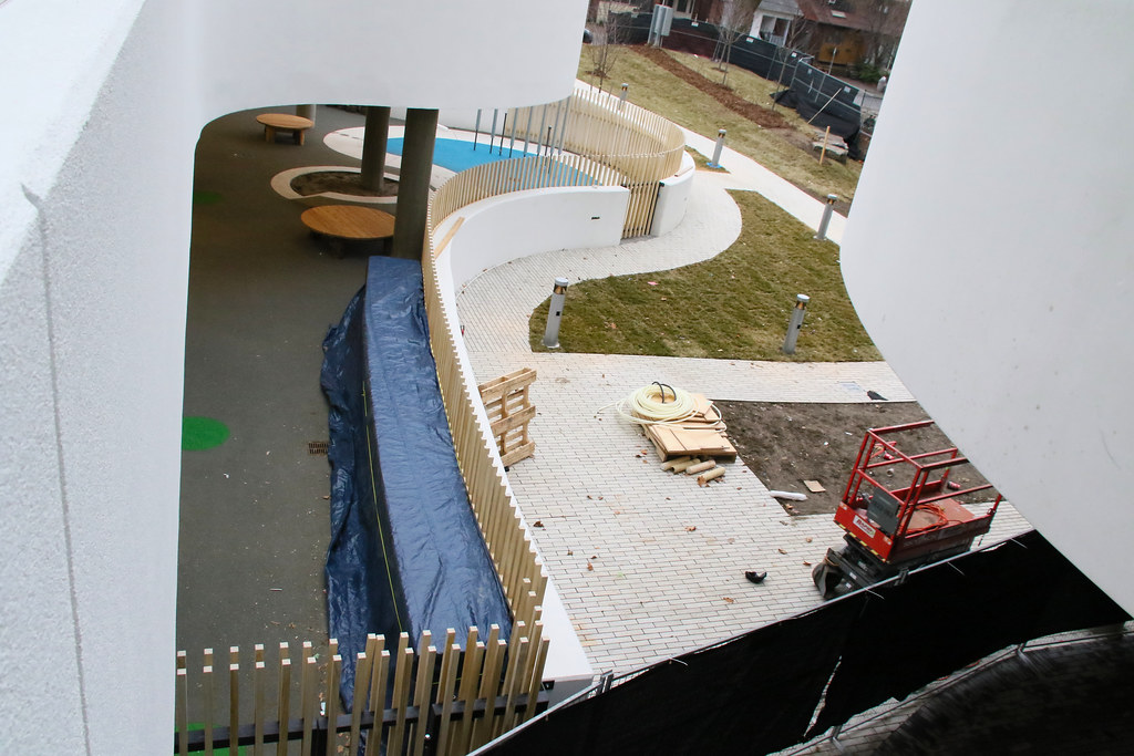
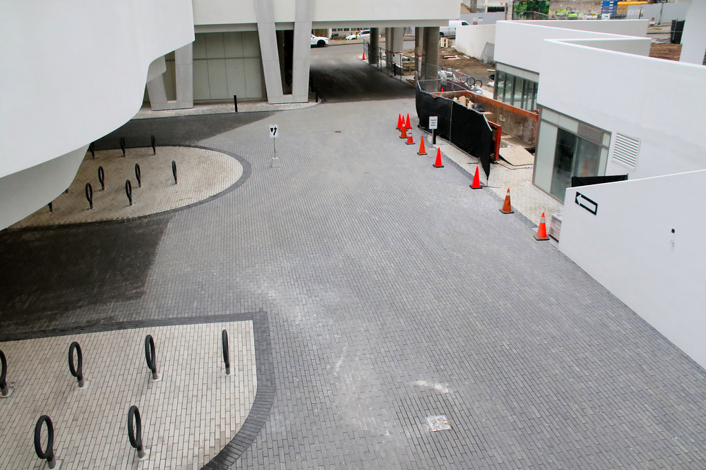
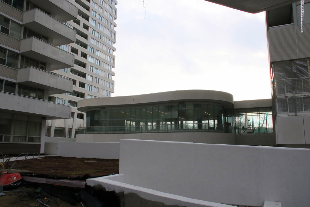
There's some nice materiality going on at grade here. Love those bike rings, too.
condovo
Senior Member
In this particular case, I'm looking forward to the precast getting dirty over time. Then there will be some proper contrast with the mystifyingly-specced spandrel panels.
AlbertC
Superstar
I'll take this over most of the green glass/grey/balcony-fest projects north of Eglinton.
AlbertC
Superstar
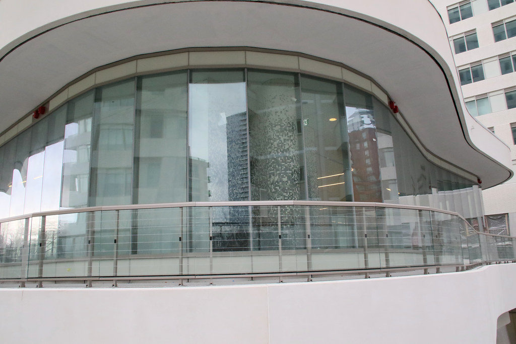
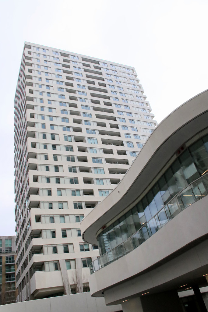
This entire project straddles between a C+ to B- for me. I really like the central amenity space, the curved spiral segment and the vintage vibes that it sends. The landscaping, public space, and the attempted articulation of the bases' angled pillars are other positives. However, the more I get accustomed to seeing the towers, the more I feel that they are neither here or there. And that's where I start docking off marks. They get too immersed with the older apartment buildings, and overall results in looking like a sea of vanilla. Spandrel to brick relation-wise, it comes out appearing as a beige-on-beige type outfit. It's a missed opportunity as a contrast of black spandrel instead would have really made this motif pop.
Last edited:
jje1000
Senior Member
This entire project straddles between a C+ to B- for me. I really like the central amenity space, the curved spiral segment and the vintage vibes that it sends. The landscaping, public space, and the attempted articulation of the bases' angled pillars are other positives. However, the more I get accustomed to seeing the towers, the more I feel that they are neither here or there. And that's where I start docking off marks. They get too immersed with the older apartment buildings, and overall results in looking like a sea of vanilla. Spandrel to brick relation-wise, it comes out appearing as a beige-on-beige type outfit. It's a missed opportunity as a contrast of black spandrel instead would have really made this motif pop.
Definitely agreed- they dropped the ball on the spandrel colour really hard (this is ultimately a D+ for me because of the overwhelming beige drearyness and the messy towers), and yet I see nice urbanistic touches that indicate that this was at least initially a well-informed design (and it was in the initial documents).
My gut feeling is that the team doing the construction drawings and material spec did not share the same clarity of vision as the initial designers, or that over-interference from the developers ended up ruining the design.
AlbertC
Superstar
Feb 20, 2020


KB1
New Member
Does anyone know the exact number of units in each building?
Koops65
Senior Member
268, 276
ChesterCopperpot
Senior Member
268 in one and 276 in the other