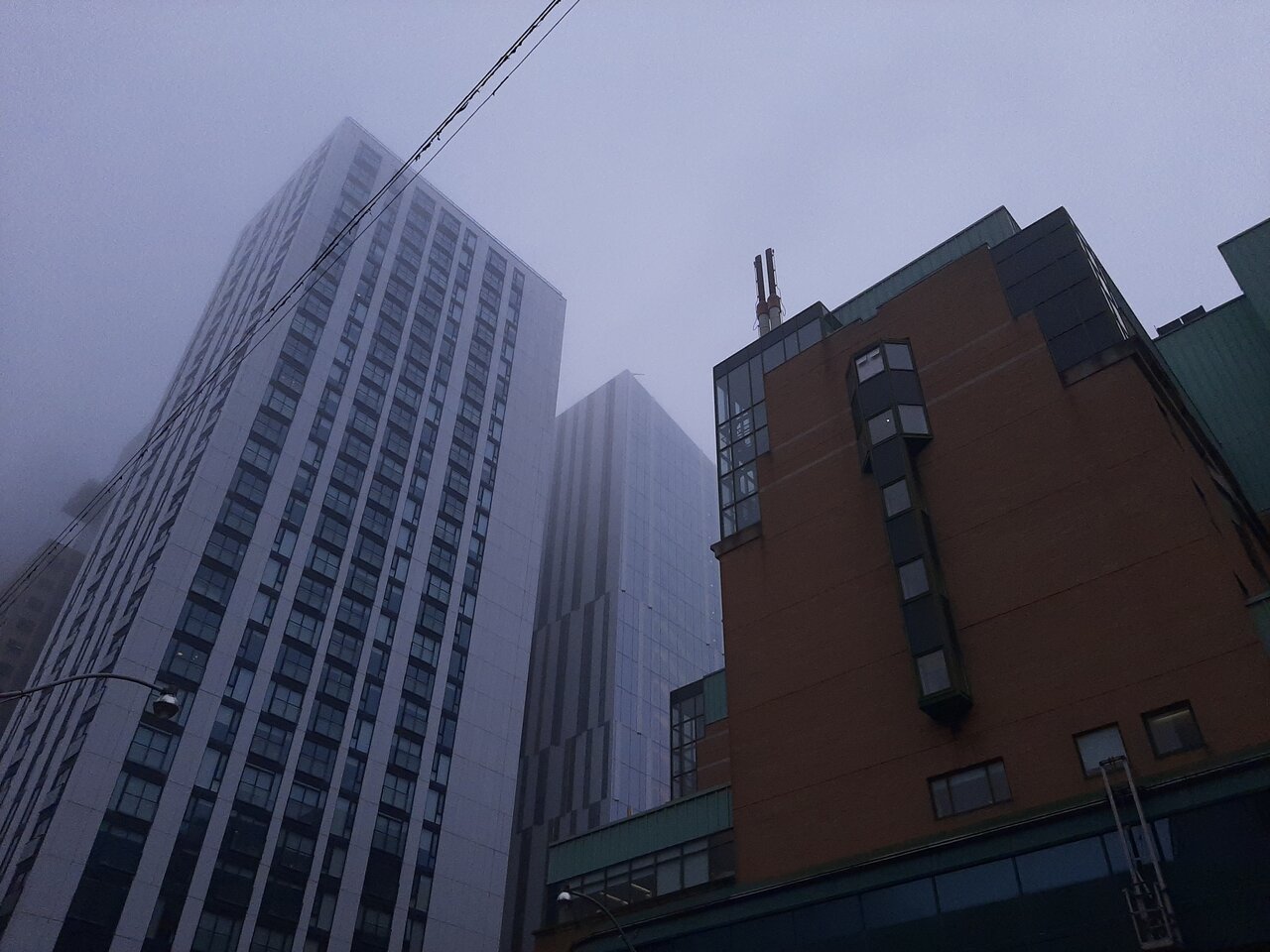
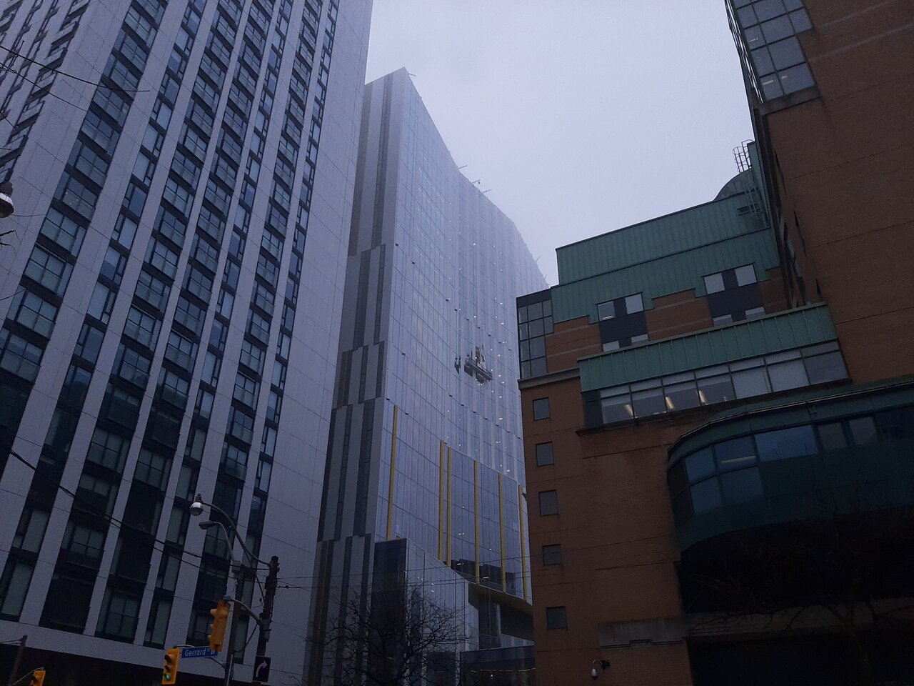
I assume Alex's critique here, based on those pics is the at-grade/base, on the Elizabeth-facing side of the building. Though perhaps he could clarify.
I agree w/others that the tower, as taken from a distance is reasonably nice, the yellow offering some much needed vibrant colour.
But I can concur w/Alex, that the at-grade expression is not great here.
Here's what I would note:
1) The entrance is relatively subtle as compared to building, it seems a bit under-scaled.
2) 100% glazed, at-grade is almost always a bad idea, even if one has retail or other enlivening, glass tends to read cold.
3) The only thing to make 100% glazing at grade look worse is integrated spandrel/opaque glazing.
4) The vibrant colour of the tower form doesn't really come down to grade.
5) The absence of any retail or something else to break up the visual at-grade and to offer some animation gives more of a hostile, secure, cut-off vibe to the building. In a building will w/staff who need to eat lunch, even a simple coffee shop w/patio could do wonders.
6) The sidewalk is wide, yet the trees are under-sized, and pushed off to the curb, where they are more susceptible to salt damage; why not do mid-sidewalk landscape, not too much, but some open beds with shrubs/perennials, so the space doesn't give off 'concrete runway'.
The introduction of warmer material choices for the grade expression and/or the use of warm-toned interlock, instead of concrete on the sidewalk would do wonders.
So would framing the main entrance so as to make use of some strategic uplighting.

