Toronto Four Eleven King Condominiums | 149.04m | 45s | Great Gulf | KPMB

Sorry to say, I must give the thumbs down for this project even though it tall.

Not having 2 entrances for the towers is a no go from the start when you have to have 3 sets of elevators that will be an extra cost to the condo owners.

Taking bikes in/out of one main entrance is nuts.

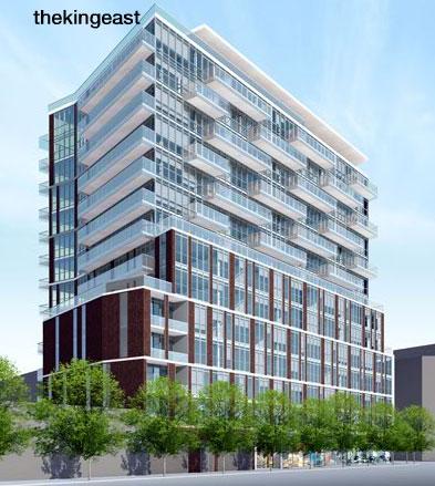
Having the bike rooms where they are, best to used those floors as commercial, as the residents will hear a lot of noise at all hours. I sure wouldn't want to live on those floors.

Saving the face of the exiting building is a lost to the rest of the base on King St like the BA tower was. As much as I like saving historical building faces, this is one case to forget it unless it is reproduce for the rest of King St.

Given the fact the developer has no plans for 5 years and never built a tower like this, not sure if teaming up with someone who has will help them. I see this as a setup for getting approval for it and then flipping it.

The Winners land needs to be part of this project.

Don't like the brown colouring.

Have no problem for retail on 2 or 3 floors like Portland & Queen.

This is one building I have too many issues from the start and not prepare to support it. This is a very rare case for me to kill a project from day one.

As for trying to match the one across the street, that not a nice building either.
 
It seems like Core Architects have been reusing the same theme in all their designs, especially with the brick podiums. I don't know exactly how to describe it, but all the building seem to utilize the same rhythmic thick/thin staggered brick motif, just in different colours:

The King East (Red Brick):
urbantoronto-4169-12447.jpg


One Eleven Bathurst (Black Brick):
111bathurstharhaycartte.jpg


Musee / Adelaide Residences (Red Brick):
461hlu.jpg


Noir (White Brick):
urbantoronto-5272-16391.jpg


And finally this proposed building at King/Spadina:
2012_03_15_11_53_08_401kingstreet.jpg


Just a theme I noticed...
 
I dont love tjis project but i am more into the stubby tower than the one to the East with the facsodomy at its feet. I like that the Spadina building carries over the brick cladding from the base to the top of the tower in sort of an interesting way. There are too many glazed towers now, there needs to be more variety in he cityscape.
 
The June 19 Design Review Panel meeting voted in favour of redesigning the 401-415 King West proposal.

http://www.toronto.ca/planning/2012/agendas/pdf/drp_minutes_19jun12.pdf

Key points:

Members found significant merit with the proposal, particularly with the architectural approach, the heritage façade retention, and the inclusion of three different uses within the building program. In this way, the proposal was described as being inventive, extremely sophisticated, and handsome. Despite this, Members also identified some fundamental areas of concern which in their opinion were significant enough to warrant a vote of "redesign". These concerns related to tower separation; public realm contributions (sidewalk widths, treatment of Spadina Avenue, and ground floor layout); and extreme concessions resulting from the proposed density. Discussion of these issues is summarized below.

Tower Separation
While some Members felt there was potential for the proposed tower separation to work, the majority of Members felt that 16.5 m between two towers on same the site, with projecting balconies, was insufficient. Although it was apparent that this separation condition was only an issue for 11 stories, it was Panel's opinion that the proposal would benefit from greater compliance with the minimum separation distances established in the Tall Building Guidelines.

Tower Setbacks
The majority of Members were uncomfortable with the proposed 0-metre setback at the eastern elevation. On the southern elevation, they were similarly concerned with how the 5.4 metre setback would affect the long-term liveability (noise, daylighting, sky view, privacy etc.) within the proposal in consideration of potential build-out scenarios of the property (s) immediately south. Members suggested the proposal should be informed by a comprehensive vision/analysis of this potential (including laneway capacity, see comments further below).


Solutions
Members pointed to concerns related to setbacks and separation as indicators that the proposal contained too much density for the site. In seeking to alleviate these issues, the following comments were provided:
- Explore a narrower and shorter west tower, with an accentuated slim floor plate
- Give more breathing room to the courtyard
- Re-consider a 1-tower solution
- Explore a taller base


Setbacks and Public Realm
Members recognized that the provision of greater setbacks along King Street was difficult given the objective of heritage retention. However, along the Spadina frontage, they felt that an increased setback was warranted for a variety of reasons:
i. It was felt that a project of such density should provide significantly more back to the City in
terms of public realm contributions
ii. It was suggested that the setback established by "The Hudson" to the north was more
indicative of what should be considered appropriate, and subsequently, one that this proposal
should respect
 
Ugh. The design panel advises against everything I love about this plan. Why are they so anti-density? It's ridiculous that all they can say about it is add setbacks, make more space between the towers, remove a tower, shorten it, etc. It's like their ideal urban form is a mouse. Couldn't they find anything about how it looks to criticize, like the fact that the eastern tower is painfully perfunctory and covered purely in glass and doesn't aesthetically match the other tower? I really hope they don't succeed in neutering this development to a stump of setbacks.
 
While I like the density too, I'm completely against the insulting treatment of the heritage portion. It looks like it's being stepped on, similar to the RCMI building on University, and it has been stripped of its dignity. The original building deserves to remain intact, with the tower portion above pushed back; similar to Five or MOD condos on Yonge St.
 
Date:
Tuesday April 30 , 2013

Time:7:00 9:00 pm

Location:
Metro Hall, 55 John St, Room 314
 
The density of this proposal is ridiculous and the incorporation of the heritage element sad (but pretty predictable at this point). Otherwise, the west tower looks good!

I remember reading an interview with the head architect of Core, and he talked about how he hated brick because he felt it was a pointless homage to heritage - so it's interesting to note that Core is now known for their use of brick.
 
Nice infill. Not perfect, but acceptable.

This thread is a little confusing, why put together two developments just because they're on the same land? (LCBO + Terracap).
 

Back
Top