PaperSun
Active Member
This new design is so damn awful, the City needs to rip up this contract and find someone else.
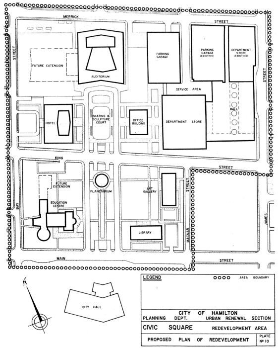
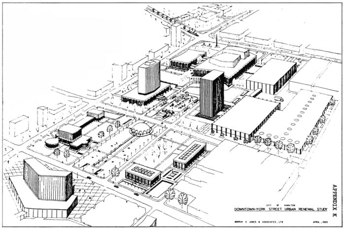
ahh I was wondering when someone would post this - the original plan for city hall would have kept it nice and open..Agreed, my personal opinion is that the city blocks running north of Hamilton City Hall from Main Street to York Boulevard are essentially dead urban tissue for walkability and vibrance, and constitute the greater urban renewal failure in downtown Hamilton.
If Civic Suqare/Hamilton Place had retained the original early-60s mid-mod civic plaza design and if the whole Jackson Square block had never been redeveloped, the whole area would be far better. Unfortunately I guess the project dragged on too long, and by the time the shovels were in the ground, the late-60s-70s-era introverted superblock/pedetrian segregation fad had taken hold.
Now all there is is a massive knot of buildings/parking/walkways with no cohesion or coordination, but there are still some glimpses of the original layout in the placement of the buildings.


The Facelift and the Wrecking Ball: Urban Renewal and Hamilton’s King Street West, 1957–1971 – Urban History Review / Revue d'histoire urbaine
An article from Urban History Review / Revue d'histoire urbaine, on Érudit.www.erudit.org
Big changes - I see that they removed the street lights..!I made a quick comparison of the current (Streetview) and rendering to illustrate the difference (or absence thereof).
Source (rendering) and Source (Google Maps)View attachment 509102
Don't forget the flood lights. $280 million / 3 floodlights puts them at about $93 million a light!Big changes - I see that they removed the street lights..!