Hamilton FirstOntario Centre Renovations | ?m | 4s | OVG | BBB

A big PDF about the proposed redevelopment, from HUPEG (Hamilton Urban Precinct Entertainment Group)
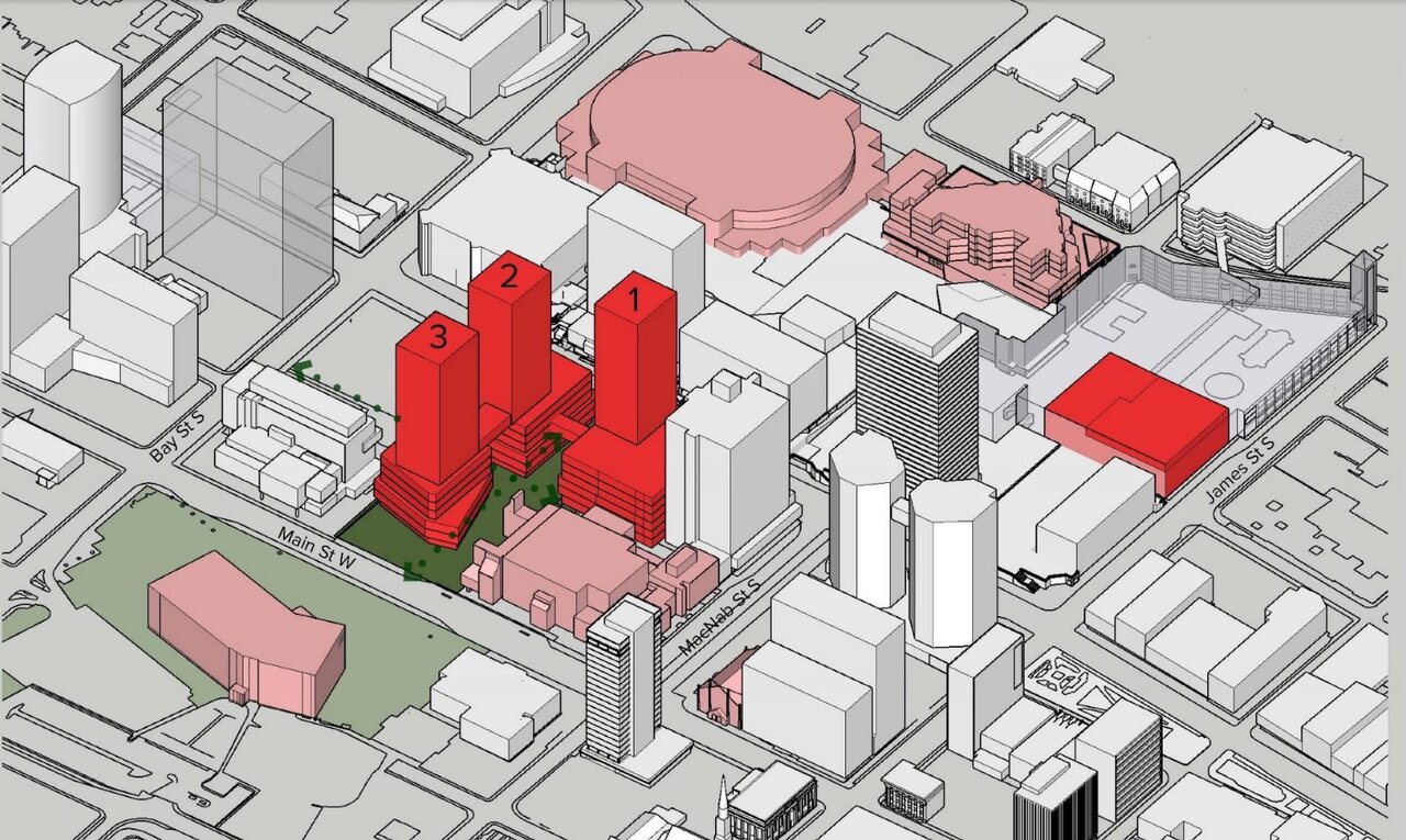
The most interesting part of the development are for the demolition of the existing Convention Centre at base and its relocation to Jackson Square. Then, the art gallery is to be demolished and rebuilt on the former Convention Centre lot, with a tower atop. The present site of the Art Gallery will hold two point-ish towers, opening up some ground-level landscaping for an improved Concert Hall entrance, plus improved west, north and south access.
Two more towers are slated to fill in the existing parking lot at the north-west end of the site.

It's better, maybe, but it still seems it could use another pass by the ol' drawing board.
-Will the new art gallery be gorgeous, or at least better than what it is replacing, sculpture garden and all? The original one may not have been sufficient nor free of problems, but let's face it - it made for a stunning modernist composition along with its concomitant concert hall. The new one had better live up to that.
-The new, slightly widened access through the block north of City Hall is free of its troubling overhangs, but it looks pinched by some kind of demand for raw square footage on the new towers. If there's one place that needs a dose of luxe and lovely after years of looking like a second-rate underpass, this is the one. C'mon, Hamilton! Rise to the occasion!
-The proposed re-do of the stadium looks boxy, drab and ordinary as all hell. Yikes. Nothing should look that mundane and stale by the time it gets to the renders. It looks like a suburban office-park warehouse, and with that much cheerless aluminum siding planned, it's going to look like a poundcake left out in the rain all too swiftly.

One good thing is that the planned new concentration of street-level retail and such will really help the area, helping mend the blasted hole that these older, blockbusting developments caused in the flow and continuity of downtown. I didn't dare hope the city would ever get to repairing it. It does seem to be an improvement in this regard.

https://pub-hamilton.escribemeetings.com/filestream.ashx?DocumentId=216822


From HUPEG's PDF:
redo1.jpg


redo2.jpg
 
Last edited by a moderator:
If this is indeed a newer rendering this is just sad. It looks like one of those self-storage warehouse buildings with a hint of industrial distribution warehouse.

Doesnt look good at all.
I agree, it’s not a great design but I do prefer it to the 2020 BBB design. Squares and boxes are not very exciting but I think this design will age better than the alternative.

In an ideal world, I would like to see an exterior/concourse expansion and redesign similar to what was done at Rocket Mortgage Fieldhouse in Cleveland in 2017/2018. For perspective, those renovations cost $193M USD.
IMG_8315.jpeg
 
Just an fyi on those renders, they were the results of a competition for the best redesign of the arena. The boxy design was another application done by the Vrancor group. The more flowy design is the one by the consortium that is actually designing the arena revamp. As for the AHG and other stuff, I'm pretty sure all of that has been significantly scaled back or isn't actually part of the plans, though I may be wrong. There has been scant information about what the plans actually consist of.
 
A big PDF about the proposed redevelopment, from HUPEG (Hamilton Urban Precinct Entertainment Group)
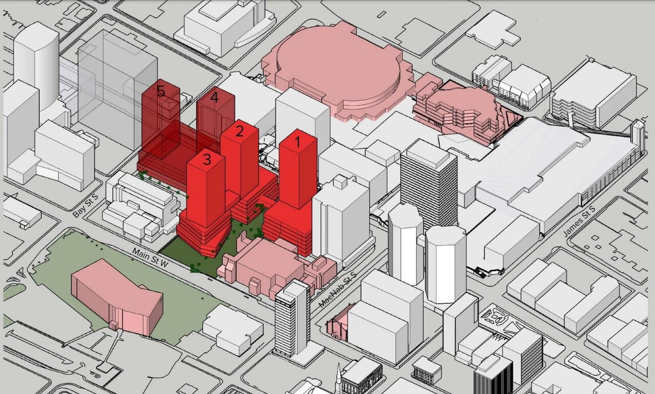
The most interesting part of the development are for the demolition of the existing Convention Centre at base and its relocation to Jackson Square. Then, the art gallery is to be demolished and rebuilt on the former Convention Centre lot, with a tower atop. The present site of the Art Gallery will hold two point-ish towers, opening up some ground-level landscaping for an improved Concert Hall entrance, plus improved west, north and south access.
Two more towers are slated to fill in the existing parking lot at the north-west end of the site.

It's better, maybe, but it still seems it could use another pass by the ol' drawing board.
-Will the new art gallery be gorgeous, or at least better than what it is replacing, sculpture garden and all? The original one may not have been sufficient nor free of problems, but let's face it - it made for a stunning modernist composition along with its concomitant concert hall. The new one had better live up to that.
-The new, slightly widened access through the block north of City Hall is free of its troubling overhangs, but it looks pinched by some kind of demand for raw square footage on the new towers. If there's one place that needs a dose of luxe and lovely after years of looking like a second-rate underpass, this is the one. C'mon, Hamilton! Rise to the occasion!
-The proposed re-do of the stadium looks boxy, drab and ordinary as all hell. Yikes. Nothing should look that mundane and stale by the time it gets to the renders. It looks like a suburban office-park warehouse, and with that much cheerless aluminum siding planned, it's going to look like a poundcake left out in the rain all too swiftly.

One good thing is that the planned new concentration of street-level retail and such will really help the area, helping mend the blasted hole that these older, blockbusting developments caused in the flow and continuity of downtown. I didn't dare hope the city would ever get to repairing it. It does seem to be an improvement in this regard.

https://pub-hamilton.escribemeetings.com/filestream.ashx?DocumentId=216822


From HUPEG's PDF:
View attachment 484820


View attachment 484821
None of these seem all that desirable IMO. Honestly it would be better to move towers 2 and 3 to the location of towers 4 and 5 and compensate with additional density, rather than permanently infilling the former plaza site.
 
Just an fyi on those renders, they were the results of a competition for the best redesign of the arena. The boxy design was another application done by the Vrancor group. The more flowy design is the one by the consortium that is actually designing the arena revamp. As for the AHG and other stuff, I'm pretty sure all of that has been significantly scaled back or isn't actually part of the plans, though I may be wrong. There has been scant information about what the plans actually consist of.
Whatever the agreement with the city was, I did involve a substantial development component that has never failed to be mentioned. However, the images posted above are basically the same as what I have seen since plans for redeveloping AHG/this vicinity began nearly a decade ago. It is odd, but not unexpected, as to how secretive this has all been.

I was also genuinely expecting the agreement to concern lands to the north/NW of FirstOntario, not here. I do question if these lots are most appropriate for residential use.
 
Just an fyi on those renders, they were the results of a competition for the best redesign of the arena. The boxy design was another application done by the Vrancor group. The more flowy design is the one by the consortium that is actually designing the arena revamp. As for the AHG and other stuff, I'm pretty sure all of that has been significantly scaled back or isn't actually part of the plans, though I may be wrong. There has been scant information about what the plans actually consist of.
Sorry, but this is not correct. Vrancor’s design was totally different - it had office space added on two sides with minimal street level changes. The original iteration of the black boxy design was the original design submitted by HUPEG, which was later revised into the swooping design.

This was the Vrancor design:
IMG_8405.jpeg
 
None of these seem all that desirable IMO. Honestly it would be better to move towers 2 and 3 to the location of towers 4 and 5 and compensate with additional density, rather than permanently infilling the former plaza site.
Totally in agreement with you regarding the plaza and the towers. The Art Gallery is so very altered from its original unified composition with the concert hall that demolishing it and moving it is not my main concern - except that the new one should be stunning. But the plaza? If such a gigantic redo is to be done, this is the one time to get it right and the opportunity. This is going to be the city's front to its art gallery, city hall and premiere concert hall. It should be generous and spectacular - not a slightly expanded and tweaked secondary space.
 
Totally in agreement with you regarding the plaza and the towers. The Art Gallery is so very altered from its original unified composition with the concert hall that demolishing it and moving it is not my main concern - except that the new one should be stunning. But the plaza? If such a gigantic redo is to be done, this is the one time to get it right and the opportunity. This is going to be the city's front to its art gallery, city hall and premiere concert hall. It should be generous and spectacular - not a slightly expanded and tweaked secondary space.
Agreed that the proposed space is suboptimal for any cultural purposes, and if lost to development, will be lost for our lifetimes.
 
Sorry, but this is not correct. Vrancor’s design was totally different - it had office space added on two sides with minimal street level changes. The original iteration of the black boxy design was the original design submitted by HUPEG, which was later revised into the swooping design.

This was the Vrancor design:
View attachment 487146
You are correct about the Vrancor design. I had totally forgotten about that. It was nearly 3 years ago and there was scarce information shared at the time. I do believe the more boxy design was a result not of the HUPEG group, but BBB as part of a 2016 report. The render is in this 2017 CBC article long before the discussion was started about handing it over to private hands: https://www.cbc.ca/news/canada/hami...io-centre-nhl-ready-would-cost-250m-1.4046406
 

Back
Top