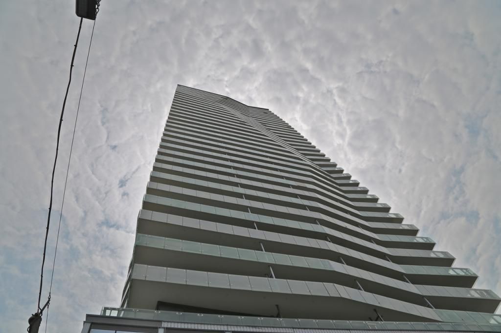
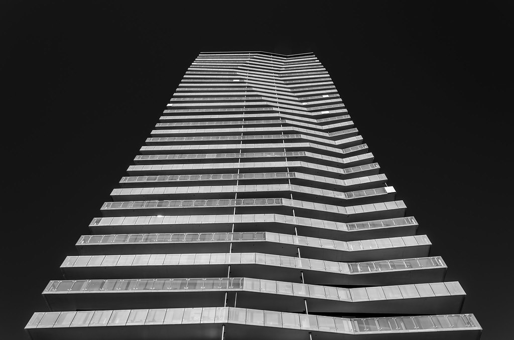
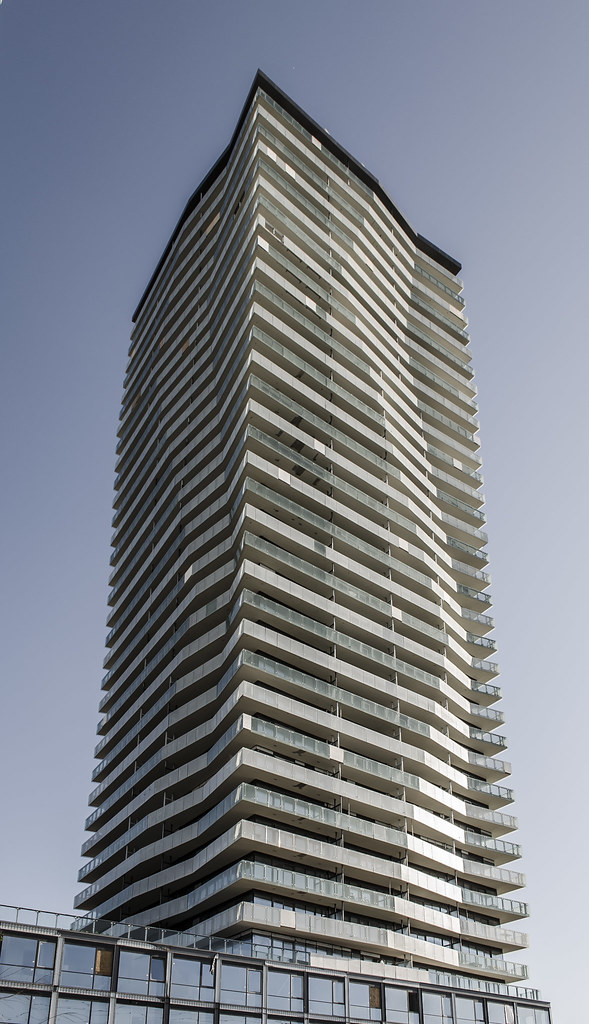
Toronto Clear Spirit | 131.36m | 40s | Cityscape | a—A

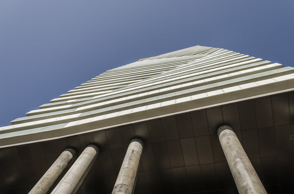
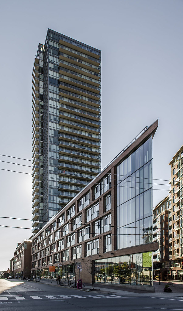
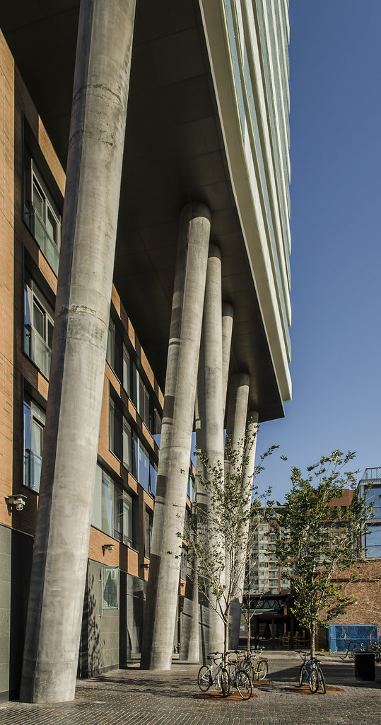
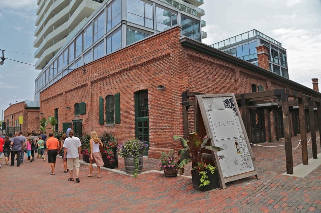
Overall, the towers look good. There are a couple of issues, though. The crooked columns should be finished somehow--that doesn't look like architectural concrete with nasty discolouration. Also, the preserved facades look like a frivolous veneer. They're unintegrated for the sake of style, yet unengaging. Without any relationship with the new architecture, it's hard to tell what purpose the building served.
 
Last edited:
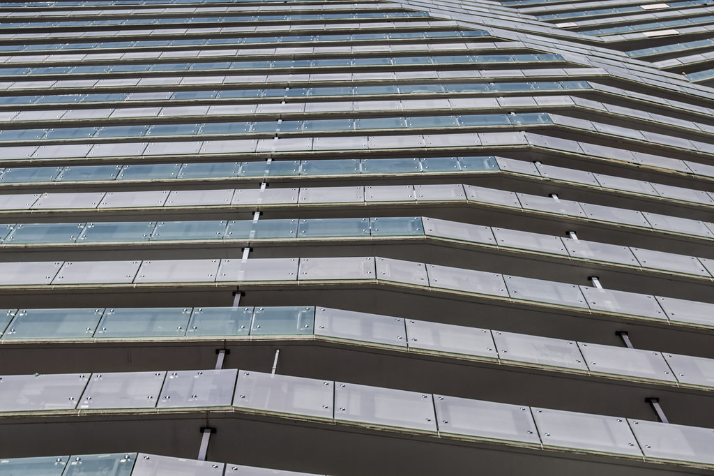
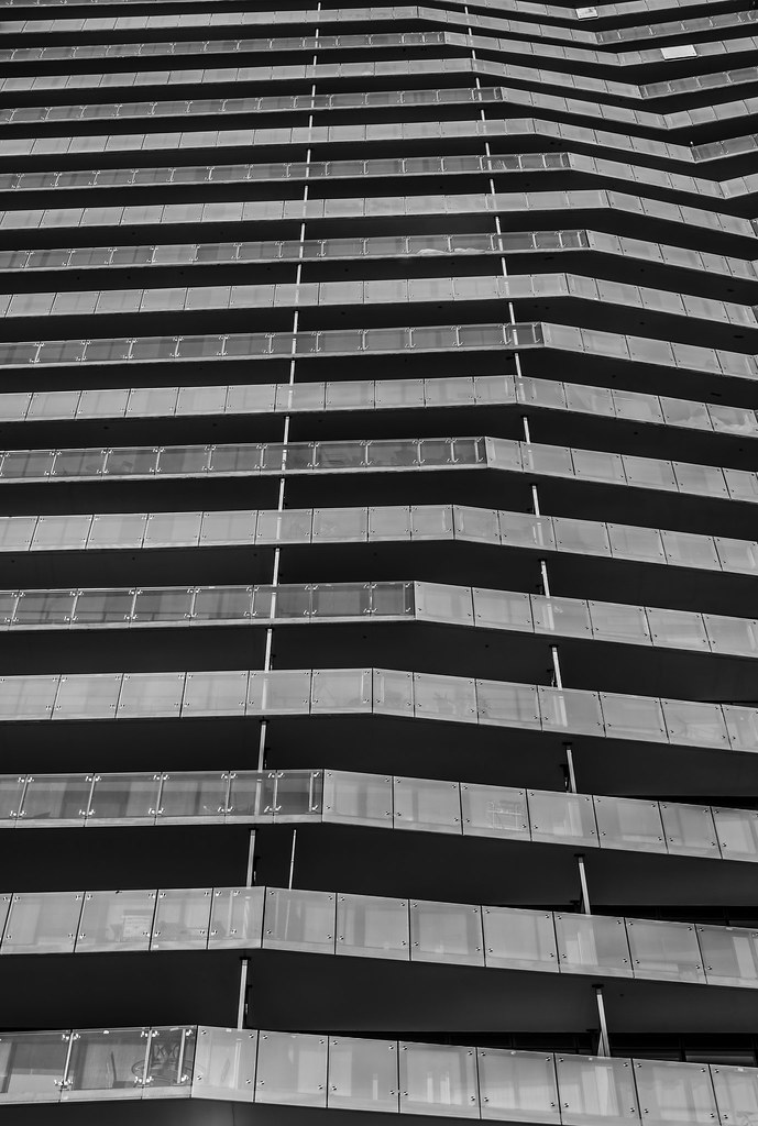
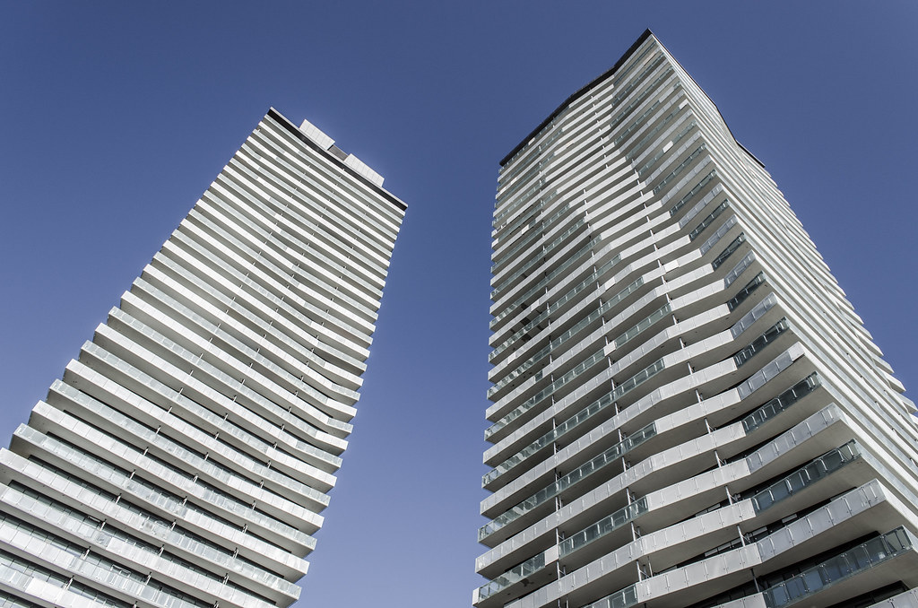
I'm sure it's been mentioned already but I really think they installed the balcony glass incorrectly. Wouldn't it look much better if all the different shades lines up the angles so the same angles would use the same glass? It would give each unique angle a focal point and probably enhance the angled effect.
 
I'm sure it's been mentioned already but I really think they installed the balcony glass incorrectly. Wouldn't it look much better if all the different shades lines up the angles so the same angles would use the same glass? It would give each unique angle a focal point and probably enhance the angled effect.

The first ten or so floors of balcony glass were installed incorrectly, but were later corrected to what it is now. It's on the blueprints as the frit pattern alternating between floors. That said, I agree that it would have looked better if the same angles had the same glass. It would have been much more dramatic.
 
27 July 2014: What time is it?
aDccPKP.jpg


MtsiLvF.jpg


Time for some more aA red brick--which reminds me, if I ever started an architecture firm, I'm calling myself "Red Brick Architects" and will be working exclusively with that material.:)
 
Is the "Ribbon" building still a go?
In the sense of "one day" the answer is YES. It is part of the recent proposal for the 'triangle lands' at 31 Parliament. "To obtain an Official Plan amendment and Zoning By-law amendment for the subject lands located at 31A Parliament St., 370 and 370A Cherry St. to construct a 57-storey mixed use building containing 496 dwelling units and the 4 to 5-storey mixed use "Ribbon Building", with 661 below grade parking spaces in a below grade garage."
 
These towers look interesting from the Distillery District, but they aren't attractive overall. The mechanical penthouses are clunky. The angled balcony slabs seem forced and dated next to curved slabs like on Market Wharf or One Bloor. The change in balcony glass from clear to frosted gives the towers a busy look. The preserved facade looks like a joke--they didn't even try to integrate new and old. Even those crooked columns at the entrance are noticeably flawed--the concrete is stained. It's probably my least favourite aA project.
 
if I ever started an architecture firm, I'm calling myself "Red Brick Architects" and will be working exclusively with that material.:)
Will someone actually be laying the red bricks one on top of the other, or will they come in sheets to be bolted on to the frame? I like the red brick plenty in the old buildings and can even accept it in the new as a way of fading into the old, but otherwise can't see the love. If it's a veneer there's little restriction imposed by the function, so why pretend to be something it's not. Like woodgrain on the side of a station wagon.
 
From yesterday:

DSC00322.jpg


42
 

Attachments

  • DSC00322.jpg
    DSC00322.jpg
    221.8 KB · Views: 1,549

Back
Top