Toronto The Berczy | 41.76m | 13s | Concert | Arcadis

what's the deal with that project? was it initially designed as a condo? i know it was designed by Moriyama, and it has a massive atrium kind of hidden away in the center.
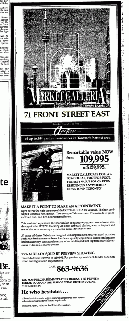
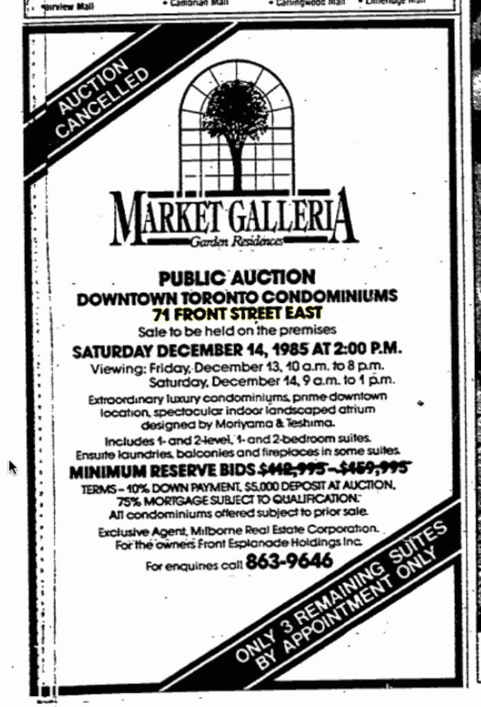
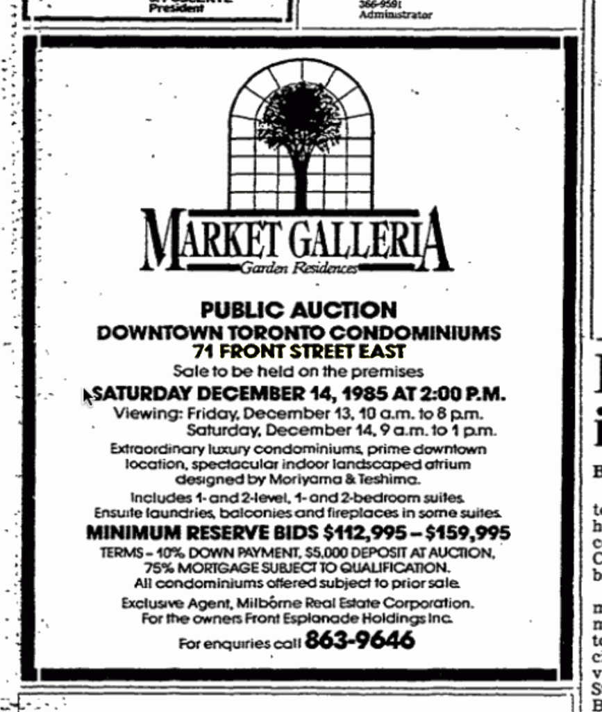
for some reason i recall the developer or something going bankrupt before it opened. and i definitely remember it was shuttered for a long time in a state of non-completion before it launched as Market Galleria.

Not sure of the history but it was indeed designed by Moriyama and opened in 1981-2. The galleria on the inside is actually pretty spectacular: Small Image.
 
Thanks for sharing that obscure but neat tidbit of urbanity. I found more images here.

The exterior is nice, but I've always found that sliver of surface parking on the Esplanade to be irksome. On a side note after checking out the space on Google Maps, Farquhars Lane might have made a good pedestrian passage if parking and public realm detail accommodations were made between the buildings.
 
Last edited:
Thanks for sharing that obscure but neat tidbit of urbanity. I found more images here.

The exterior is nice, but I've always found that sliver of surface parking on the Esplanade to be irksome. On a side note after checking out the space on Google Maps, Farquhars Lane might have made a good pedestrian passage if parking and public realm detail accommodations were made between the buildings.

Actually the pedestrianisation of Farquhars Lane is one of the proposals in the Community Improvement Plan for St Lawrence. http://www.toronto.ca/legdocs/mmis/2008/te/bgrd/backgroundfile-9479.pdf

This says:
Farquars Lane runs north-south between Front Street East and The Esplanade, serving the rears of buildings that front onto the east side of Church Street. This lane provides an opportunity to contribute to the fine grain of the St. Lawrence neighbourhood’s pedestrian realm.
Farquars Lane could be refurbished to provide a comfortable pedestrian environment. Adjacent property owners may take advantage of the opportunity to open retail frontages onto the lane. A precedent from outside the St. Lawrence Neighbourhood is the lane improvement made to St. Nicholas Street west of Yonge Street between Wellesley Street West and St. Joseph Street in 2005. The re-design of St. Nicholas Street’s pavement creates a single space shared by pedestrians and vehicles, but indicates where pedestrians may step when a vehicle uses the lane.
This Public Realm Strategy proposes to:
Implement streetscape improvements to Farquars Lane to create a comfortable and pleasant pedestrian environment, particularly including decorative pavement and pedestrian-scale lighting; and
Maintain the lane as a space shared by pedestrians and service vehicles.
The detailed design process for improvements to Farquars Lane will need to consider a number of technical matters:
Access to the loading area at the rear of 71 Front Street East;
Access to the entrance of underground parking for 71 Front Street East;
Access to the parking lot located at 94 The Esplanade; and
Changing all or a portion of Farquars Lane to one-way operation.
As noted above, design of the laneway improvements should also consider opportunities for owners of adjacent buildings to create retail entrances and/or frontage on the lane.


The parking lot at the corner of The Esplanade and the lane is not owned by the Market Galleria, I think it belongs to the owner of the building at the corner of The Esplanade and Church.
 
Last edited:
The poor little Flatiron building is completely lost next to this massive spandrel-clad blob. What was once a nicely-scaled Victorian streetscape is now dominated by this gigantic grey mess. Way to go!
 
The poor little Flatiron building is completely lost next to this massive spandrel-clad blob. What was once a nicely-scaled Victorian streetscape is now dominated by this gigantic grey mess. Way to go!

There should be a limit on number of negative comments one can post to a forum for each positive one. You're killing us, Creighton. Credibility is a long way off at this rate.
 
19 May 2013: The following presentation is brought to you in part by NimbyTect, maker of all things horrible. But while celebrating Toronto's worst architect may be fun, staring at this retro 90's block got rather tiresome.

rps20130520014349.jpg

rps20130520014438679.jpg

rps20130520014524390.jpg

rps20130520014610601.jpg

rps20130520014804.jpg

rps20130520014848.jpg

rps20130520014936.jpg

rps20130520015014.jpg

rps20130520015115198.jpg

rps20130520015236.jpg

rps20130520015549.jpg


To be honest, at first I didn't see it--it sort of blends in from a distance. Checking out the details though it's clear it blends in for all the wrong reasons.
 
I've tried so hard to like this damn thing and yet I haven't succeeded. I'll still try until it is done but the top truly is a disaster which makes the whole thing even worse. If you're going to make a shitty building then design a shitty building. If you're going to make part of a building shitty, then it becomes a crime because it's just be painful to watch it be built, as it is now.
 
^^ Yes, what really bothers me about this building is that it so easily could have been a good building, if they just continued the bottom's design, all the way up. The way a building meets the street is the most important thing, so I'm so glad the best part is the first few floors but it just irks me to think how nice it would have been if it was all brick. Oh well, live and learn. I bet next time, more people will speak up against these kinds of buildings in St. Lawrence.

The next time a developer/architect tells you white/grey spandrel will lighten a building on top or lessen its bulk, remember this building, where the ugly spandrel does no such thing. In fact the spandrel draws your eye to it and makes its bulk, that much more noticeable and painful to look at.
 
What?

The building meets the street appallingly. If you can't understand that, than g-d help this town!

Really? It's not terrible, but could have been better. The design fits contextually by continuing the rhythm of Front St. The materials are suspect though and they really missed keeping a tall ceiling height on the main floor to match the heritage beauties next door. They should have stuck with the brick.

Hmmm...the more I type the more I agree with you.

The Berczy has a so-close-yet-so-far feel to it.

I think because it really is way off, but its not the type of total unmitigated disaster we're accustomed to.
 
The site is hypersensitive to missteps simply because the quality of what's immediately surrounding the site. It makes any failure look all that much worse. Even the ground level isn't that successful - the cadence of the storefronts windows got rudely interrupted by the new building.

AoD
 
Last edited:
Indeed. The thing is decent infill, but when it features next to the Flatiron, the row of historical buildings, and with the L Tower peaking in the back... one can't help but feel they could have done much better. The massing was promising, too.

Luckily an overhaul of the public realm on Front St. would go a long way to taking this building out of the spotlight.
 

Back
Top