Toronto Avenue 151 | 41.45m | 10s | Dash Developments | Teeple Architects

Marks docked off for that large vent in the middle of the top mechanical section.

Feb 6, 2020

20200206_121646.jpg
20200206_121704.jpg
20200206_121714.jpg
 
Last edited:
Feb 12
This is one of the better ones I have seen over the years and not the run of the mill cookie cutters
Lot more up on site
49534586142_7645c28ede_b.jpg

49534586507_4e408da786_b.jpg

49533995048_beb6634c41_b.jpg

49533993883_55c7ec6280_b.jpg

49533994388_952b2048fb_b.jpg

49534489036_d24b2dd03e_b.jpg

49533995543_ffce7c855a_b.jpg

49533995978_aaf8a1d3f3_b.jpg

49534490236_b2b6beefbe_b.jpg

49533997338_d6b4edb1c2_b.jpg

49534491331_81c226955a_b.jpg

49533997953_03abb6f153_b.jpg

49534720237_f4a815c353_b.jpg

49534492296_477a569717_b.jpg

49534721402_05f1f0daf8_b.jpg

49534004733_1f3482ca93_b.jpg
 
Backside looks quite nice, due to the strength of the lines (though I wish the railings were more minimalistic and actually curved).

Frontside is interesting, but marred by the spandrel.
 
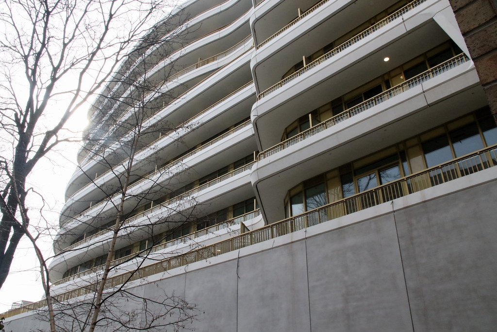
Love the colour palette, the materiality, and those balcony railings on the back side. The Avenue side is really let down by the fit & finish for me, though. All I can see are the mismatches where those angled pre-cast sections meet the horizontals.
 
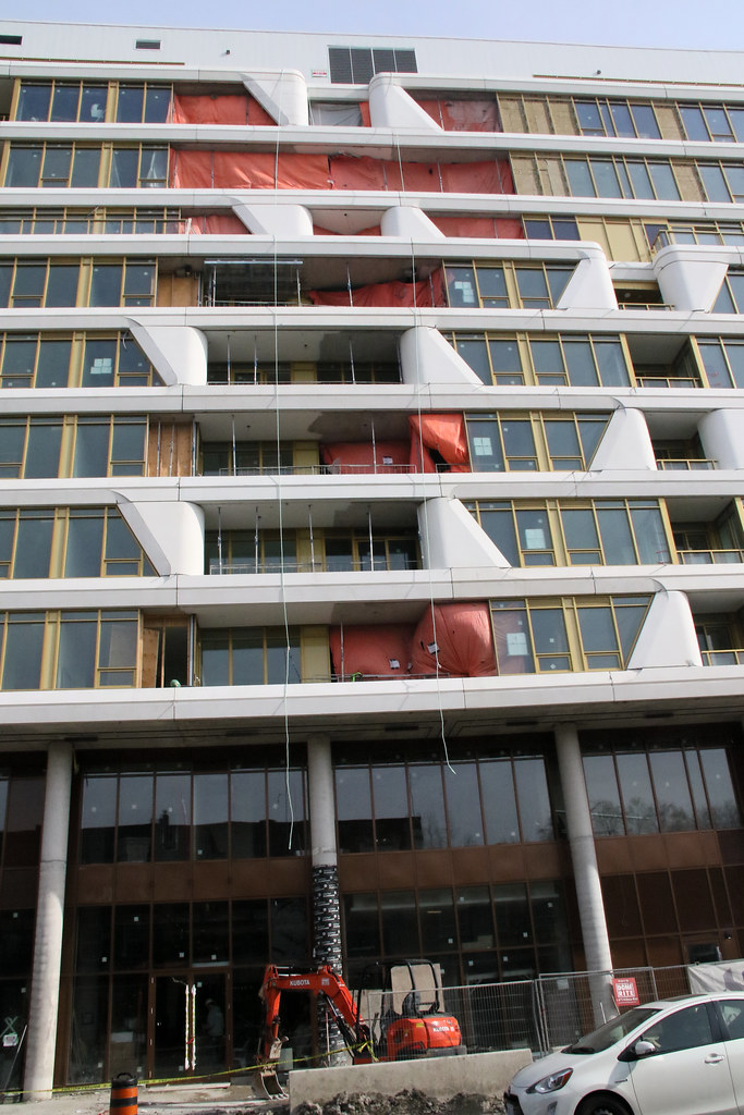
That rust finish at grade really does look downright awful; what a huge miss at the most important part of the building. The colour is completely incongruous, which they may have been able to get away with if they'd gone with a a different material -- a corten product of some sort would've obviously been far superior -- and the paneling immediately to the north of the driveway entrance is particularly atrocious.

The signage also looks super budget -- what a thoroughly awful project from a details standpoint.
 
I mean the colour choices and signage are ugly YES but they definitely work in a retro Tupperware kinda way. I think the address in yellow on the rust actually really ties it all together.
 

Back
Top