enlisant
New Member
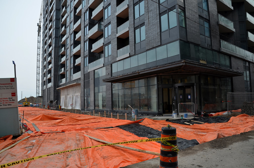
When do residents start occupying?
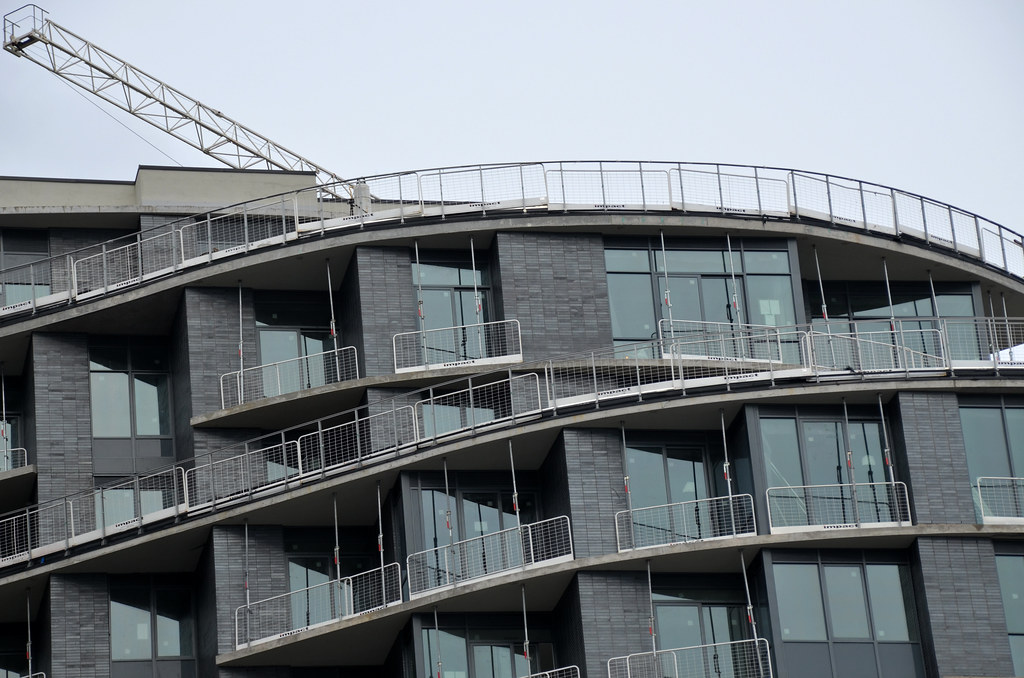
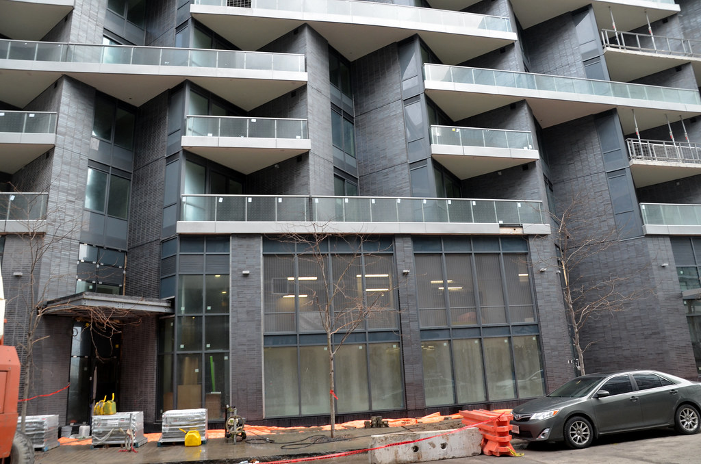
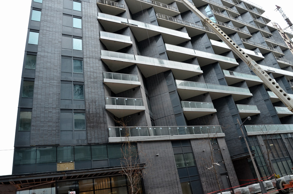
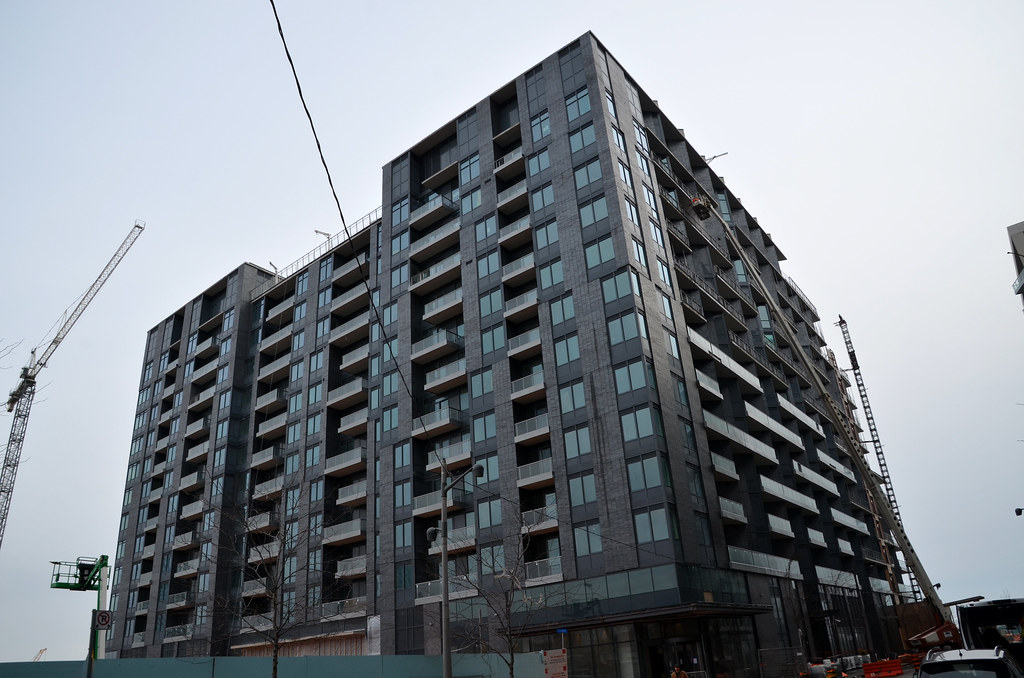
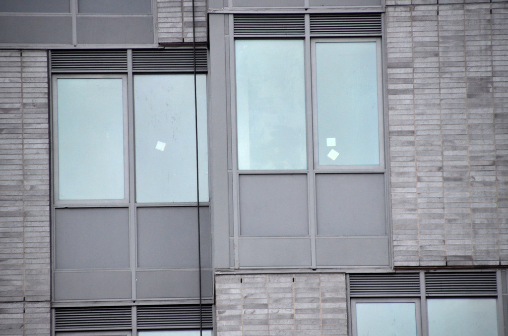
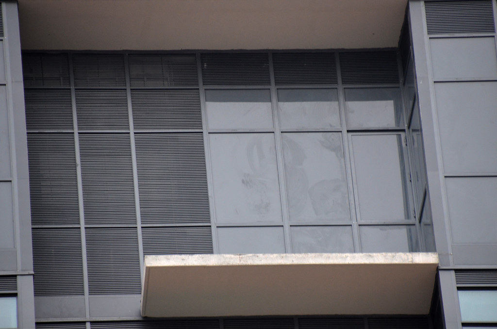
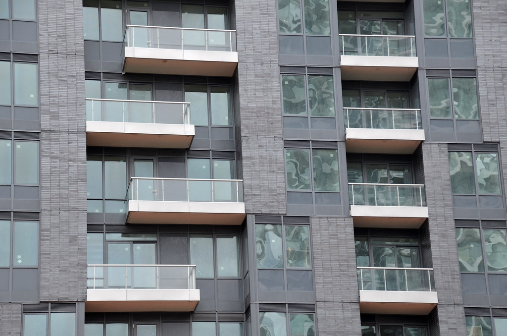
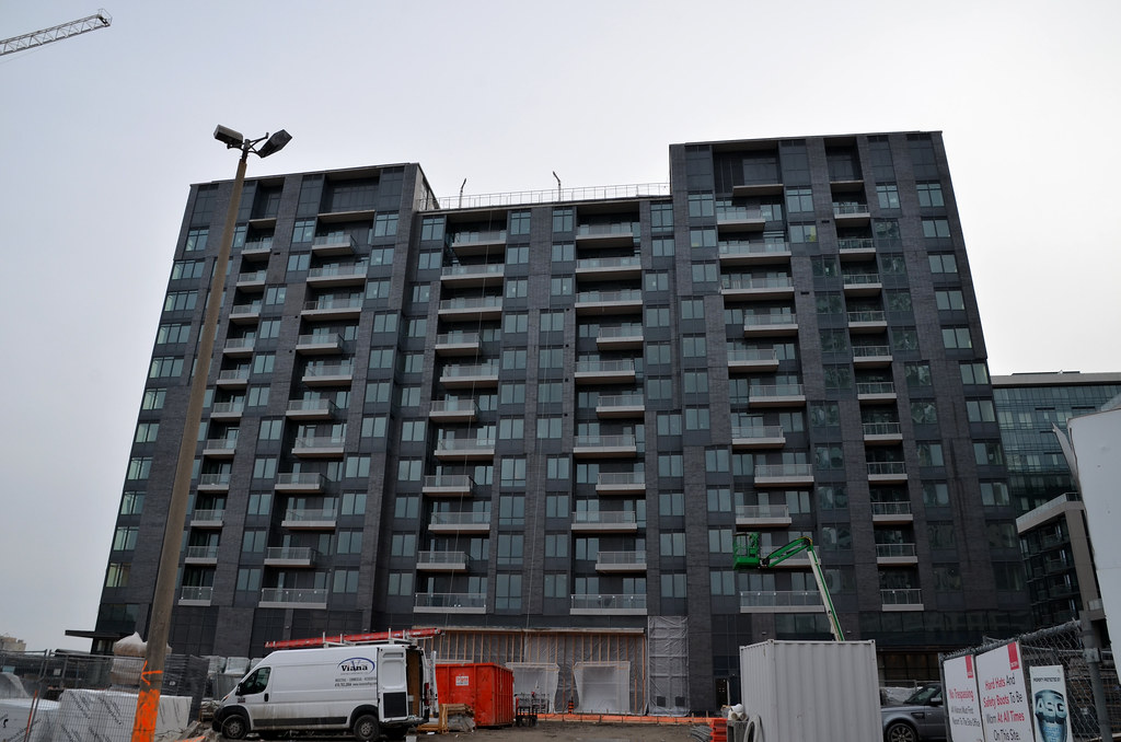
Get onto social media and put Tridel and Arquitectonica on blast for this. I did. I figure if all of UT moans and complains on Twitter as much as we do in the forum, developers and architects ought to get the message in a few years time.I love the curves on this building but I can't understand why they would choose dark grey for this location. What other city puts dark grey buildings right on a central part of the waterfront? Why not blue or white or any other colour besides dark grey? Hell, even a light shade of grey would have been better for this Miami-style building. The back side of this building is dreadful but I'm at least thankful it's brick and not completely grey spandrel!!!
The sad part is, this building could have been so nice with just a bit of colour! Doesn't a prime waterfront location count for anything in this city?
Jan 2019When do residents start occupying?
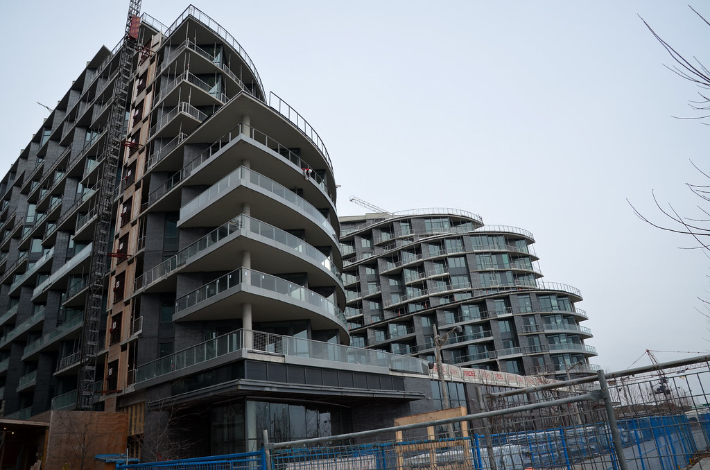
While I really like the curves and overall look of the southside of Aquavista facing the water, I can't wait for the north side to be blocked by Queens Quay Place at Bayside - http://urbantoronto.ca/database/projects/queens-quay-place-bayside
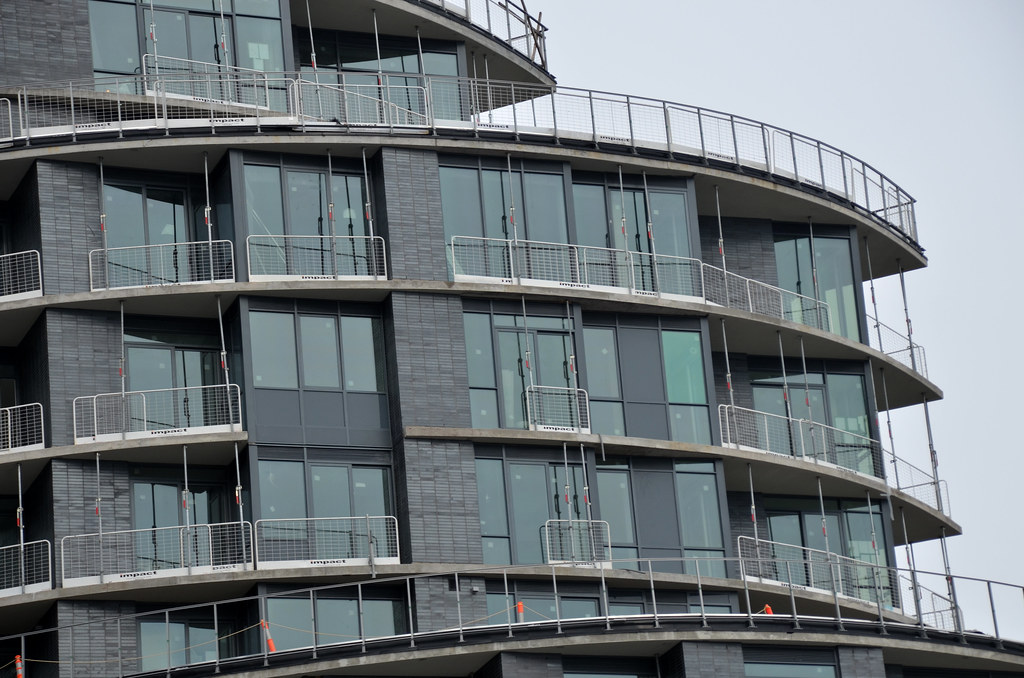
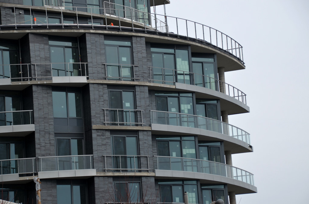
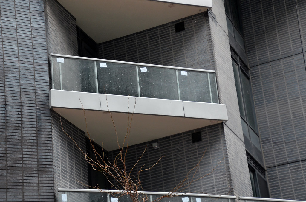
Aquavista didn't have to be a clunker. It would have looked amazing (including the north side) had they chosen literally any other color for the spandrel cladding. Even the north side has some nice features with window rows shifting positions as they go up the building. If they had chosen light or brightly colored spandrel to highlight those features, this building would have been a total home run all-around. It would have been "1 for us, 3 to the community", But, alas, it will be 2 vs. 2 instead, and it's not like the building profitability depends on the color of the spandrel either. I don't know if Tridel is even to blame here. Aren't the color choices more up to the architect?The odd thing is that this and its neighbour to the west are such clunkers, but the two that'll join to the east look to be fantastic, even though it's the same developer. Is Tridel's philosophy here, "two for us, where the driving force is purely profit maximization, then two where we give a little back to the community"?
My understanding is that the two buildings to the east are to be sold at a much higher price point, so they'll probably make a healthy profit on those too. The pattern with Tridel seems to be mediocre or bad architecture for the mid-end buildings and good architecture for the high-end buildings (see also: Bianca). Though SQ and Form might just sneak into the "good architecture" category despite not being particularly high-end.The odd thing is that this and its neighbour to the west are such clunkers, but the two that'll join to the east look to be fantastic, even though it's the same developer. Is Tridel's philosophy here, "two for us, where the driving force is purely profit maximization, then two where we give a little back to the community"?
Aquavista didn't have to be a clunker. It would have looked amazing (including the north side) had they chosen literally any other color for the spandrel cladding. Even the north side has some nice features with window rows shifting positions as they go up the building. If they had chosen light or brightly colored spandrel to highlight those features, this building would have been a total home run all-around. It would have been "1 for us, 3 to the community", But, alas, it will be 2 vs. 2 instead, and it's not like the building profitability depends on the color of the spandrel either. I don't know if Tridel is even to blame here. Aren't the color choices more up to the architect?
This is far from a clunker. It's just.. bland. Same really with Aqualina. Not a bad project per se, just absolutely no flavour to it.
These would be great projects in a more anonymous location. The problem is that they are right on Toronto's limited waterfront frontage.