Toronto 50 Scollard | 147.62m | 41s | Lanterra | Foster + Partners

0AB0655D-593B-47D1-9769-0B98A344965F.jpeg
02DFB44C-58DA-47C4-8DB1-C44334B236DC.jpeg
 

Attachments

  • 0AB0655D-593B-47D1-9769-0B98A344965F.jpeg
    0AB0655D-593B-47D1-9769-0B98A344965F.jpeg
    259.2 KB · Views: 707
  • 02DFB44C-58DA-47C4-8DB1-C44334B236DC.jpeg
    02DFB44C-58DA-47C4-8DB1-C44334B236DC.jpeg
    207.6 KB · Views: 694
50 Scollard, Toronto launched today
Press release
22.06.18

Download images


Designs for Foster + Partners newest residential project in Canada were revealed in Toronto today. A unique amalgam of community-based amenities, heritage restoration, high-end luxury residences, and public green space, 50 Scollard lays the foundation for a rich social anchor within a vibrant district in downtown Toronto.

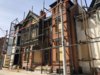
The 41-storey residential tower is located on the corner of Bay and Scollard Streets in Yorkville, Toronto. The new development enhances the connection between the Jesse Ketchum Park to its west and the larger Yorkville Green Corridor to the south by creating a new public plaza at the corner of Bay and Scollard Streets, where a heritage building currently stands. The innovative proposal seeks to relocate the entire building to the south-eastern corner of the site, thereby freeing up space in front of the residential tower. The form of the tower also steps back dramatically, adding volume to the landscaped plaza, which features a sculptural tree hedge – the space can be used as a performance area for staged events, screenings and projections, to host farmers’ markets, for festivals and open-air dining events. Shops and restaurants within the heritage building and tower, including the restaurant on the third floor, provide active social spaces for both residents and public, making a positive contribution to the surrounding urban realm.

Nigel Dancey, Head of Studio, Foster + Partners: “The building has truly evolved from its context, a timeless addition to the Toronto skyline. The massing was sculpted to minimize the shadow falling on the adjacent park and school yard, while maintaining a purity of geometry and structural expression.”

Setting itself apart from the usual ‘green glass tower’, the building has been inspired by the colours and textures of the surrounding urban fabric, giving the tower a materiality that relates to the unique character of the borough. The pure geometry and structural expression provide a timeless quality, creating a harmonious relationship between the tower and the heritage area of Yorkville – a new addition that makes a positive contribution to the community.

“Public engagement was an integral part of the design process, where we worked hand-in-hand with the city and the local residents to evolve a design that resonated with the historic character of the district, while being very much ‘of its own time’,” added Dancey.

The building reveals expansive private terraces as it steps back at upper levels, and a majority of residential units feature dual aspect views to the Don Valley Parklands to the east and over Yorkville to the west. Expansive layouts, full height windows and Juliet balconies, all come together harmoniously to provide a luxurious living experience.

Press contacts
Foster + Partners
Katy Harris, Head of Communications
 
The more the design is revised, the more disillusioned I become.

I really liked the first and second designs. A combination of the two would be ideal. What I like most about the first design was its deep, punched windows with bronze/orange accents. That was a really audacious feature. In addition to that, the horizontal window relief grid/pattern along the edges of each volume, at the south end of the building, helped to break up the monotony and gave the building strong definition.

With respect to the second design: the punched windows became more shallow (at least I think these were still punched windows), but the muntins still provided some depth and prevented the tower/glazing from appearing flat. One area where I think the second design outshone the first is at the pinnacle of each volume. The incorporation of open-air terraces gave the tower a porous feel that was absent in the original vision, which was solidly enclosed; still very nice, mind you. Unfortunately, the horizontal window pattern on the southern edges of the tower was cut from this iteration, removing the most distinctive feature of the initial design and leaving the tower feeling a bit bland and unresolved. The absence of this feature detracts from the tapering effect of the tower. It becomes harder to notice, as the singular window size and their exclusively vertical positioning makes them blend into each other, almost obscuring the tower's receding expression. The vertical placement of windows atop the horizontal really emphasized a stepping pattern that is hard to discern, otherwise. An additional feature that helped ease my acceptance of the second design is the subtle, vertical articulation/emphasis between every three panes of glass. This helps give the tower a sense of airiness and offers gentle separation between the windows, breaking them into groups of threes, as opposed to having monolithic walls of windows without any variation.

The third design is by far my least favourite. The lines in this version come across as being very messy. The departure from the perfect harmony of the window arrangements in the previous two versions in favour of the 'narrow-wide-narrow' arrangement in the latest, breaks the consistent rhythm of the tower. In addition to that, the open air terraces have doubled in size and their ceiling/roof slabs have become beveled and chunky, as opposed to being thin and flat (which I prefer), as depicted in the previous design. The gracefulness has been lost and this now appears too cumbersome, in my opinion. Looking closer, there are now what appear to be randomly placed (doors?) running along a few columns of units, furthering the imbalance of the tower's lines. The worst feature, though, is the crown of the tower. What is going on there? Is that now an enclosed mechanical level? It looks atrocious. It's almost identical to the mechanical levels of the CIBC tower at Yonge & Bloor (2 Bloor West). That completely dissolves the flow of the tower as it steps up to meet sky. The transparency is now gone from the crown.

The pleached trees at ground level have also been reduced by one undulating section; but that isn’t a crucial loss.

f9hyxi.jpg


24o81oh.jpg


33ml8nm.jpg


2vuenhe.jpg

All renderings used are already sourced in this thread, minus the tower from the park rendering of the latest iteration, which comes from fiftyscollard.com
 
Last edited:

Back
Top