Toronto 1 Yorkville | 183.18m | 58s | Bazis | Rosario Varacalli

today。
mmexport1548428674586.jpg
mmexport1548428671201.jpg
mmexport1548428667713.jpg
mmexport1548428664167.jpg
 
I'm pretty sure someone visiting from Manhattan would see it and go, "Oh, well...now isn't that a cute attempt.'
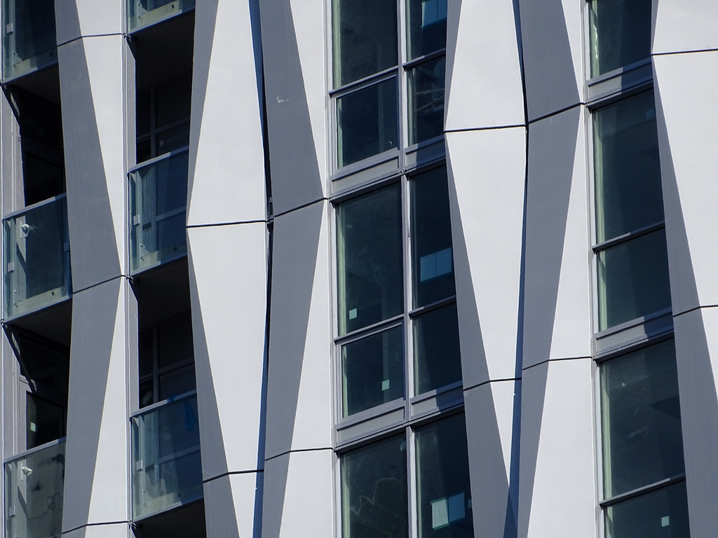
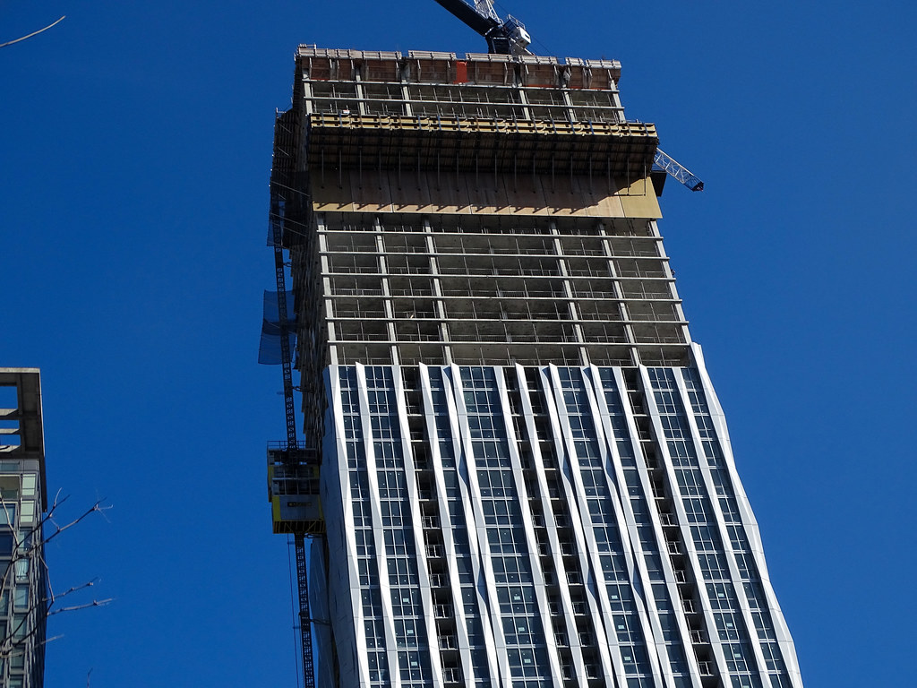
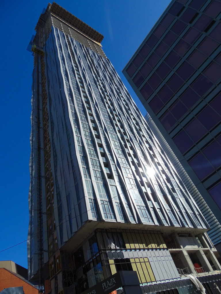
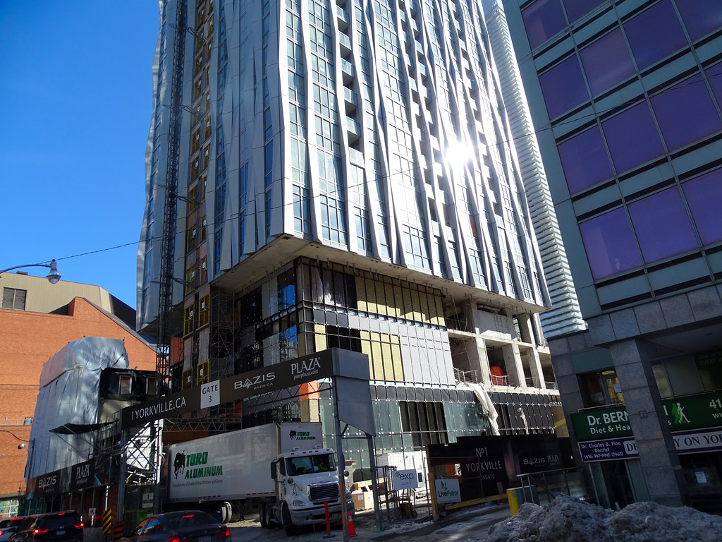
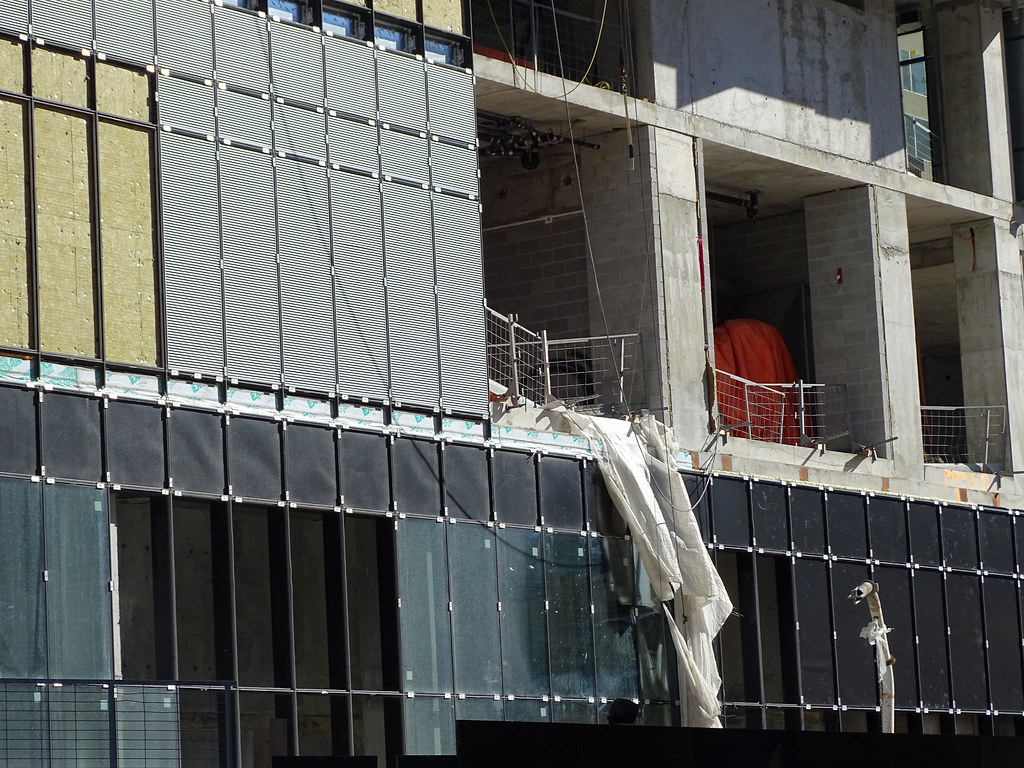
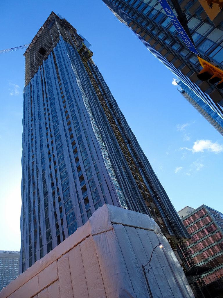
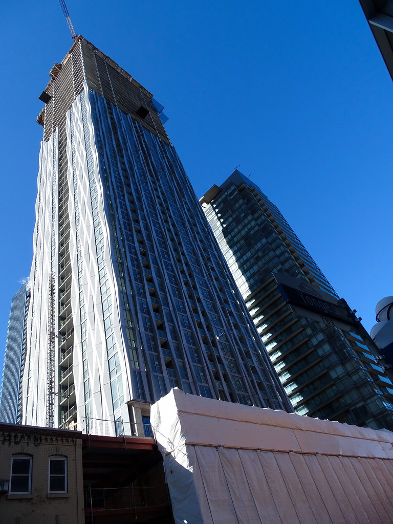
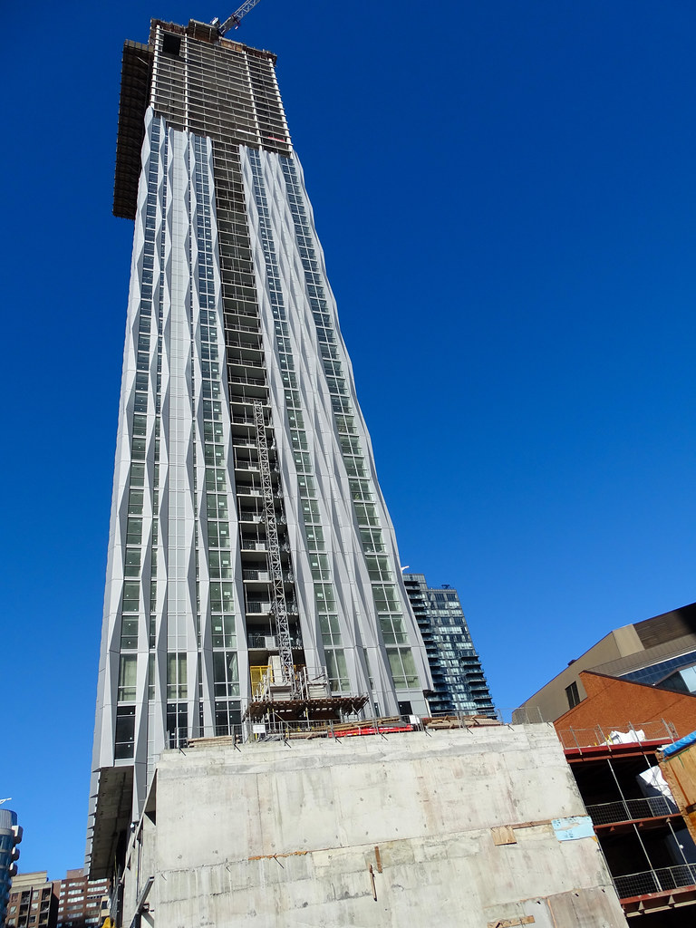
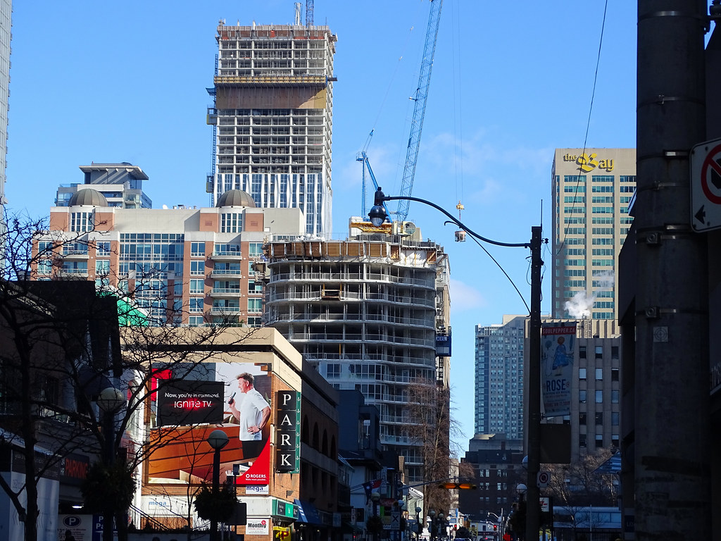
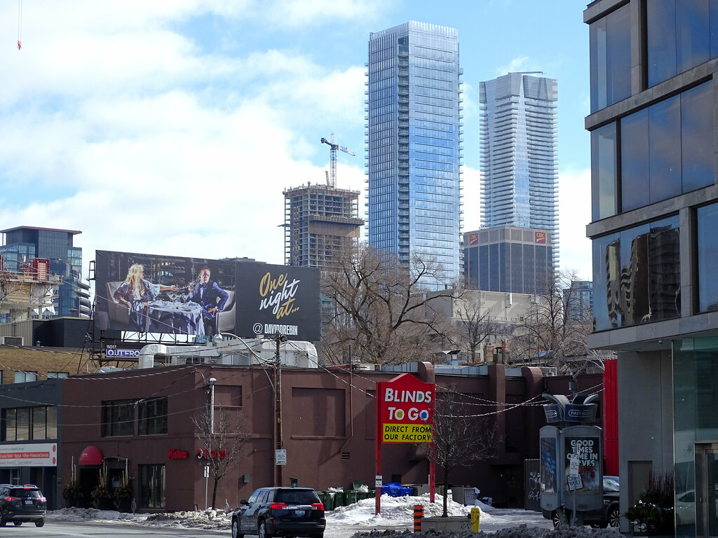
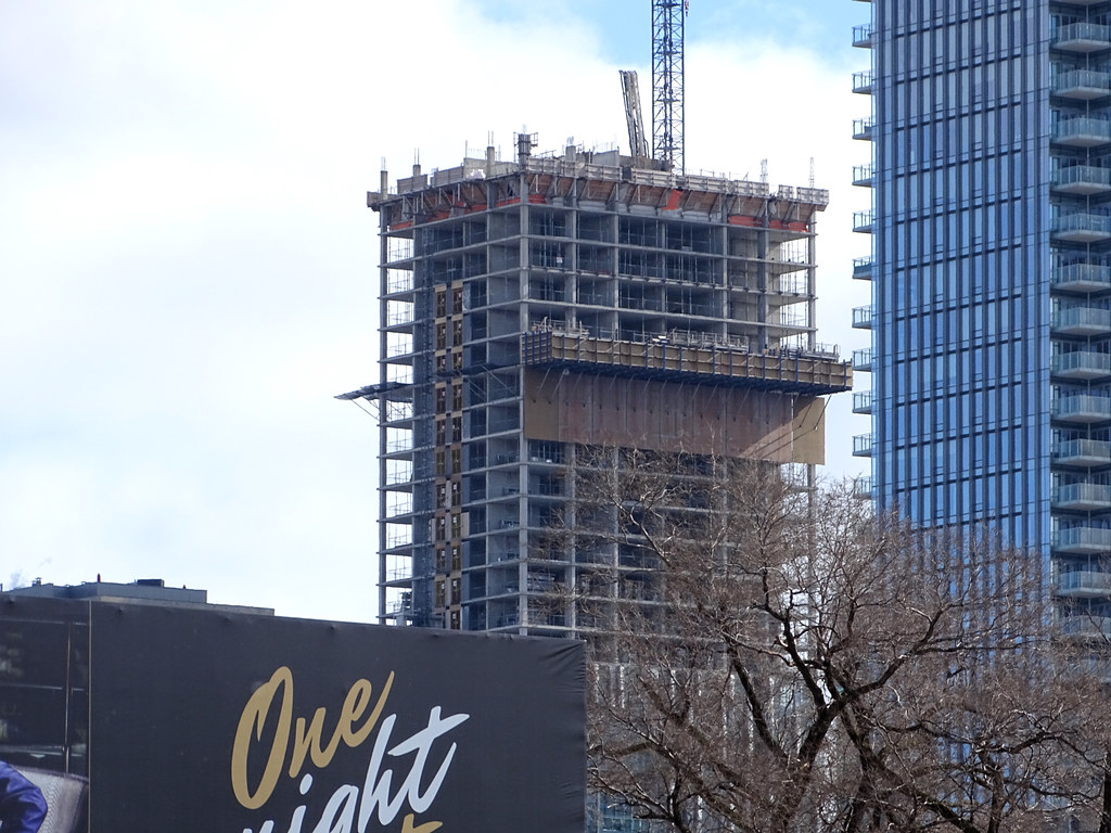
There are both good and crappy new(ish) buildings there too. I mean, a lot of New Yorkers don't much care for New York by Gerhy (8 Spruce Street; a FRANK-effing-GEHRY!) or 432 Park Avenue, both less than a decade old. Every city has subjectively and objectively ugly buildings (Tour Montparnasse in Paris anyone?). If people here are gonna compare Toronto and Manhattan on what seems like an annoyingly regular basis, please check the inferiority complex first.
 
I lived in NYC for four years and can assure all of the breathless Toronto-bashers that there's just as much bad and cheap contemporary architecture in NYC as there is in Toronto.

I find that Toronto of all places manages to keep more of its old architecture (even as facades) than New York, maybe because we have less.

They still regularly tear down lots of what can be considered heritage fabric for new development (plenty of awful residential developments nonetheless).

In fact, I'd consider that Toronto's major multitower projects are more urbanistically progressive on average than those going up in many US cities.
 
I just feel like they could have done so much better than the opaque grey windows. Why not darken them so they match the windows? Why not take advantage of an amazing geometric facade in that place? Would love to know the decision making that led to this...beyond money, of course as I'm sure darkening it would be a negligible cost difference.
 
You have to hand it to bazis and teams for there creativity in this project as well as the E Condo towers. They're both unique and stand out amongst the other buildings !
 

Back
Top