News   Apr 19, 2024
 1.1K     0 
News   Apr 19, 2024
 722     2 
News   Apr 19, 2024
 1.1K     3 

Scotiabank Arena (Air Canada Centre) Renovations

Scotiabank's renovation plans are actually quite awesome. As an insider in the project I can tell you that the exterior signage will be pretty innovative, the first of its kind in North America in fact. Stay tuned for more details coming out soon.
Innovative signage isn't my idea of a good thing - especially when it's Scotiabank.

Ruining venues across Canada with its crass branding. :)
 
Innovative signage isn't my idea of a good thing - especially when it's Scotiabank.

Ruining venues across Canada with its crass branding. :)
I think you'll be pleasantly surprised by the subtlety of the final design. Scotiabank's brand presence from the outside will be more of a background player, giving priority to the essence of the teams that inhabit the space (Raptors and Leafs) and alluding to the corresponding moods based on whatever is going on that day. The objective is to give more life to a space that has been underleveraged from a fan integration standpoint, shining the spotlight back on the great heritage space that it is and bringing its intended use to true form :)
 
I think you'll be pleasantly surprised by the subtlety of the final design. Scotiabank's brand presence from the outside will be more of a background player, giving priority to the essence of the teams that inhabit the space (Raptors and Leafs) and alluding to the corresponding moods based on whatever is going on that day. The objective is to give more life to a space that has been underleveraged from a fan integration standpoint, shining the spotlight back on the great heritage space that it is and bringing its intended use to true form :)

I’m hesitantly optimistic and looking forward to it. Thanks for the insight!
 
I'm extremely disappointed by the tasteless Scotiabank lettering and signage on the exterior.

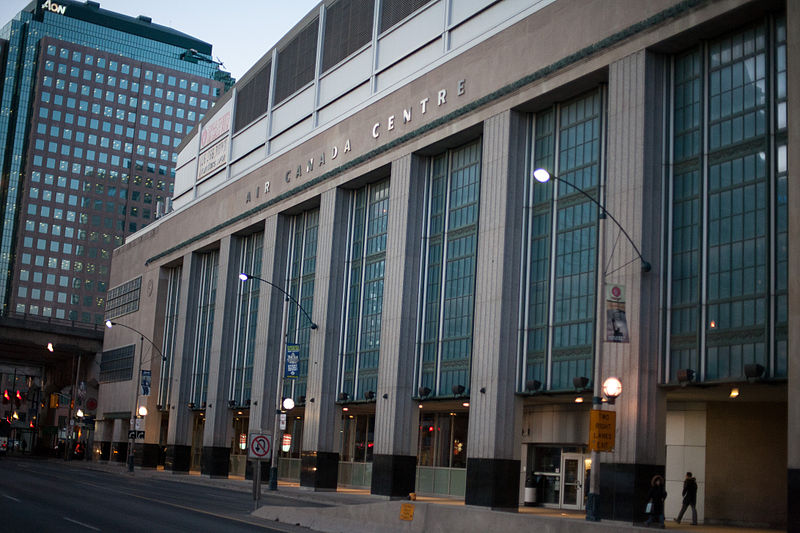
The 'Air Canada Centre' lettering on the current building, below, is more respectful of the heritage building.

Can't Preservation Services put their foot down?

800px-Air_Canada_Centre_Bay_Street_Facade.jpg

Credit Roland Tanglao
 

KFC Yum! Center seems like it has to be a joke. So terrible!

Bojangles on the other hand is hilarious and I would take that over ScotiaBank lol
 
It looks like the "Scotiabank Arena" text on the east, south and west elevations will be LED signs, so I'm assuming this will light up the text in different colours/designs depending on the team or event happening that night. I would have thought this was a cool idea if it weren't for the size of the text on all four sides, IF the diagrams are to scale. I really hope Scotiabank understands smaller text = classier and better branding.
 
Why is the logo not centered w/ anything? It's not even centered above the 'S' in the text below it.

upload_2018-6-19_19-39-6.png
 

Attachments

  • upload_2018-6-19_19-39-6.png
    upload_2018-6-19_19-39-6.png
    145.2 KB · Views: 906
Why is the logo not centered w/ anything? It's not even centered above the 'S' in the text below it.

View attachment 147387

It’s just a mess overall. Isolated huge S on the east, two-line big text on the south, one-line big text and huge S on the west, one-line small text on the north. It looks like they’ve simply ignored their own branding standards. Can you imagine a modified “Air Canada Centre” logo with “Centre” on a second line, just so the text can be bigger?

I’d be amazed if Scotiabank’s marketing department approved the signage as shown in the application. If the final product looks like the application, file this under “how to spend $800 million on branding and end up looking cheap.” Their only saving grace is that they’ve copied Air Canada’s elegant scale in some areas like the canopy on the west elevation, but even there they made the bizarre decision to squeeze in a third “Scotiabank Arena” about 10 feet away from the first one.

 
Last edited:
It’s just a mess overall. Isolated huge S on the east, two-line big text on the south, one-line big text and huge S on the west, one-line small text on the north. It looks like they’ve simply ignored their own branding standards. Can you imagine a modified “Air Canada Centre” logo with “Centre” on a second line, just so the text can be bigger?

I’d be amazed if Scotiabank’s marketing department approved the signage as shown in the application. If the final product looks like the application, file this under “how to spend $800 million on branding and end up looking cheap.” Their only saving grace is that they’ve copied Air Canada’s elegant scale in some areas like the canopy on the west elevation, but even there they made the bizarre decision to squeeze in a third “Scotiabank Arena” about 10 feet away from the first one.

I'm not really surprised by the awful design though, as it's just another eyesore 'designed' by KDA.
 
Interior construction started yesterday. Presumably on the 'Scotia Club' lounge (there was a building permit for it)
Today, some exterior construction commenced.
 

Back
Top