News   Apr 24, 2024
 297     0 
News   Apr 23, 2024
 2.5K     5 
News   Apr 23, 2024
 636     0 

Regency Yorkville (Plazacorp/HiRise, 18s, Turner Fleischer) COMPLETE

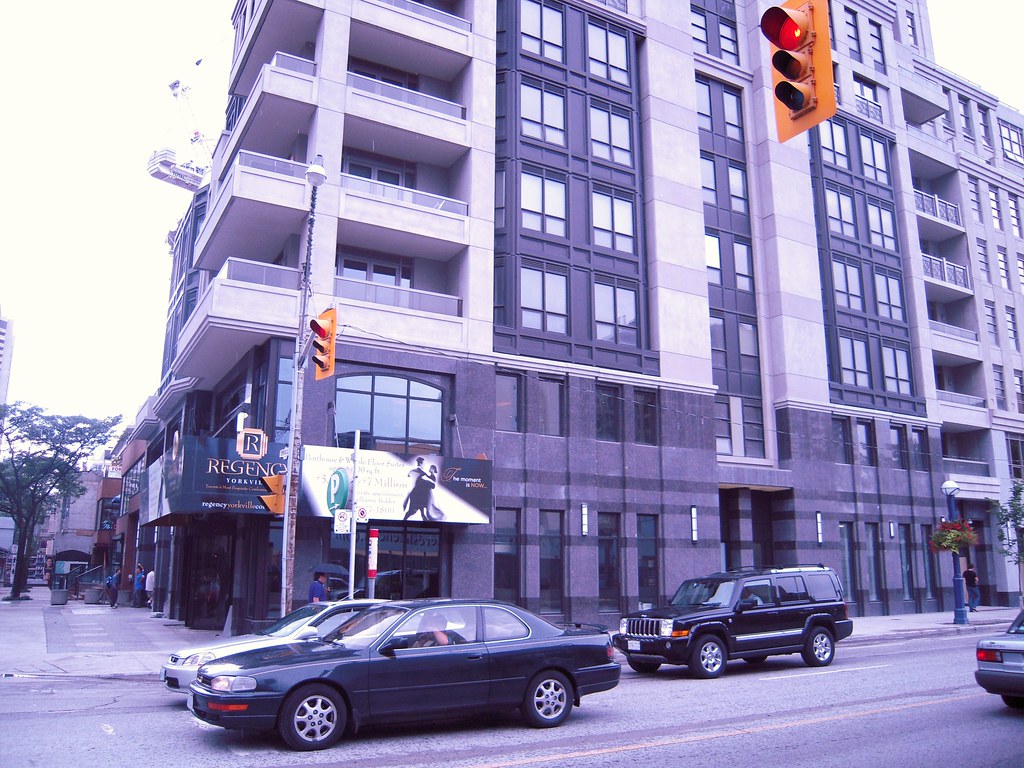
I think you are right...looks a bit better from the north...

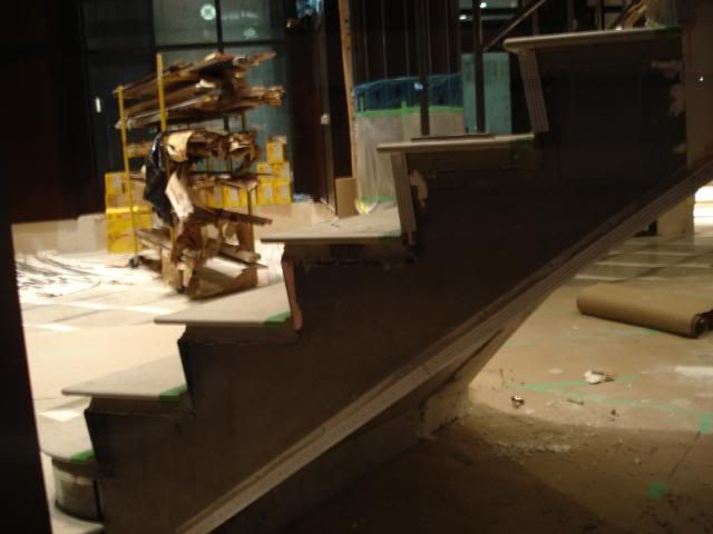
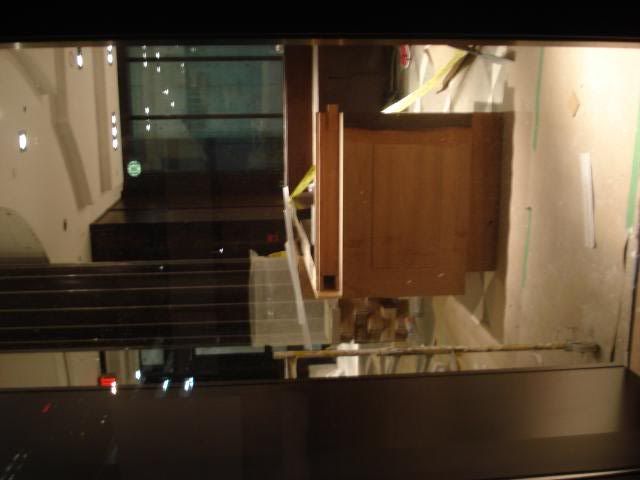
This one is taking forever to finish..
 
I think this is another one (like University Plaza) that gets unfairly bashed. I think it turned out quite decent. The massing is good and it meets the street well.
 
Work on the base and sidewalk is nearly complete. This "Regency" sign in the photo looks like it will come down soon and reveal something a little more polished then a wood billboard structure.

2766653040_09530c7d0c_b.jpg
 
Haven't been to this area for a while... It came out better than I was expecting from that photo
 
19 August 2008 interior photo update

Gosh, what a tacky "cheap"-looking lobby! The way the retail space is organized is awkward too--the smaller spaces are closer to Yorkville Ave while the larger spaces are facing Scollard. Also, a really bizarre entrance from Bay St to the parking garage--shouldn't this be a retail spot here?

Essentially, with the large driveway killing the retail vibe along Yorkville, we've got the equivalent of a McMansion here....:(

Some photos I took last night:

 
^... I'd disagree from those photos... It's look pretty good, but it's too early to tell
 
The hoarding is down around the lobby entrance and it looks really, really nice. The staircase banisters have nice detailing and the floor and dark wood all complement each other. There is a giant sparkly ball for a chandelier (perhaps the wealthy man's disco ball?).

The font choice over the revolving doors is excellent and matches the whole feel of the building too.

They are still adding finishes to the parking bay walls, so it's not all complete yet.

This building keeps looking better and better. I think it will age the best of all the current Yorkville construction.
 
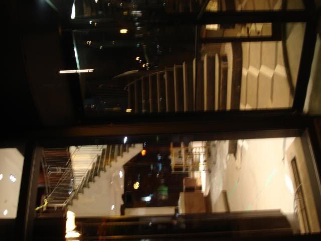
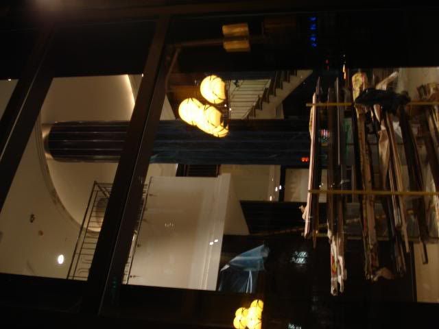
Ewww. Those are the cheap canned pot lights everyone seems to prefer in the states. Halogen pot lights would have been a much more tasteful choice IMO.

You mean these? They are actually a rather upper crust Italian contemporary design. Artemide makes these and they cost a bloody fortune:

artemidenothingpotlightbz9.jpg
javarm3.jpg


Halogen pot lights belong in 1990s ikea kitchens.
 
Last edited:
No I meant the cheap standard pot lights that are still used in the U.S. Halogen always looks better than standard IMO. Recently they've been given a nice stainless steel square frame for a more contemporary look.
Btw I think those Italian ones above are used in Holt Renfrew Vancouver. I really like them.
 
As a stand alone building, I think its fairly attractive. However, its virtually similar to the neighbouring Minto Yorkville condo and the condo next door to that (above the Starbucks) - similar height, similar chunky concrete base and similar staggered balconies near the top. The three combined create a grey and monotonous street wall.
 

Back
Top