Toronto Nathan Phillips Square + Spirit Garden | ?m | ?s | City of Toronto

I don't see how anyone could determine anything about removing the walkways based on a photoshopped aerial view? The issue is how they obstruct views/cut off the square at ground level from the surrounding city, and this is not addressed in an aerial picture.

I do respect the 'original design' argument, and for me it is really the only one that makes some sense, even if I don't necessarily agree with it: If we view heritage as a cumbersome legacy that is inflicted on us 'for our own good' then sure, we are somewhat 'obligated' to keep the walkways, poor design or no. If on the other hand we view heritage as living, ongoing and evolving then I feel we can intervene on elements that are problematic.

Our City Hall and civic square must be open and welcoming to the surrounding city, and the symbolism of its design elements must reflect this.
 
Even in that crude photoshopped aerial view, the lack of clutter between the square and Queen Street is excellent. Rather than a mess of lawns, railings, concrete walkways and elevated walkways that look like highway ramps, there's a sidewalk, trees and the square itself. It's open and inviting. The west side looks trashy because it shows the existing landscaping designed to fill in the deadzone between the elevated walkways and Osgoode Hall.

Without the walkways, the space would be redesigned to transition seamlessly into the grounds of Osgoode Hall. You could use that space for a gallery pavilion or perhaps even a small boutique hotel fronting right onto the square. It's only the west side that needs enclosure, which could be achieved through a small but architecturally striking building to animate the square year round.
 
Last edited:
Without the walkways, the space would be redesigned to transition seamlessly into the grounds of Osgoode Hall. You could use that space for a gallery pavilion or perhaps even a small boutique hotel fronting right onto the square. It's only the west side that needs enclosure, which could be achieved through a small but architecturally striking building to animate the square year round.

Agree completely with this idea. Having just come back from Europe, having a square with hard edges like buildings just makes the place feel much more intimate and interesting. The current walkways do serve this purpose, however, I would LOVE to see the square extended to the edge of Osgoode Hall in the west, and up to old City Hall in the East.

This would involve eliminating Bay Street though, which won't happen any time soon. (Or at least raising the street to the same level as the square and paving it with the same treatment as the square)

This would also allow for a linear park to be built at the south end, which could stretch from University Avenue, to James Street just East of Old City Hall.

73j6vb.jpg
 

Attachments

  • 73j6vb.jpg
    73j6vb.jpg
    456 KB · Views: 824
Last edited:
Yuck. Definitely benefits from the walkways.

I do like the framing that the walkways give, and if they do hide some of the view at the same time, big fracking deal: walk into the square and get the whole view of City Hall and become part of the scene at the same time. The amount of view of Old City Hall that they block is negligible at best. This is a special square, and for me, separating it out with these walkways does not detract from that but reinforces that status.

42

Architect John B. Parkin, who partnered with Revell on city hall and NPS execution and design, had some interesting things to say about the walkways, as Revell saw them, in a book I read recently. He noted that the walkways were designed not to cut people off but rather to almost intentionally block their views of city hall behind them. The idea was that people whizzing passed in their cars or those on foot should not be the focus of the squares design. Instead the partial views of magnificent city hall and events within NPS were meant to attract and draw people into the square to activate it with interest from passers by who wanted to know what was happening behind the walkways inside the square. Revell's NPS design was not meant to cater to hurried or uninterested passers by who wanted some sort of architectural slideshow to look at in their travels. He designed it to draw people directly into the square and to force them to leave their cars and enter their public square and enjoy it once they entered.

Aside from the functional aspects of an above grade pedestrian network I think this key design philosophy gets lost on many people. Revells square design was for the people IN the square.

I know a lot of people will disagree with me but that's just bad design. Seriously, blocking off the square from its surroundings? That design philosophy assumes that squares that don't have a barrier around them aren't enticing and don't draw people in. That's not the case. Squares that are open to what's around them are a natural draw and people gravitate towards them. This is the case in every city I've been to that does squares well. NPS, with its physical obstacles and visual barriers to entry, seems cold and uninviting from the streets around it. The ideas behind the walkways are based on erroneous assumptions and the design hasn't worked as intended.

Besides, it's not just the view to the square, it's the view from the square as well. NPS was designed as an island separated from everything around it, in classic 1950s style. That's the opposite of what a public square should be.
 
Last edited:
The ideas behind the walkways are based on erroneous assumptions and the design hasn't worked as intended.

Bingo. I doubt they would have been built in the first place had NPS been built today. Times have changed, and preserving a failed idea for the sake of maintaining architectural integrity is a lame reason to keep the walkways.

Even Mississauga made changes to it's City Hall to improve the experience for the users of Celebration Square. Removing some walls and opening up the square has made it a much more inviting space.
 
I personally think the walkways if partially/selectively/fully reclad in some sort of frosted glass type glazing and providing a "lighter look" would help to alleviate some of the heaviness which sometimes comes across as off putting and uninviting according to some.

While i cant speak for the man himself, i think Revell was trying to address the growth of car usage during the time and that people were increasingly being emptied off the streets and into their quick cars/subways/other and being whisked away from what was at that time still a heavily stigmatized part of town, in a city eager to change so rapidly. I suppose he wanted to entice people to linger.

In such a sense the walkways i interpret partially as some form shelter and peace from the massive and hectic construction zone that was downtown in the 60s, almost cocooning the square in some sort of veil of order and calm.


Whatever the choice one day is with regards to refurb/teardown of the walkways, i dont think it is easy for us to cast judgements on a design that was most assuredly dealing with a historically and contextually distinct set of pressures and influences during Revell's time.
 
So the walkways serve as a sort of see through curtain. Who doesn't want to pull back a curtain and see what's really behind?
 
In paraphrasing of Parkin, I dont mean that he/Revell deliberately meant to block the view. At least thats not the intention I got. Rather it was more closely something of a beneficial by product which they perceived.

If i can come across the original quote again I'll post it along with some other things he mentions about the walkway in the book.
 
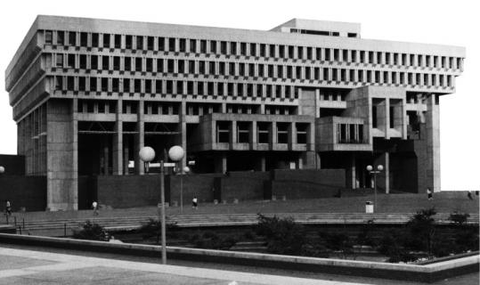
To repeat what I've suggested before: lamenting the persistence of the NPS walkways is to Toronto as lamenting the persistence of Boston City Hall is to Boston.

539w.jpg
 

Back
Top