News   Apr 16, 2024
 647     3 
News   Apr 16, 2024
 466     3 
News   Apr 16, 2024
 828     1 

European traffic signs in Toronto

reaperexpress

Senior Member
Member Bio
Joined
Nov 20, 2009
Messages
3,263
Reaction score
6,443
Location
National Capital Région de la Capitale Nationale
I've noticed a couple instances of non-standard signs in Toronto. They're in the European style of a blue circle with white symbols, instead of the North American style of a yellow diamond with black symbols.

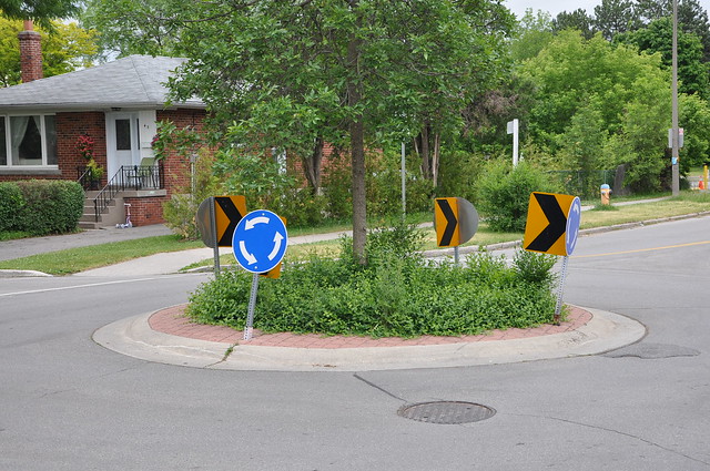
Here's a picture I took of one of the roundabouts on Yeomans Road in North York:
7167928255_6a719c0170_z.jpg


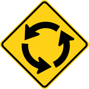
The standard sign would look like this:
288px-MUTCD_W2-6.svg.png


Here is a sign at Harbord St. and Tower Rd. It is the European "bicycles only" sign. That is amusing, because it means cars aren't allowed on Harbord.
7167920993_672131618f_z.jpg


Signs that would make more sense include the "Caution, bicycles" sign,
200px-MUTCD_W11-1.svg.png

or a Toronto Bicycle Route sign.

How did these signs get there? I actually prefer the European style, but I wonder who decided to use it.

Also, does anyone know of other examples of European-style signs in the city?
 
Last edited:
The blue bike circle is the old signage for a signed bike rote. These have been largely replaced by bike lanes, sharrows and the new bike route signage. I like the blue roundabout signs. The yellow bike warning sign is more a warning of bikes crossing, and not a bike route sign.

The "European" signage is actually known as Vienna Convention on Road Signs and Signals. Canada and US use the (or variants of) Manual of Uniform Traffic Control Devices.

Under the MUTCD, warning signs are yellow diamonds, regulatory signs (specific laws) are black-on-white rectangles (ie speed limits, lane restrictions like one-way streets and HOV lanes), temporary conditions in orange, and directional signage in green. Stop and yield signs are pretty much the same as the VCRSS. Canada differs from the MUTCD with the greater use of pictograms instead of text and railway crossbucks more similar to European types.

Australia, Latin America and Ireland use a blend of American warning signs (yellow diamonds) and all other signage based on Vienna conventions.
 
I've noticed the occasional UK-style sign near roundabouts. Sometimes the arrows on the diagram-like sign showing which road goes where will be UK-style instead of North American-style; sometimes there will be a UK-style direction sign. I get the impression that this occurs where there is no North American equivalent.

I think this happens more on municipal and regional roads though... i've noticed that those signs play a lot more loosely with fonts and such than actual MTO signs on actual provincial highways.
 
What about this very European woonerf sign?

http://goo.gl/maps/g7b2

Great find! That street certainly isn't a woonerf, 30km/h being considerably more than walking pace. Looks like another instance where we have used an European sign in a different way than intended.

The blue bike circle is the old signage for a signed bike rote. These have been largely replaced by bike lanes, sharrows and the new bike route signage.

One would think that it would be a bad idea to use a design which has a completely different meaning in Europe.
 
Last edited:
No, it really seems like someone just liked the idea of having the sign there. Where it came from and how it came to be installed there is another matter. The other ones here: http://goo.gl/maps/2gqz, here: http://goo.gl/maps/5XzQ and here: http://goo.gl/maps/2gqz seem to be more about telling drivers they're not on Eglinton or Bathurst anymore, without traffic calming.

You're right about the speed limit, plus the street is far too level, straight and wide to be anything like what I think of as a woonerf, which is stuff like this: http://goo.gl/maps/FGib
 
I also prefer the European signs. They're consistent and their intent is very clear:

Red: Prohibition (i.e. Speed limit, Do not overtake, No Parking, etc)
Blue: Mandatory (i.e. Minimum speed limit, roundabout direction, enter in this lane, etc)
Yellow: Danger (i.e. Sharp turn, Zig Zag turn, Construction, falling rocks, crossing animals, etc)
Green: Information (i.e. Highway 1 next turn)

I also like how lights on special vehicles are also colour coded:

Blue: Fast moving vehicle (Police, Fire, Ambulance)
Yellow: Slow moving vehicle (Trucks, construction equipment)

Signage in Ontario is not consistent at all. There could be several different signs used for the same thing and the relationships between signs appears to be completely random.
 
Last edited:
I also prefer the European signs. They're consistent and their intent is very clear:

Red: Prohibition (i.e. Speed limit, Do not overtake, No Parking, etc)
Blue: Mandatory (i.e. Minimum speed limit, roundabout direction, enter in this lane, etc)
Yellow: Danger (i.e. Sharp turn, Zig Zag turn, Construction, falling rocks, crossing animals, etc)
Green: Information (i.e. Highway 1 next turn).

Signage in Ontario is not consistent at all. There could be several different signs used for the same thing and the relationships between signs appears to be completely random.

To be fair, the MUCTD is also very consistent:
Red: Stop
Yellow, diamond: Danger (curve, lane ends, hazard)
White with black lettering, rectangle: Regulatory/Mandatory (speed limits, turning and lane restrictions)
Green, rectangle: Directional signage
Blue, rectangle: Supplementary information (amenities)
Orange: Temporary/construction

This is why the old practice of orange speed limit signs was eliminated and replaced by white and black signs: because they actually have force as a mandatory speed, where orange signage is more of a cautionary indication of a recommend speed. Ramp speeds (yellow backing) also have no legal force, apart from being a factor in laying dangerous driving charges.

The MTO is very good at signage. Some municipalities can be lacking though.
 
Last edited:
I like the cut-out direction signs that Waterloo Region went with and the advance schematic directional signs (the MTO did the same thing at Highway 33 and County Road 1 near Picton, not on Streetview), which are intiutive and still do not clash with MUTCD standards. They work very well for medium traffic roadways like Ira Needles and Highway 33.
 
This is a puzzling one:

http://goo.gl/maps/euLd

Euro roundabout sign, but North American stop sign. Why would you even need to stop before entering a roundabout, rather than yielding, unless traffic were heavy?
 

Back
Top