News   Apr 19, 2024
 720     0 
News   Apr 19, 2024
 638     2 
News   Apr 19, 2024
 1K     3 

DRL Station Design

wyliepoon

Senior Member
Member Bio
Joined
Apr 22, 2007
Messages
2,011
Reaction score
3
3267959765_b56e703125_o.jpg

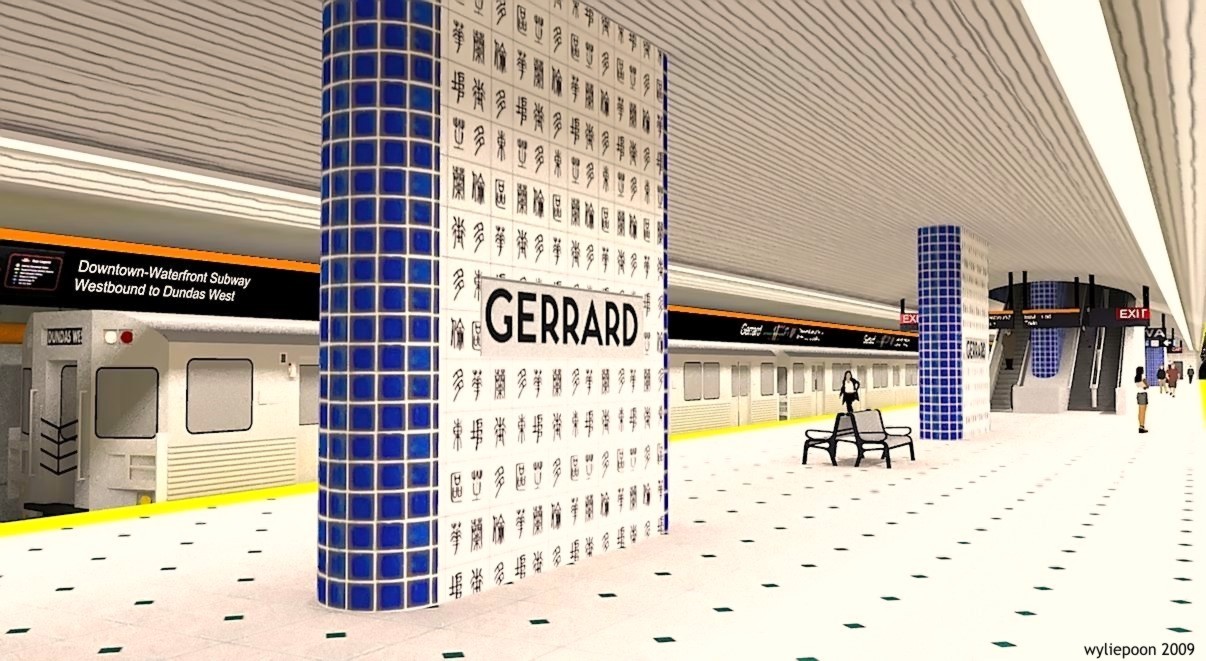
Rendering of Gerrard Station platform in Sketchup - Sheppard Subway style. The tiling on the station wall is printed with ancient Chinese script that reads "Toronto - East Chinatown - Gerrard Street".

Permission hereby granted to use any of my DRL renderings for free for your DRL advocacy with proper credit.

Stay tuned for more renderings of Gerrard and other DRL stations.
 
Last edited:
I vote to merge this thread with the advocacy thread. We don't have a line yet to discuss station design. They are excellent designs though.
 
I love the idea, but…

I love what you’re doing here, but when you say “Sheppard style,†you mean it, complete with the half-assed channel signage over the platforms (an accurate rendering of the mistakes TTC would surely make) and the too-tight spacing of the station name. You need one-third-em spacing to resemble the rest of the system, and the keystone on which the station name were set would clearly extend the full width of the column as shown here.

But keep it up! Talk to me before you do Leslie.
 
^
You don't like the TTC's newer station signage? Of all the TTC decisions made over the past decade or so, I think those newer signs are my favorite. They are intuitive, uncluttered and decently appealing in an institutional sort of way, at least to me. One thing i am disappointed in the rendering, and that I think would complement the new platform signage, would be platform screen doors of some sort.

Great design though, needless to say.
 
Great look!

I would recommend that the TTC try something different with the DRL stations, such as cavernous common spaces which would look incredible in comparison to our current system.
 
I'd rather see a different design for the roof of the stations. Reminds me of siding, like the material used for the ROM.

I'd rather see more artistic stations and brutalist stations like Montreal's.
 
*drools a little

My favourite feature is the TTC map-esque info bars above the subway platforms. It a perfect, useful place to put them and helps increase the utilitarian feel of it.

Honestly, I think Kerning is a minor issue and is easily fixable.

Verb
to kern (third-person singular simple present kerns, present participle kerning, simple past and past participle kerned)

1. (transitive, typography) To adjust the horizontal space between selected pairs of letters (characters or glyphs), particularly in a proportional font (printing).
2. (intransitive, typography) To perform a kerning adjustment.
 
Last edited:
I'd say that the Sheppard line station design is fine for some suburban line, but each station on a new downtown line should be unique by a different architect. A diverse group of local and international architects and artists should be commissioned, with each station having a platform with a high ceiling (like Downsview though perhaps without Downsview's massive mezzanine). High ceiling stations generally feel more substantial, even if the design is not that interesting. Natural light should reach the platforms, if possible.

I'd like to see what Clewes would come up with for a station.
 
Do we want a centre platform, or would it be easier to have side platforms? The last station built with side platforms was North York Centre, right? What's better, side or centre?

I like the use of the orange.
 
Does NYC even count? That had no choice but to put in side platforms. Last built would be Sheppard Yonge I believe.
 
Does NYC even count? That had no choice but to put in side platforms. Last built would be Sheppard Yonge I believe.


Didn't think that counted, since Sheppard Yonge uses the same track both ways.
 
wylie, were your choice of the blue tiles influenced by this? http://en.wikipedia.org/wiki/Blue_and_white_porcelain

what do you think about changing the black diamonds on the floor to blue diamonds and changing the color of the chinese script from black to blue?

a crude example of what i'm talking about:

attachment.php


it's a fine china station!
 

Attachments

  • gerrard.jpg
    gerrard.jpg
    113.9 KB · Views: 528
Last edited:
Centre platforms are preferred these days because it maximizes pedestrian circulation and also reduces the cost of the station - i.e. only one set of elevators vs. two.

I'd love to see how the stations would look with platform screen doors ;)
 

Back
Top