News   Apr 25, 2024
 117     0 
News   Apr 25, 2024
 316     0 
News   Apr 25, 2024
 509     0 

Toronto Crosstown LRT | ?m | ?s | Metrolinx | Arcadis

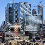
I find the interior shots of the stations - particularly the mined stations - quite interesting. They appear to have high ceilings and therefore appear quite spacious. Hard to tell how their rough surfaces will look with some aging, but it’s an appealing look. As to the white square boxes on top - easily forgettable, which is not bad for something that has to last for many decades. Won’t be my problem if they look dated in 50 years.

- Paul
 
I'm fine with it. Subway stations don't need to be palaces.

We're short of publicly accessible palaces in Toronto though............ just sayin...

Simple, attractive, functional is fine. And that is exactly what Metrolinx is aiming for here.

Attractive is key........that includes, in my mind, distinctive designs from one station to the next. I'm not suggesting un-due elaboration, I really like St. Clair West; I also like Glencairn alot. I wouldn't consider either 'palaces' but they're both nice, well done, and unique.

TYSSE was over the top, the palatial style of design, and it comes across as farcicial and overkill for it's purpose.

The ceilings are too high in spots, but the stations are actually under invested in when it comes to finishes. The bare trackside walls look terrible; and there are sections of missing ceiling finishes that appear to absent only as a cost-savings, not for any functional reason.

... the Sheppard line, which looks like designed by engineers (and honestly probably was).

Sheppard had its finishes budget slashed. The money was taken from ceilings, lights, and trackside walls, as well as the flooring budget.
 
I'm fine with it. Subway stations don't need to be palaces. Simple, attractive, functional is fine.
I don't disagree. But the problem is that this line of thinking has been used for literally every major civics works project in this city. At some point we should strive for more; something beyond the mediocre. Ontario Line is as good as opportunity as we'll get to start building great things.
 
These stations would look beautiful on the OL if the stations end up looking like these. From Metrolinx's Subway design standards pdf.

1631754886486.png


1631754951542.png
 
The plain tile design of BD is pretty good and often underappreciated. What destroys it is a) bad colour scheme, b) bad lighting. Off-blue with off-blue lighting. And dirt. *shudders*. The peachy colours tho, with the maroon trims, I quite like.

Sherbourne and Dundas West (and VP and Donlands) grey is pretty irredeemable.

Somber, depressing, morose, ...... did I mention ugly?

Just saying................

Sure Broadview is moderately sharp in White and Black........though uneven plaster ceilings in banal white......with crap lighting......and floors with no contrast take away from the effect.

I could also accept the two-tone green of Woodbine with the right complimentary choices (ceiling/lighting/floor).......

***

In all seriousness, preference/taste is a subjective thing..............

But personally, I can't really get behind the B-D aesthetic, on the whole.

I don't do bland. ; I also prefer my bathroom aesthetic in the WC, not on the platform.
 
The plain tile design of BD is pretty good and often underappreciated. What destroys it is a) bad colour scheme, b) bad lighting. Off-blue with off-blue lighting. And dirt. *shudders*. The peachy colours tho, with the maroon trims, I quite like.

I think the main issue with the old subway line stations is the erosion of adherence to design standards and upkeep. If you look at the original photos from when the subway opened, there was a simple beauty to them. Changes to signage, lighting, etc. can have a significant impact on how we perceive these environments.

Kind of like how tearing up a landscaped sidewalk and filling it in with asphalt will seriously damage the perceived value of the area.
 
Some architectural fixtures and art features are inexpensive, a rounding error on a rounding error in the exorbitant transit prices of Toronto.

On the surface sections of Eglinton LRT, we could have had a wavy roof for little cost, instead of this:
View attachment 348987
View attachment 348986
A wavy roof bus stop in Washington state.
I prefer the flat roofs...actually would've preferred they made the shelters much longer to provide more covered area.

Agree in principle though. When the St. Clair ROW opened I found the little touches elevated each stop to something beyond the usual TTC design.
 
A terminal station with side platforms?
Not that unusual, for example, Montreal has them. After unloading passengers on one platform, the train uses the tail tracks beyond the station to switch directions and then pick up passengers on the opposite platform. Works well for passenger flow since everyone is going in the same direction to/from each platform.
 
Not that unusual, for example, Montreal has them. After unloading passengers on one platform, the train uses the tail tracks beyond the station to switch directions and then pick up passengers on the opposite platform. Works well for passenger flow since everyone is going in the same direction to/from each platform.
Even the Toronto subway system had terminal stations with side platforms.

Keele and Woodbine stations on Line 2 both served as terminal stations from 1966 to 1968 and both stations have side platforms both then and now.
 
One platform for dropping off, one platform for picking up.

Not that unusual, for example, Montreal has them. After unloading passengers on one platform, the train uses the tail tracks beyond the station to switch directions and then pick up passengers on the opposite platform. Works well for passenger flow since everyone is going in the same direction to/from each platform.
I've also seen operations where, if there are future expansions projected, they simply build both platforms, and leave one unused for the time being.
 

Back
Top