grey
Senior Member
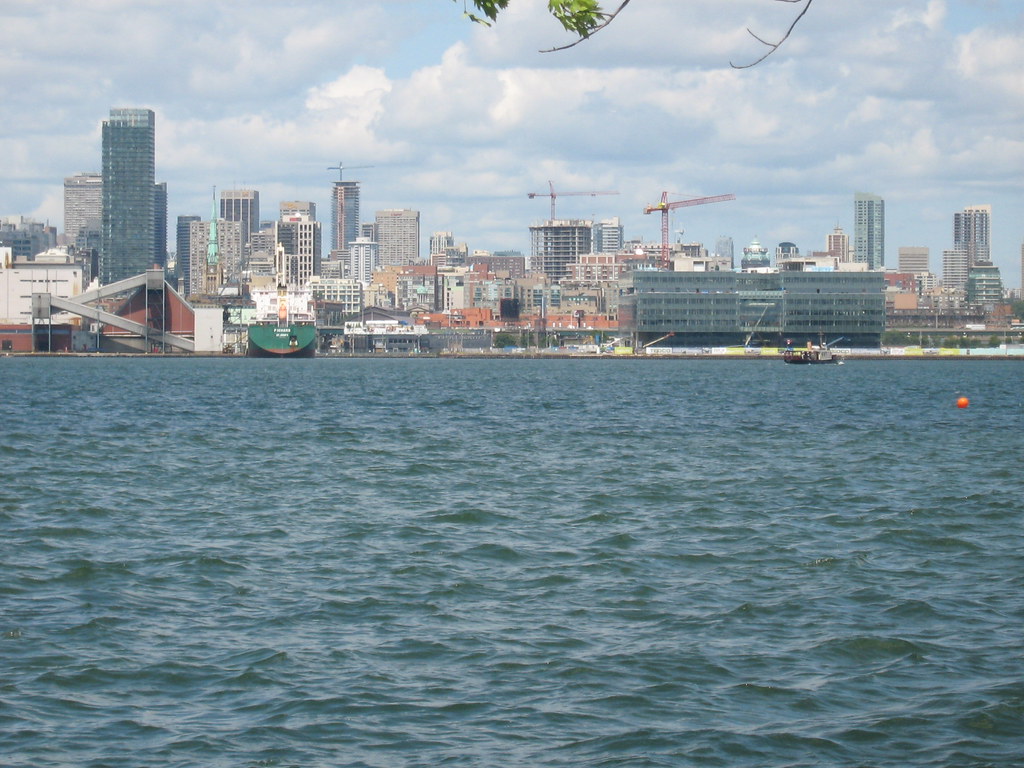
Grey, if these shots were taken from the islands, I demand some updated 'classic' shots of the city skyline which have been denied to us due to the strike. Thanks.
http://www.urbantoronto.ca/showpost.php?p=298486&postcount=57
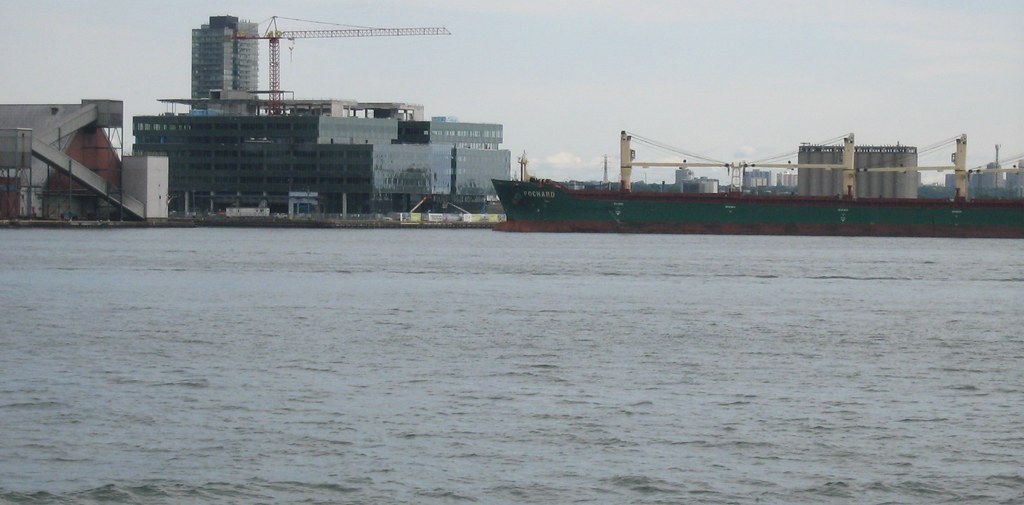
Grey, if these shots were taken from the islands, I demand some updated 'classic' shots of the city skyline which have been denied to us due to the strike. Thanks.

Yeah, too bad Spire isn't Hot Pink!
42
^You're nuts! I don't see anything remotely plywood like and one hot pink tower in this city is more than enough.
F- to Diamond and crew on this one.