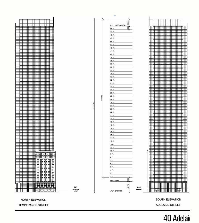
gbelan noted that the final BA report (west tower) had a rather glaring error... the same east/west elevations were used for the north/south elevations.
I sent a note to the planner and he sent back the corrected north/south elevations.
----- Original Message -----
From: Al Rezoski
To: Scott Dickson
Sent: Tuesday, May 09, 2006 1:39 PM
Subject: Re: Bay Adelaide
Thank you for catching the mistake. The correct north and south elevations are attached.
Al Rezoski, Project Officer
Clean & Beautiful City Secretariat and
Senior Planner, Downtown Section
(Ph) 416-392-0481
(Fax) 416-392-1300
You are welcome Al.
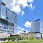
After patiently waiting for many years to see the BA stump disappear, I pray the "real" architecture (or at least the cladding/materials) conjures up more than these elevations seem to offer. So many designs over so many years.... to arrive at a stubby BMO box?? I can't believe I envy Mississauga...!
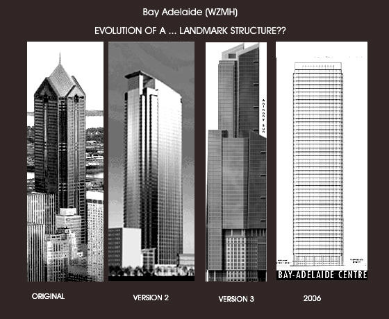
V.1 - Early nineties Atlanta - looks like something the people on Melrose Place would have worked in. Two words: LA Law.
V.2 - The swoop roof says we're different, but still too cheap to get a real architect.
V.3 - We have no idea what we're doing so we just threw this together! Setbacks are cool, right?
V.4 - The bland leading the bland.
A dome was also an option for the crown of the mid '80s design. The shopped both options around when they were trying to lease it originally, and would ask prosepective tenants which they preferred.
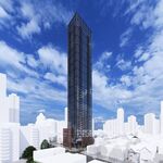
I actually prefer the latest version. Is it daring? No. Is it as tacky as the first three designs? No. Its just something in the middle, average, wont stand out as being great or horrible. Its inoffensive. I think this building will work just fine for Toronto.
The origianl and verison 3 are just plain ugly as hell. Version 2 would look better if it were taller and the latest version looks best compared to these choices.
I'm not worried that it's a box. A new TD or CIBC would be a great addition. The question is will it be anywhere close to those two? Awaiting proper renderings.
I also like versions 2 and 4. However, for version 4 I think it would be better if a more well known architect is brought in as a design consultant- something like Mies' role in the design of the TD Centre.
Hi,
We require 1:50 podium detail elevations. The section 37 agreement will secure building materials. Through site plan approval we will ensure that the building is attractive.
Al Rezoski, Project Officer
See above his response to my editorializing.
It's clear we have no worries... we have now been assured the building will be an architectural masterpiece ("attractive" is code for masterpiece).