Toronto St Michael's Hospital Emergency Department Redevelopment | ?m | 2s | Unity Health Toronto | NORR

Marcanadian

Moderator
Member Bio
Joined
Jul 30, 2007
Messages
4,017
Reaction score
11,495
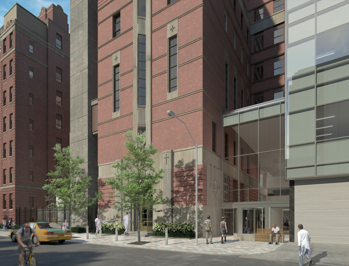
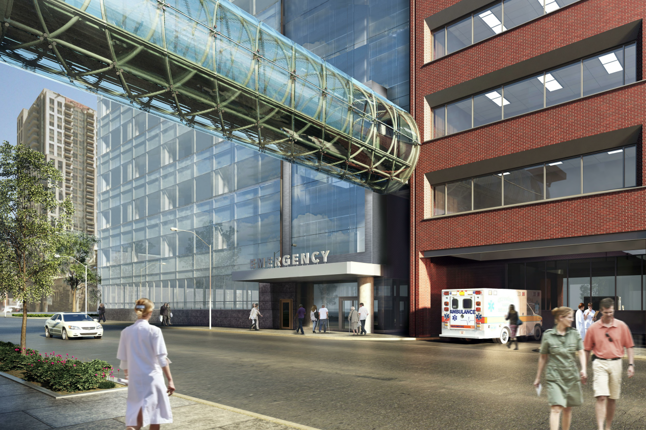
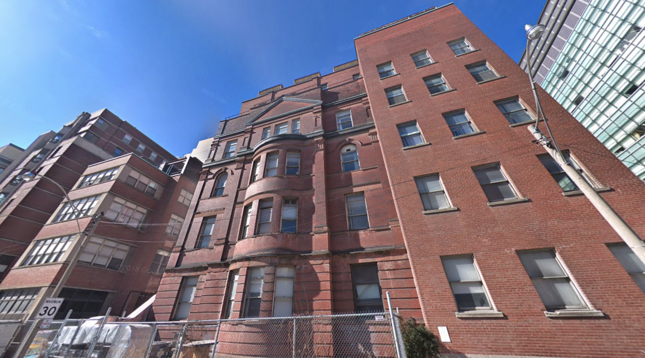
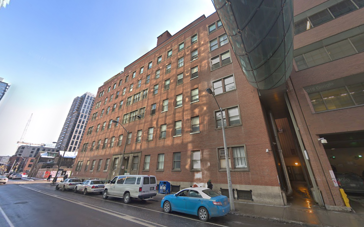
Site Plan Approval to construct 6-storey addition to St. Michael's Hospital (demolish existing Shuter Wing; construct new Shuter Wing):
178813
178814


178815
178816


Nope - the emerg is always meant to take up the ground floor of the Shuter wing - originally proposed as a 2s addition (with clear room for vertical expansion).

AoD
I only asked because of the last pic before my comment. The Emergency sign on the NE corner of the new Bond Street wing...
 
I only asked because of the last pic before my comment. The Emergency sign on the NE corner of the new Bond Street wing...

Understandable if you haven't been following the larger project and phasing.

The 'original' ER (meaning the one prior to the recent wave of redevelopment) was in both the Shuter Wing and the adjacent Cardinal Carter wing, where ambulances offload.

As part of this envisioned redevelopment, what was in the Shuter wing shifted over to Cardinal Carter and its expansion, and the ER was also net expanded in the process.

However, St. Mike's ER was, and remains, grossly undersized given the growth in visits.

When the new Shuter wing opens, it will be an expansion of the existing ER first and foremost; some of what's in the Carter Wing may be repurposed, I haven't seen the detailed layout.

But the ambulance Bay isn't moving, so a substantial portion of the ER will remain where it is currently located.

The finished product will be approximately double the size of the original.

You can get a sense of the layout at the St. Mikes 3.0 site (video of the construction phases)

AoD
 
I understand the whole spiel about the requirements of a modern hospital and incompatibilities with the older floorplates, but it's a shame to see the oldest facade (which has some interesting depth) go for some pretty uninspired architecture.
 
Last edited:
I understand the whole spiel about the requirements of a modern hospital and incompatibilities with the older floorplates, but it's a shame to see the oldest facade (which has some interesting depth) go for some pretty uninspired architecture.

Well hospital is one use that doesn't even get facadectomy - you might bits and pieces saved (e.g. portico of old TGH Bell Wing), but that's pretty much it.

AoD
 
Well hospital is one use that doesn't even get facadectomy - you might bits and pieces saved (e.g. portico of old TGH Bell Wing), but that's pretty much it.

AoD
Which is unfortunate given that hospitals are happy filing downtown streets with fairly banal, fortress-like architecture (i.e. the Women's College Hospital).

A picture of the wing from earlier days- in my opinion, retention/reconstruction of only the street-facing facade would be entirely acceptable in this case, maybe even like at the Bay Adelaide Centre where the National Building was rebuilt to match the new floor-to-floor heights. The interiors are irrelevant/outdated anyways, it's the facade and its contextual contribution to the surrounding heritage fabric that matters.

smh-original-csjt-archives.jpg

http://www.csj-to.ca/story/2011/06/blessing-st-michaels-keenan-research-centre

Yes, though it this case the building had been so compromised by later additions that it almost a small mercy to euthanize it and save the energy for something more architecturally noteworthy. But of course, the proposal is rather banal and anonymous.

I should correct myself though, there are rare examples of preservation - e.g. old Ontario Hydro building at PMH, which is a combo of facadectomy and a more substantial preservation along University Ave.

AoD
 
Last edited:
Which is unfortunate given that hospitals are happy filing downtown streets with fairly banal, fortress-like architecture (i.e. the Women's College Hospital).

A picture of the wing from earlier days- in my opinion, retention/reconstruction of only the street-facing facade would be entirely acceptable in this case, maybe even like at the Bay Adelaide Centre where the National Building was rebuilt to match the new floor-to-floor heights. The interiors are irrelevant/outdated anyways, it's the facade and its contextual contribution to the surrounding heritage fabric that matters.

smh-original-csjt-archives.jpg

http://www.csj-to.ca/story/2011/06/blessing-st-michaels-keenan-research-centre

Agreed.

I was looking on line for a history of this specific building and couldn't find it.

It is/was designated as D wing south.

The (partially retained) building was E wing.

This wing doesn't appear to have its own street address.

In looking at the heritage report on retaining the E wing entrance I didn't see any reference to it (maybe I missed it).

In terms of exterior, I think its the more handsome vs E wing.

Though the interior lobby of the latter is lovely.
 
Yes, though it this case the building had been so compromised by later additions that it almost a small mercy to euthanize it and put the save the energy for something more architecturally noteworthy. But of course, the proposal is rather banal and anonymous.

I should correct myself though, there are rare examples preservation - e.g. old Ontario Hydro building at PMH, which is a combo of facadectomy and a more substantial preservation along University Ave.

AoD
I don't know, I feel that the main street-facing facade is still intact enough to merit preservation- it hasn't been stripped of its ornamental detail, painted over, or reclad as in other cases (which makes it harder to argue on the merits of aesthetics).

Apart from the loss of the original fenestration patterns, the decay of the stonework, and some incongruous additions on the roof, the facade remains substantially intact- I think there's enough there that retention of the street-facing facade would probably actually enhance the current proposal, which is nothing but glass.

I would accept a total replacement if what's being proposed is better than what's currently there; the new proposal is functionally better, but not better in architectural design.

Another picture from the original St. Michael's Complex.

1892.jpg

https://www.archtoronto.org/175/Pages/timeline-1600s-1800s.aspx
 
Last edited:
The problem of saving this particular facade is that unless you design the new building around it to a similar scale, it will look really fake, in a studio set in Disneyland kind of way. Quite frankly I think the focus should be on giving some warmth to the Bond St. facade in the new design instead (though not in the perfunctory - institutional red brick sort of way). HPA would have been a good choice for that.

AoD
The way I see it, it's less an issue with facadism itself, but rather a design issue wherein the new architecture makes no attempt to 'talk to' the old architecture- resulting in the old architecture essentially becoming subsumed by the new and feeling pasted-on. As a result, you get instances like One Bedford which feel like tokenism rather than earnest attempts at preserving the best elements of the prior architecture.

Simple things like facade patterns and materiality could go a long way even in lieu of changes to the massing, IMO.
 

Back
Top