News   Apr 25, 2024
 339     0 
News   Apr 25, 2024
 1K     4 
News   Apr 25, 2024
 1K     0 

The Tenor (10 Dundas St E, Ent Prop Trust, 10s, Baldwin & Franklin)

  • Thread starter billy corgan19982
  • Start date
Um. Wow. Major disappointment.
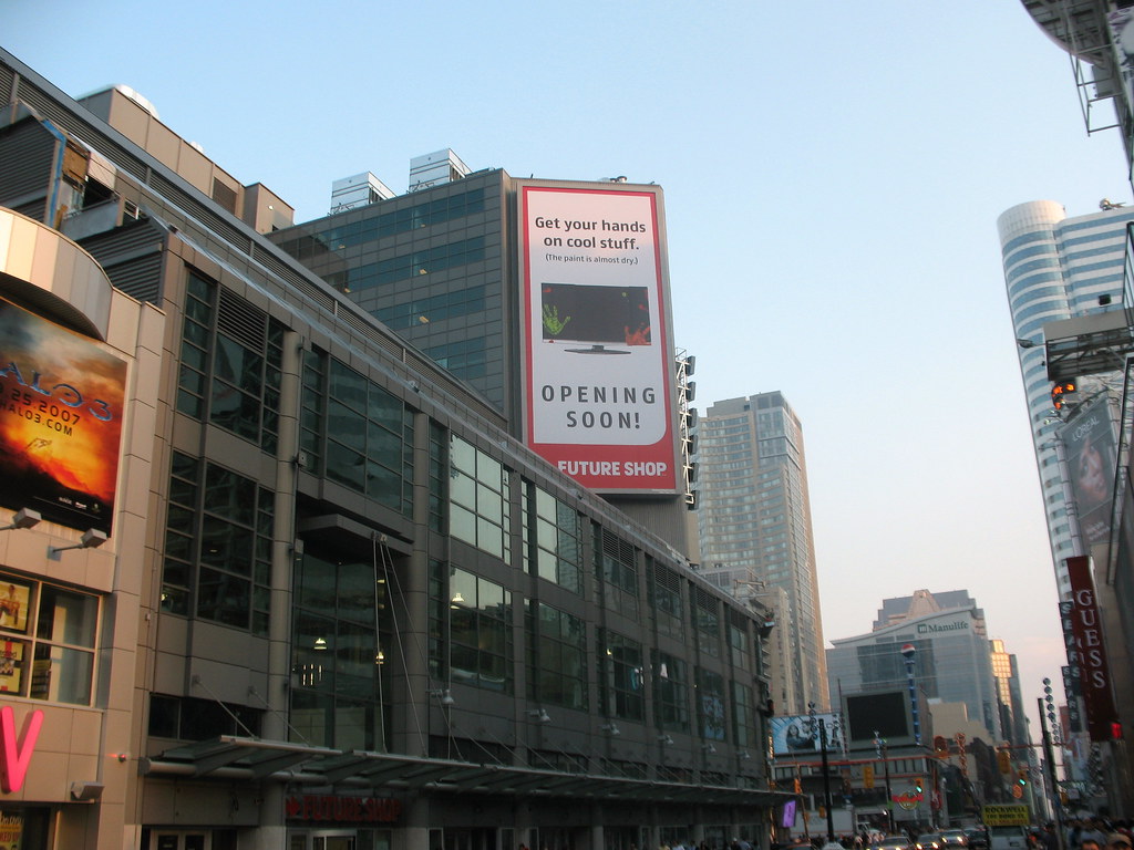
Where is the movie ads? What happened to the cool multicoloured light thing on the right?
The only good thing they've done is the ad on the very right takes up the entire space to the top of the roof now, there used to be a big grey gap.
And what happened to all the cool ornamental roof stuff?
What a letdown!
 
Pen Equity strikes again
 
^ one is to be seen by those walking up and down Yonge, the other is to prominantly display the name of the building to those in the square.

I'm sure the sign is double sided so it would be visible from both Yonge Street and the Square, thus making a 2nd sign redundant.
 
1502271841_01c9fbfa8b_b.jpg


Steel for the new tunnel entrance between TTC and Toronto Life.
Once in place and open, existing stair well become an air shaft like was done at Four Season or fill in.
1503132378_398ab80662_b.jpg
 
1502271841_01c9fbfa8b_b.jpg


Turn your attention to the anchors on the last post on the left. I have a feeling this is where the vertical Toronto Life sign will go. There are no anchors for that sign in the position next to the big screen for it to be mounted as per the rendering.

I do like this side of the building though. It's still a little bland and grey but I'm sure that will change once all the signs are installed and the stores filled with merchandise and people.
 
By the way, does anybody think that the Toronto Life sign is just a place holder?

If Toronto Life is spending so much money on naming right, they would be insane not to make their investment stand out with a well designed sign.

Toronto Life is a creative house, I hope they use their talent to come up with something a little better than what is shown in this latest rendering.
 
Aw jeez, it was the roof that had all of the charm - in a Daily Planet, Jimmy Olsen kind of way...hopefully they will still find a way to include this...:(
 
It's kind of funny that the sponsor and all the tenants with signage on the upper exterior have red logos -- sort of an unintended theme.
 
Aw jeez, it was the roof that had all of the charm - in a Daily Planet, Jimmy Olsen kind of way...hopefully they will still find a way to include this...:(

The roof elements which are absent in the latest rendering is what has me disappointed. It's a crime having exposed HVAC units on the roof as seen in the photo to the left of the new Future Shop backlit and none of the flashy finishing touches on the building.
 
I think the new rendering is a half assed job and we'll see more flash on the building.

This rendering was based on a photo of the partially complete building.

A good example is the light pole: the rendering doesn't bother to even finish it and leaves it as is with the insulation.
 

Back
Top