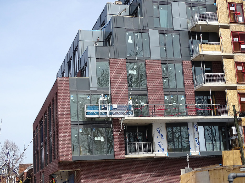
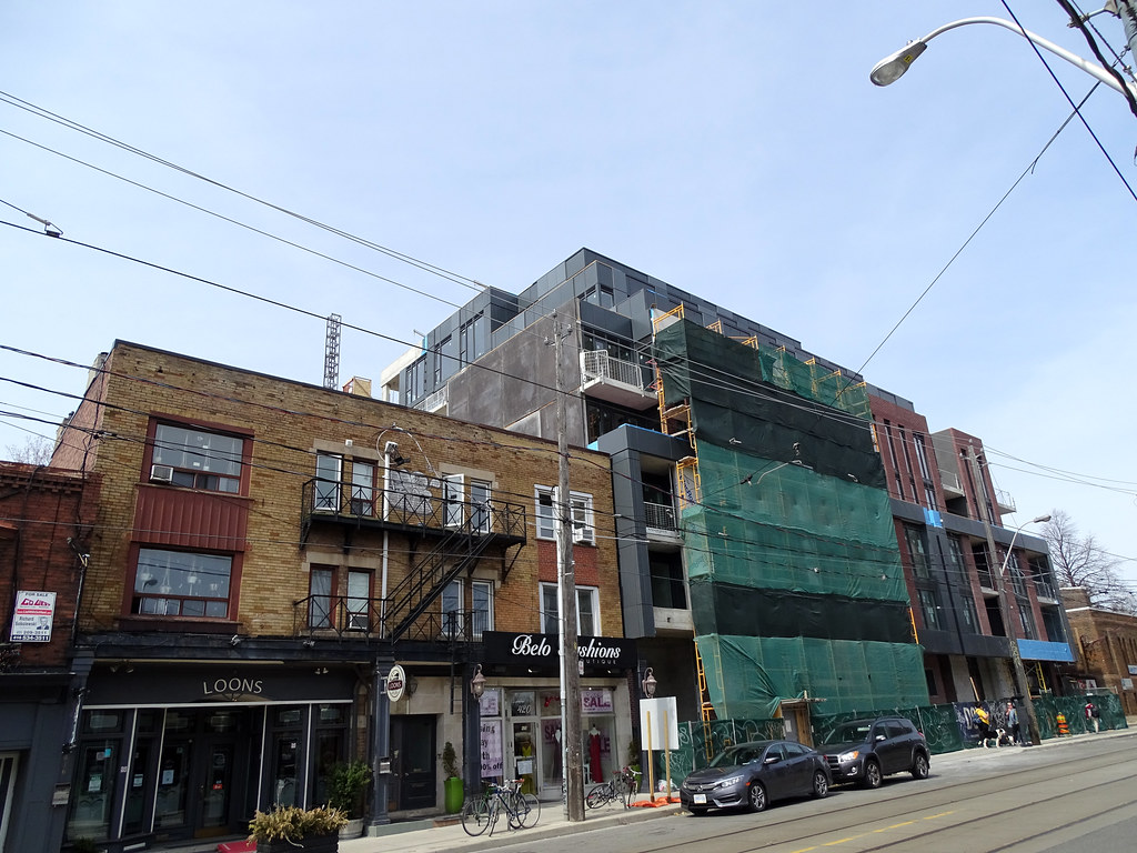
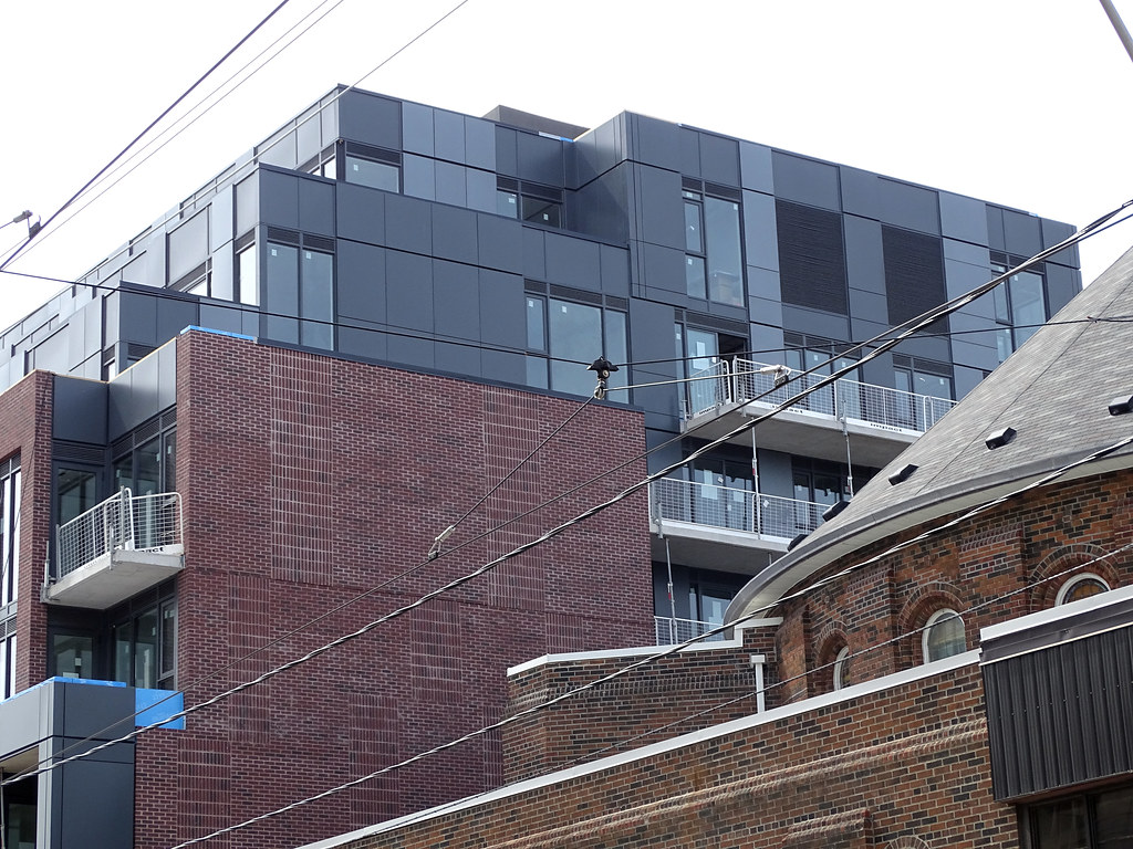
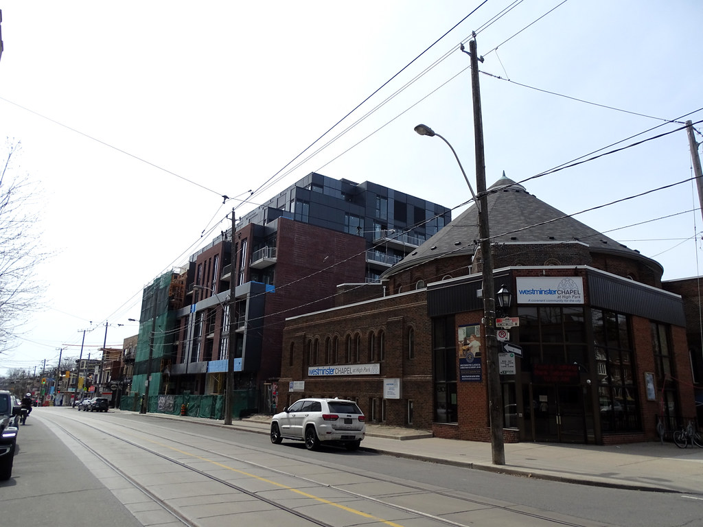
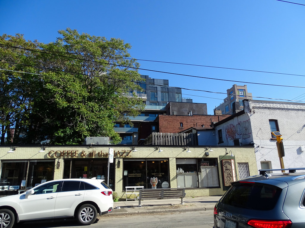
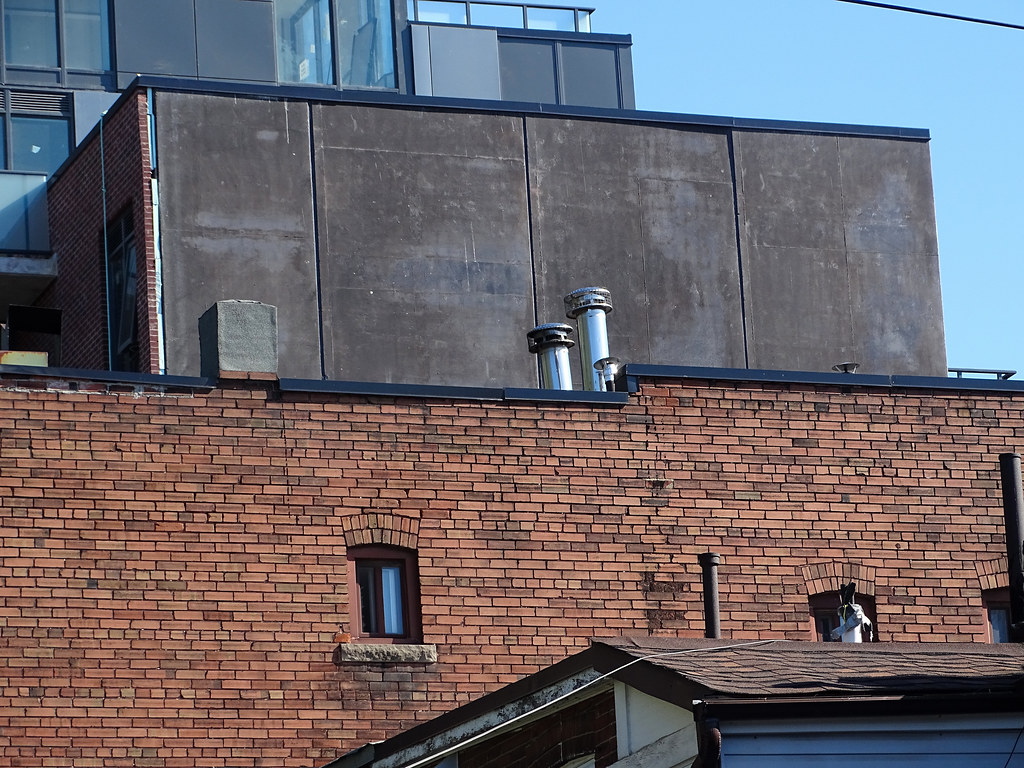
The front dark grey sections on the second and third levels are wayy bigger and more prominent and heavy feeling than in the rendering. IMO this would be pretty decent if that framing section, which has much worse materiality than much of the rest of the project, didn't become so overpowering. It also got broken up into two sections which makes it even more dominant vs. before it was just one dark grey frame the full width of the building.
One thing I'm wondering though: the bottom layer has small periodic holes in it as if something is going to be affixed to it — like signage or an overhang possibly, but in the render the signage is shown below and there's no overhang or anything that would seem to correspond to those holes.
Perhaps these holes reflect another change and signage will now be up there, or there will be an overhang or some other element there, which I think would help break up the heaviness of it.