The design of the square itself is well done, I especially like the fountains and it serves as a needed event space. It's the surrounding architecture and cluttered signage where it flops. It's not ever going to give Times Square a run for it's money, unless they start extending the 'glitz' well down towards Queen street- heaven forbid.
Actually Manhattan has some really nice squares too, as does Montreal. I wish we had a few more of those traditional squares in the downtown, perhaps that is why Berczy park is such a hit.


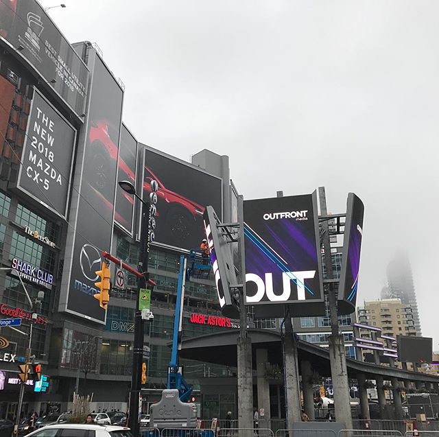 Oh just what Yonge and Dundas in Toronto needs more LED signage #thisisnottimessquare
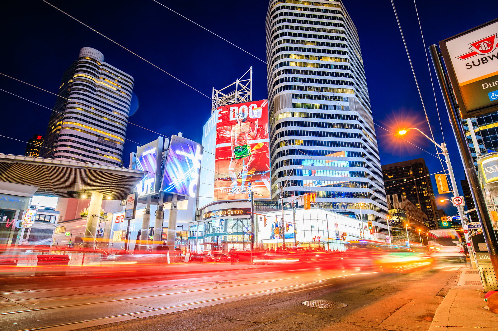 1W2A0053