You are using an out of date browser. It may not display this or other websites correctly.
You should upgrade or use an alternative browser.
You should upgrade or use an alternative browser.
Toronto 88 Scott Street | 203.9m | 58s | Concert | P + S / IBI
- Thread starter yyzer
- Start date

GenerationLee
Senior Member
I saw the red line on Saturday....it makes the tower looks incomplete on the crown. The towers fine....the red/intergration of the logo does not work at all for the design language of this tower.
stjames2queenwest
Senior Member
The visual weight of the orange is far more than the other two bands which makes it weird.
Not ideal.
Probably better than a random boring design flop though.
Not ideal.
Probably better than a random boring design flop though.
Contra
Senior Member
I mean the first problem is that Concert is using three colours that were popular in the early 2000s. I wouldn't be caught dead using that combination for any of my clients...All they had to do was pick one of those colours at the very least (in this case the blue or MAYBE the red, though there's no other red in the structure so it would be quite out of place).
maestro
Senior Member
A corporate logo incorporated into the design. It's the perfect topper for this tower. Everything about the design is marketing appeal. It's mostly an illusion like those setbacks.
adHominem
Senior Member
madknife
Active Member
LOL
you just made my day! thank you!
innsertnamehere
Superstar
It's gotta be temporary. It's a condo, Concert wouldn't be sticking their logo on something they will lose control of in the next year. I doubt the condo board will want the developers logo on their building, either.
DSC
Superstar
Member Bio
- Joined
- Jan 13, 2008
- Messages
- 18,629
- Reaction score
- 25,371
- Location
- St Lawrence Market Area
We may all know it's the Concert logo colours but I bet 99% of ordinary folk (and lots of UTers) won't and will see it as an attempt (a someone feeble one) to give some colour to the building. I doubt any condo board would (or should) spend $$ to remove it - though if it ever needed repair/repainting they might no bother to replicate it.)It's gotta be temporary. It's a condo, Concert wouldn't be sticking their logo on something they will lose control of in the next year. I doubt the condo board will want the developers logo on their building, either.
innsertnamehere
Superstar
I mean to say that Concert will likely remove it as the building registers.. just like the giant "concert" logos in the amenity areas. It is likely a sticker or other form of temporary material designed for short term marketing, not as a permanent feature.
Concert's Toronto office is in the office building at the condo's base, so that logo may very well stick around.
42
42
yoshirocks702
Active Member
Solaris
Senior Member
Tridel still has their logo on solaris at metrogate and its lit since at least 2011. I guess it would be up to the condo board to remove them afterwards?
View attachment 133084
Tridel slapped a restrictive covenant on title in the condo declaration that it will continue to have access to that 'wall' where that cheap looking temporary signage is ... thus sadly the condo board could not remove it
Ryan_T
Senior Member
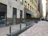
Photos from somewhere up the building.


And a bit more of the lobby. They made some parts of it very conducive for work. I see tall tables, library-like desks, and a future meeting room for tenants to use. Much more practical use of the lobby area than a simple passthrough.


Nice area outside...maybe for a patio?

And a bit more of the lobby. They made some parts of it very conducive for work. I see tall tables, library-like desks, and a future meeting room for tenants to use. Much more practical use of the lobby area than a simple passthrough.
Nice area outside...maybe for a patio?
Attachments


Last edited:
ChesterCopperpot
Senior Member
That 2nd picture is a killer