|
|
|


You are using an out of date browser. It may not display this or other websites correctly.
You should upgrade or use an alternative browser.
You should upgrade or use an alternative browser.
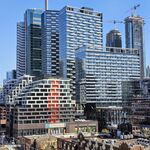
Yonge-Dundas Square/Sankofa Square (Brown + Storey Architects)
- Thread starter MetroMan
- Start date

FMCS
Active Member
What a shame!
heatscore
Active Member
OMG that is shockingly bad. Like, I am actually shocked at how bad it is.
Bogtrotter
Senior Member
The good news is that nobody seems to notice it. Maybe it will look better after dark.
mdparker
Active Member
Has it been fully re-assembled?
That's it in all its daytime glory.Has it been fully re-assembled?
D'oh!
42
Amare
Senior Member
Now that they've fully assembled it, they should go ahead and disassemble it and take it straight to the landfill.
Torontovibe
Senior Member
I'm MAD! In fact, I'm very mad! I just saw this sign for the first time today and I was shocked, it's that terrible! This is NOT the Sam's sign! This is a cheap, flimsy, badly positioned, poorly mounted, half-assed attempt to copy the Sam's sing but it is nothing like the original! If Ryerson really didn't want to spend money replacing that sign, fine, fight it in court and don't do it but this just makes it worse for me! It's a SCREW YOU from Ryerson to Toronto!
I am so pissed right now and I will express my anger to Ryerson and the politicians who allowed this to happen! To hell with Ryerson! This is a FAILURE of epic proportions! I want this sign taken down and replaced, NOW!
This is just a joke and everyone who sees it, knows it, including the people who approved it! Who is responsible for this, that is what I want to know. If anybody can get back to me with some names, I would appreciate it because I seriously need to vent and give these people a piece of my mind! Did I mention that I'm seriously PISSED!
Why is this city so bad at putting up signs? It's not rocket science! Sheesh!
Last edited:
Torontovibe
Senior Member
Most Torontonians and most tourists will only see this sign walking up/down Yonge Street during the day which is why it is very important that this sign look good day and night, like the original sign did! The big burst of red metal, contrasting the black record is what made the sign eye-catching during the day. The neon lights helped to animate it and make it dance at night but it was a wonderful sign day or night! This was a lagre, sturdy metal sign that grabbed your attention, not some see-through, flimsy piece of trash! This totally disrespects the spirit and look of the original sign.That's it in all its daytime glory.
D'oh!
42
How could anybody in their right mind think this was an acceptable option?
Torontovibe
Senior Member
Look at this piece of crap! You can see the flimsy brackets that hold it up, right through the sign, as well as the sky! There is not even the smallest attempt to cover the brackets or at least put a backing on it, so you can't see right through it! No wonder those brackets went up so fast, they are obviously very cheap and who knows if they are even safe? Every other sign in Dundas Square took weeks to put up, yet this thing flew up in a day or two. That tells you everything you need to know about this embarrassment!
MetroMan
Senior Member
Look at this piece of crap! You can see the flimsy brackets that hold it up, right through the sign, as well as the sky! There is not even the smallest attempt to cover the brackets or at least put a backing on it, so you can't see right through it! No wonder those brackets went up so fast, they are obviously very cheap and who knows if they are even safe? Every other sign in Dundas Square took weeks to put up, yet this thing flew up in a day or two. That tells you everything you need to know about this embarrassment!
I don’t know where to begin so I’ll just add to what you said. The lower signs are not even centred. And here’s something you can’t unsee after I tell you so stop now if you don’t want to be even more pissed: the kerning (spacing between letters) is different on one SAM sign from the other. This is an absolute disaster.
This is not the Sam The Record Man sign. They threw out the red backing, the black records, and they even replaced the neon tubes. So what exactly is this a restoration of? It’s just a cheap imitation.
Last edited:
MetroMan
Senior Member

steveve
Senior Member
These should have been installed within the Square itself - instead of those new video ad screens being added.
I think these signs would have been better suited slapped onto the face of a building (like 10 Dundas), like how they originally were, versus high above the streets in open air.
Torontovibe
Senior Member
I don’t know where to begin so I’ll just add to what you said. The lower signs are not even centred. And here’s something you can’t unsee after I tell you so stop joe if you don’t want to be even more pissed: they kerning (spacing between letters) is different on one SAM sign from the other. This is an absolute disaster.
This is not the Sam The Record Man sign. They replaced threw out the red backing, the black records, and they even replaced the neon tubes. So what exactly is this a restoration of? It’s just a cheap imitation.
The second I saw this sign, just a few hours ago, I realized this was NOT the real Sams sign and it was nothing like the rendering either. Ryerson completely pulled a bait and switch on all of us but who is responsible? I will be screaming my head off at Wong-Tams office, along with John Tory and Ryerson tomorrow! I am NOT just going to let this BS slide! This really ruined my day and probably my week! I just feel like Ryerson really tried to pull a fast one on the city! It shows how little respect or love they have for Toronto and that sign!
kotsy
Senior Member
APPALLING.
Literally everything about about the retrofitting and installation is a completely and total embarrassment. I'm honestly stunned beyond belief here.
Literally everything about about the retrofitting and installation is a completely and total embarrassment. I'm honestly stunned beyond belief here.
Last edited: