|
|
|


Recent content by snyberTO
-

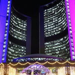
Toronto Aura at College Park | 271.87m | 78s | Canderel | Graziani + Corazza
This Homesense signage is new, right? Perhaps Marshall's will brand part of their space as a "Homesense" to draw IKEA shoppers upstairs. -
Toronto Aura at College Park | 271.87m | 78s | Canderel | Graziani + Corazza
Saw this signage today and it's really not great. Looks cheap, ill-fitting and temporary. I am surprised IKEA wouldn't have come up with a more urban-looking type of signage for this location. Or, at least scaled it to properly match the mounting area - Marshall's signage is so much better. -
Toronto TeaHouse 501 Yonge Condominiums | 170.98m | 52s | Lanterra | a—A
Something is very jarring with the smaller tower. It's too short and squat or without enough elements to accentuate the curve. Maybe if the balcony detailing had less pronounced horizontal banding or if the balconies were all a consistent depth rather then the common setbacks every three floors... -
Toronto Stanley Condominiums | 138.37m | 41s | Tribute | Core Architects
dang. The banks strike again! -
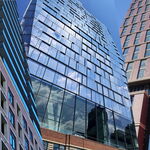
Toronto CIBC SQUARE | 241.39m | 50s | Hines | WilkinsonEyre
I wish it had dark (black) contrasting inset corners like First Canadian Place. -
Toronto 399 Yonge | 252.3m | 75s | Capital Developments | Teeple Architects
I especially dislike the shoulder-high window frosting on the middle section of the building. The cashiers have their backs to this area, and i know that drugstores dont have a lot of products that would make good window displays, but still, i think there should be better views into the... -
Toronto Eaton Centre (Ongoing Renewal) | ?m | ?s | Cadillac Fairview | Zeidler
What a strange tunnel/hallway to Nordstrom. I bet a lot of "non-Nordstrom" types will use the store to shortcut to the rest of the Mall. I wonder if the store is designed with this in mind. And I agree that this "atrium" is too big to be so empty, bland and purposeless. I realize that the mall... -
Toronto Eaton Centre (Ongoing Renewal) | ?m | ?s | Cadillac Fairview | Zeidler
I hope its colorful but something other than a video screen. A smaller version of this colour-changing grid would look great next to H&M's white facade. I'm also hoping for a ticker. -
Toronto Eaton Centre (Ongoing Renewal) | ?m | ?s | Cadillac Fairview | Zeidler
These screens are going to be huge. -
Toronto Five St Joseph | 160.93m | 48s | Five St. Joseph | Hariri Pontarini
I like this project for its intended impact on Yonge, but those wavy balconies don't do it for me. I wish it was much more geometric of much more curvy, and that the effect was the same (or inverted) on the east/west sides. To me it looks sloppy and saggy - like it needs spanx. lol. -
Toronto Pace Condos | 146.3m | 42s | Great Gulf | Diamond Schmitt
Nope, no glass, but the "awnings" are getting strips of lighting which look pretty awkward. -
Toronto Eaton Centre (Ongoing Renewal) | ?m | ?s | Cadillac Fairview | Zeidler
Roots is getting a makeover - I'll miss the curved glass but glad to see this refreshed. -
Toronto Eaton Centre (Ongoing Renewal) | ?m | ?s | Cadillac Fairview | Zeidler
I'd be happy with grey-tinted concrete to help hide the gum and stains from various liquids. The sidewalks are always filthy and are rarely pressure washed.