|
|
|


Recent content by holographic plastic
-

Toronto Ontario Line: Queen-Spadina Station | ?m | 1s | Metrolinx | HDR
Seemed to create quite the discussion, so I wouldn't call it that cold.- holographic plastic
- Post #38
- Forum: Buildings
-
Toronto Ontario Line: Queen-Spadina Station | ?m | 1s | Metrolinx | HDR
Maybe it's because I'm a graphic designer, and I care more about these things than the average person, but I suspect a lot of people like it simply because it's old and it's all they've ever known the TTC logo to be. My own personal taste doesn't exactly favour a kitschy early 20th-century logo...- holographic plastic
- Post #20
- Forum: Buildings
-
Toronto Ontario Line: Queen-Spadina Station | ?m | 1s | Metrolinx | HDR
And slightly on that note, the TTC logo should be updated since it's horrible. I know it won't happen, but I can dream okay?- holographic plastic
- Post #15
- Forum: Buildings
-
Toronto Union Station Revitalization | ?m | ?s | City of Toronto | NORR
I was being sarcastic. It's absolutely ridiculous that so much money is being spent on renovating Union Station, and yet after all these years we still have platforms that in many ways wouldn't be out of place in a rural village. Aside from the obvious accessibility issues, of which there are...- holographic plastic
- Post #9,041
- Forum: Buildings
-
Toronto Union Station Revitalization | ?m | ?s | City of Toronto | NORR
Well, I guess I'm used to climbing up a flight of stairs to get onto the train so what does it matter.- holographic plastic
- Post #9,037
- Forum: Buildings
-
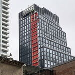
Toronto Concord Sky | 300.2m | 85s | Concord Adex | Kohn Pedersen Fox
What is it with Toronto buildings, Aura and now this, where they would otherwise be fairly sleek and inoffensive if not for the blocky growth that's placed halfway up the tower?- holographic plastic
- Post #2,607
- Forum: Buildings
-
Toronto Union Station Revitalization | ?m | ?s | City of Toronto | NORR
This corridor has all the grace and warmth of an industrial warehouse.- holographic plastic
- Post #8,983
- Forum: Buildings
-
Toronto 1 St Clair West | 165.63m | 49s | Slate | Gensler
Well, clearly most people here disagree.- holographic plastic
- Post #17
- Forum: Buildings
-
Toronto CIBC SQUARE | 241.39m | 50s | Hines | WilkinsonEyre
Does anybody remember why they're even there in the first place? I swear they've been sitting there for so long I've forgotten at this point.- holographic plastic
- Post #7,212
- Forum: Buildings
-
Toronto Annex Flats | 8.9m | 2s | Originate | Smart Density
I've felt the same way for a long time as well. When I was very young even then I remember thinking it was strange how many 2-3 storey houses were so close to the city centre. Now that I'm older and I realize they're largely inhabited by wealthy people, it makes more sense why there always seems...- holographic plastic
- Post #61
- Forum: Buildings
-
Toronto 1 Yorkville | 183.18m | 58s | Bazis | Rosario Varacalli
Asphalt patches that are in huge messy blobs too, of course.- holographic plastic
- Post #1,810
- Forum: Buildings
-
Toronto St Lawrence Market North | 25.3m | 5s | City of Toronto | Rogers Stirk Harbour
Buttcon?- holographic plastic
- Post #1,592
- Forum: Buildings
-
Brampton 45 Railroad | 94m | 27s | Boardwalk REIT | Graziani + Corazza
It's actually made me speechless for a moment.- holographic plastic
- Post #86
- Forum: Buildings
-
Toronto YZD | ?m | ?s | Northcrest | Henning Larsen
We can only hope.- holographic plastic
- Post #323
- Forum: Buildings
-
Toronto Waterfront Innovation Centre | 53.03m | 11s | Waterfront Toronto | Sweeny &Co
Straight outta Markham.- holographic plastic
- Post #1,134
- Forum: Buildings