Toronto George Brown College Waterfront Campus | ?m | 8s | George Brown | KPMB

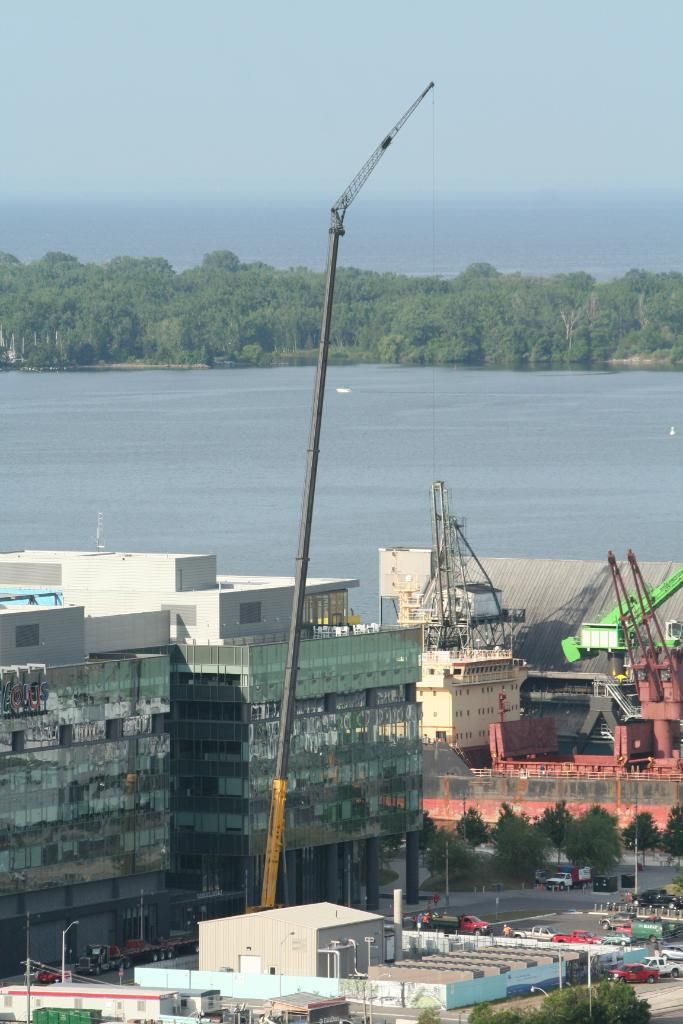
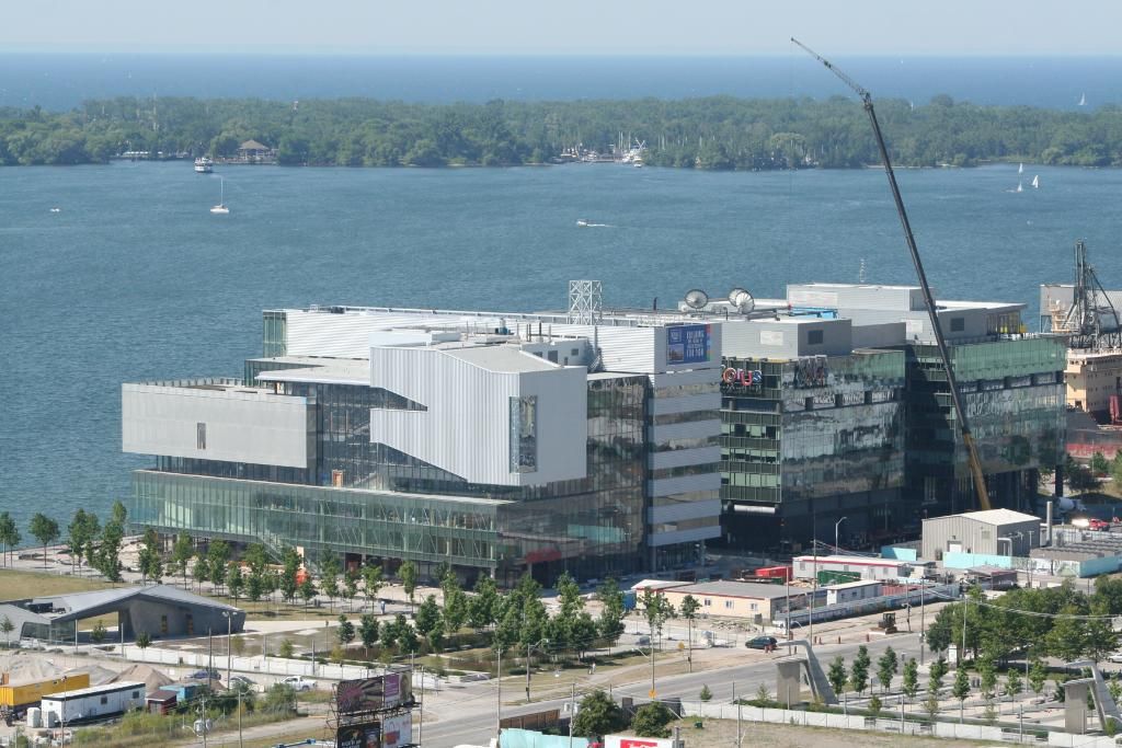
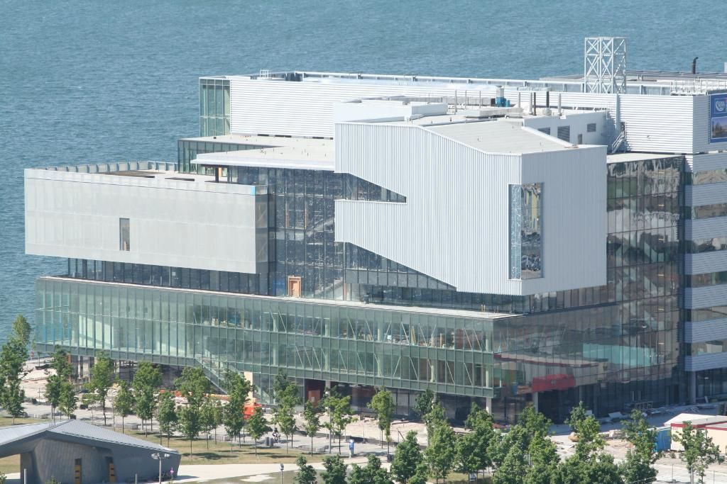
The design bothers me a lot less than the use of materials - and the same criticisms leveled against Southcore can be applied here as well - where are the warm, natural materials like brick, wood or stone?

Well, Southcore sort of works as a generic and cold downtown adjunct, though it's not nearly as corporate and obtuse and controlled and overwhelming as it should have been to be a place like Canary Wharf or Dallas/Houston or the financial district in The Crimson Permanent Assurance.

I don't mind at all the horizontal bands of corrugated metal on the west side of George Brown, but the jagged corrugated plating shaped by the position of internal staircases/lecture halls on the east side is just awful. If Corus is Markham-by-the-Lake, George Brown looks like some pre-fab government building north of the Arctic Circle.
 
Last edited:
As pointed out previously, it's exactly the same cladding, just aligned vertically rather than horizontally.

Live a little.
 
That the scabrous patch of aluminum on GB is industrial, in an industrial area, needs no new comment. What is a problem is that the way it was handled, which leaves it as a clumsy, overbearing compositional and stylistic error on an otherwise well-made building.

Sounds like Vasari describing the Porta Pia: "At that time Michelangelo, engaged by the Pope for a design for the Porta Pia, made three, all of them extravagant and beautiful, of which the pope elected to realise the cheapest, as we see today built today, with great praise for him."

http://upload.wikimedia.org/wikipedia/commons/e/ee/RomaPortaPiaFacciataInterna.jpg
 
Compare the Gooderham & Worts buildings with modern light industrial sheds or big-box stores in the suburbs. Buildings that have been value engineered to achieve their intended function with absolutely zero embellishment. This in many respects was the inadvertent by-product of the early modernist movement, except that Peter Behrens or Walter Gropius must be turning in their graves with how it turned out. But intentionally or not, modernism facilitated this transformation; taking the act of building out of the hands of the artisan and placing it in the hands of industry and mass production, a mode where engineers and accountants could then strip the process of all cultural and artistic associations in the name of efficiency. (Many big box stores are clad using EIFS, I might add.)

Well, Rack House 'M' ( 1927 ) at the Distillery certainly had as much embellishment as a big-box store in the suburbs ( which is to say very little ... ) and that's because the days of cladding industrial buildings to look like Gothic or Renaissance structures was already over when it was built. Late Victorian Toronto's bricks, decorative tiles, terracotta architectural ornaments, cast iron railings, lamp posts etc. were mass-produced with technology unknown to the earlier age of the artisan - it was already the age of the competitive commercial builder and the bottom line. Yet, despite all the applied pippypoos and doodads, Paxton, and architects such as A. J. Davis in the States, showed the way towards Modernism as early the 1840s, but everyone was pretty much in denial about it for the rest of the century.

What interests me about the Pier 27/Redpath/Corus Quay/George Brown/Sherbourne Pavilion sequence is the variety that exists within the Modernist language, and how it has evolved. D+S reduce their designs to an essence that verges on big-boxiness, KPMB taunts us with baffling Porta Pia-like complexity ( how dare they upend the direction of their cladding at the north-east corner of the building! And why? ), and Redpath sits with the work of Toronto Moderns like Dickinson as a historical marker of how it was done in the early days.
 
And as I like to say, when the Bloor-Lansdowne Knob Hill Farms was replaced by No Frills a decade ago, they saved the most "artisan" part of the old NCR plant (the Moderne Lansdowne facade)--and that was probably the least interesting part of the place. What really mattered was the gargantuan, utilitarian steel-framed Kahn-factory interior...
 
June 30, 2012: Crane doing some work on the roof of the Corus building.

IMG_4325.jpg


IMG_4326.jpg


IMG_4327.jpg
 
Shocker, we rely on you to shower the forum with the airy ineffables of aesthetic speculation, from a rarified - nay, chimerical - place. However, even the headiest fan wrapt in agreement with you might have trouble comparing the social history, built form and formidable personalities involved around Michelangelo's design for the Porta Pia with this twee patch of siding on the butt-end of a modern college building. To say that KPMB is "taunting us with Portia-Pia like complexity" here is rather like seeing the face of Jesus in a piece of toast.

Of course all this speculation is based on the notion that KPMG were engaged in a conscientious stylistic and intellectual expression of architectural acumen when looking at what to do with this section. It could also be they just got a good deal on a heap of cheap-ass siding that they knew they could get away with.

Since it looks like there's a plan to continue GBC into the lot immediately north of this building, it'll be interesting to see how they work together. Maybe this corrugated 'shipping container' section will be played up or ameliorated in the addition. It could work better as a single element in the extended facade the addition will provide.
 
Last edited:
Did anyone notice that the ship docked in the 'Redpath Slip' is unloading it's cargo in the first shot presented by Razz
 
Did anyone notice that the ship docked in the 'Redpath Slip' is unloading its cargo in the first shot presented by Razz
In summer there is at least a ship a week unloading there. Sometimes they dock east-west and a section od Sugar Beach needs to be fenced off and other times they dock (north-south) right into the slip, as in the photo. I assume the difference is because of the size of the ship or the configuration of the holds.
 
Of course all this speculation is based on the notion that KPMG were engaged in a conscientious stylistic and intellectual expression of architectural acumen when looking at what to do with this section. It could also be they just got a good deal on a heap of cheap-ass siding that they knew they could get away with.

I'm sure this was fun to write but you took the easy way out. You may not like the siding, which is fine, but it's obviously not the explanation. While the Porta Pee analogy is an outrageous stretch US is still closer to the mark.
 
Last edited by a moderator:
Why is likening 16th century Italian Mannerism to 21st century Toronto Style an "outrageous stretch"? Michelangelo played fast and loose with the High Renaissance design language, and we're seeing all sorts of deliberately provocative re-orderings of Modernist forms in town these days - "double" podiums ( or is it double towers? ) at 60 Colborne, and a second podium parked on the roof of King Charlotte condos, for instance, and that odd, elevated lobby room at Casa. Porta Pia's strikingly odd combinations would have caused the faint of heart the same sort of knotted knickers effect that Kuwabara's decision to reverse the direction of the cladding at George Brown has had.
 
US, I was basically supporting your position. But as a layman or humble Canadian my instinct is to assume Toronto's architects aren't quite in the league of Michelangelo. I mean, we can't even agree we're "world class" yet.
 

Back
Top