Toronto The Modern | ?m | 17s | Empire | DTAH

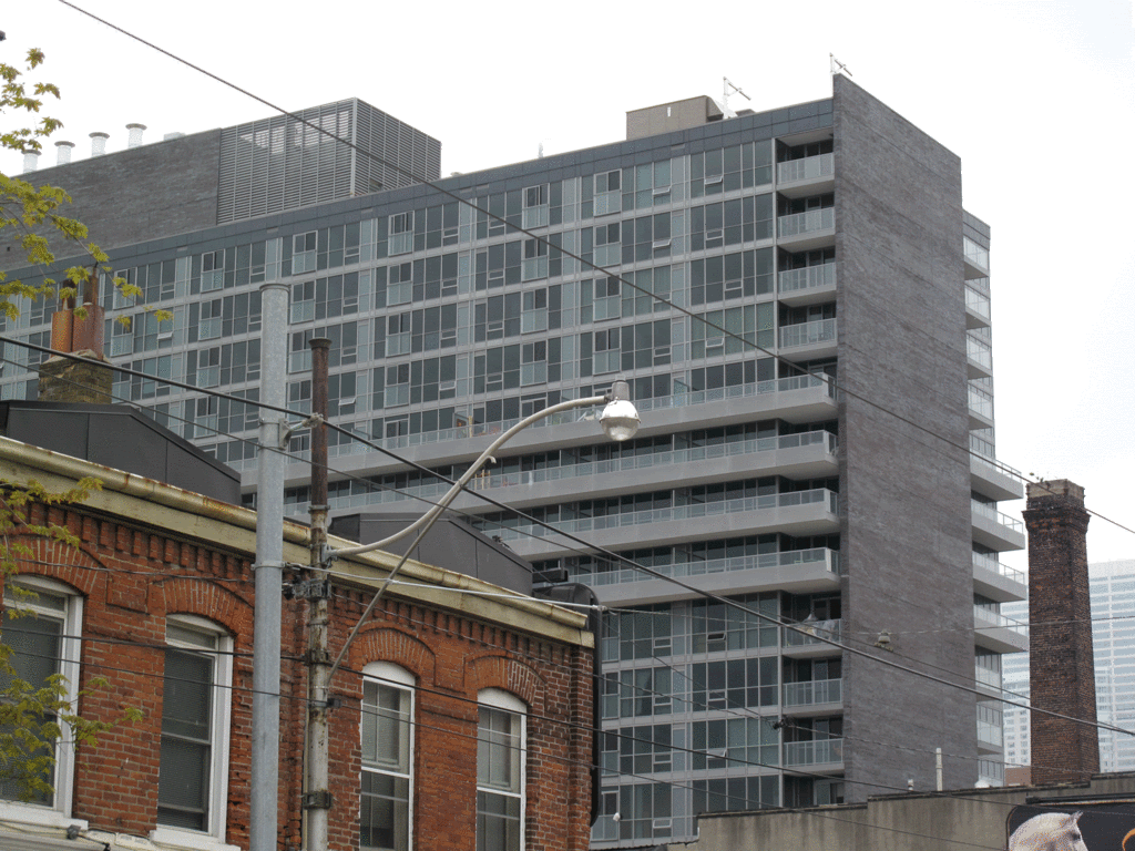
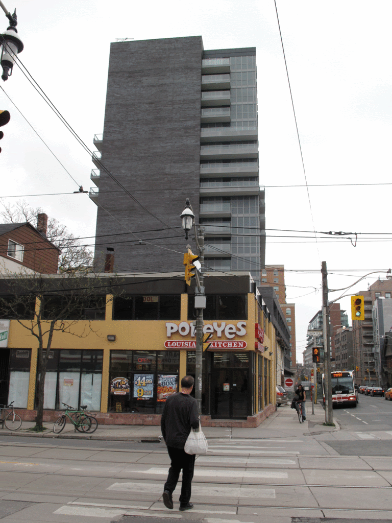
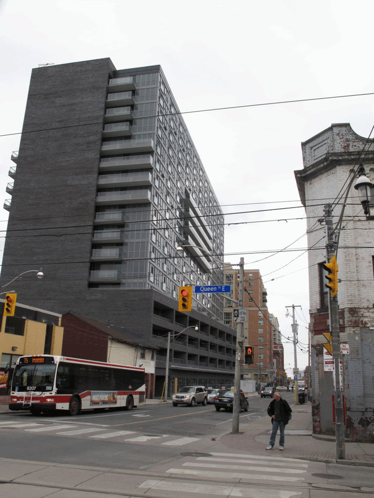
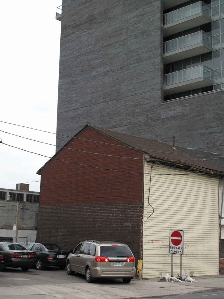
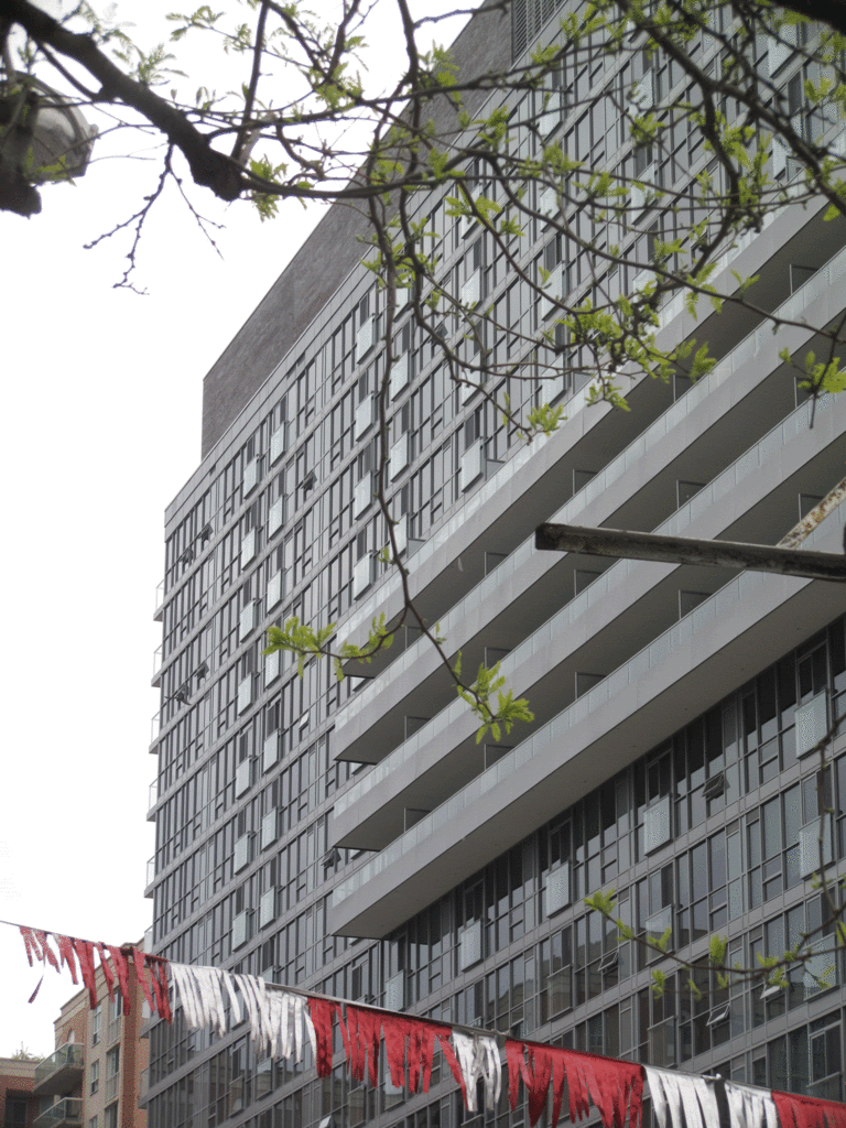
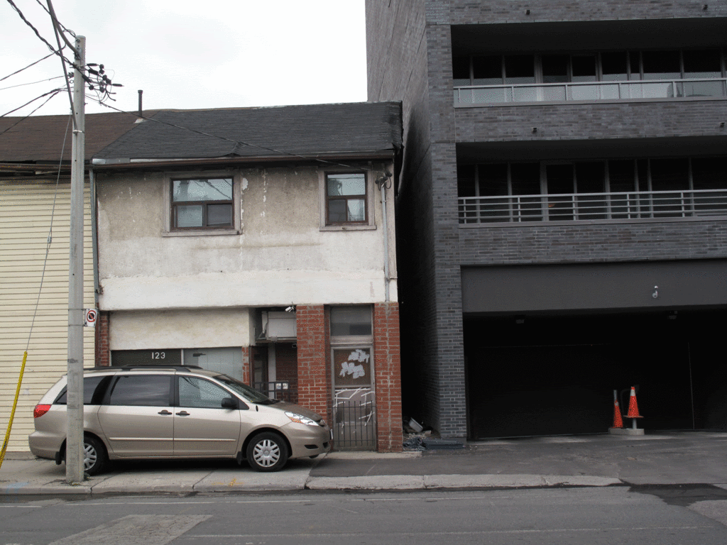
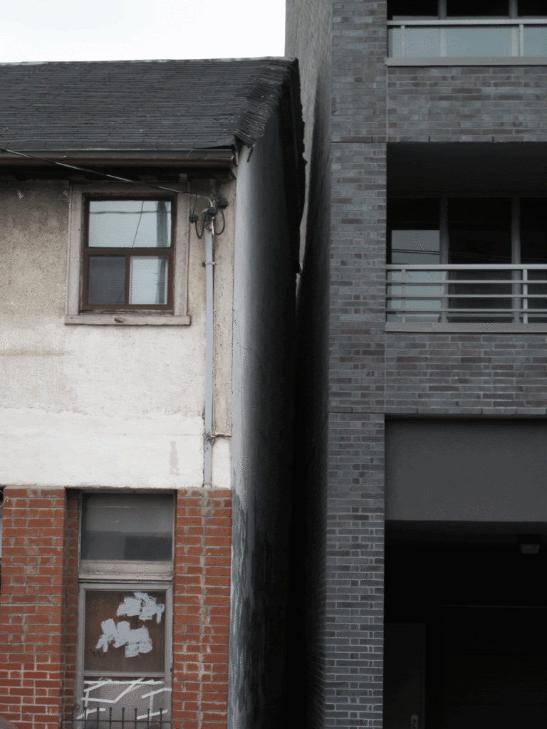
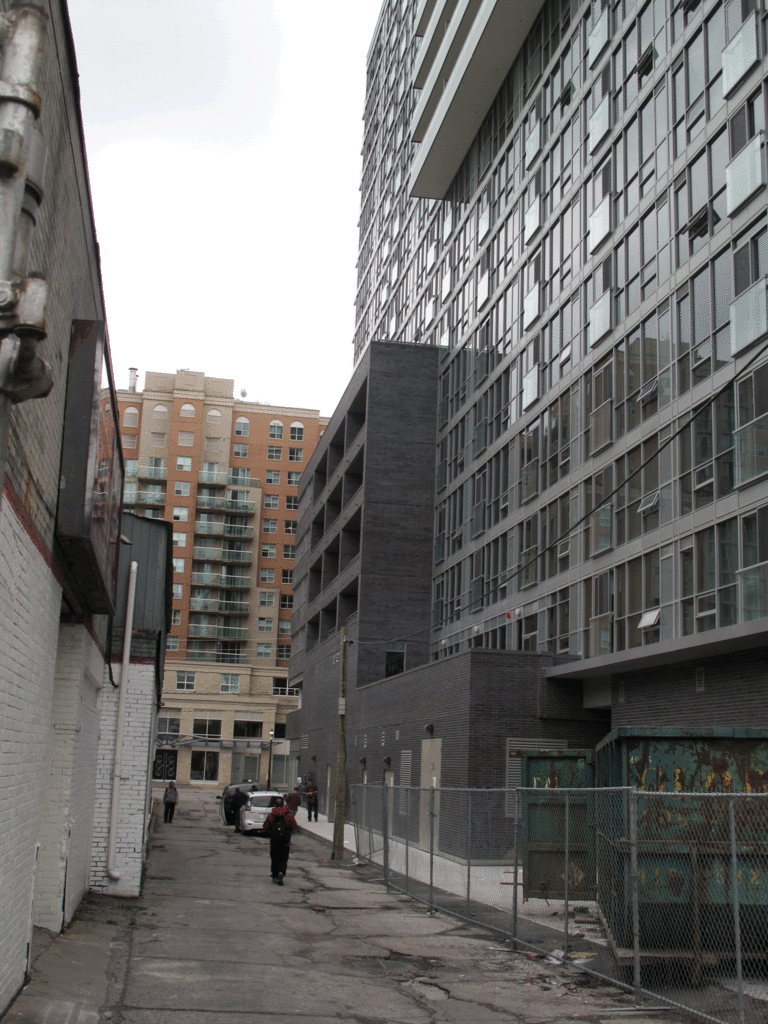
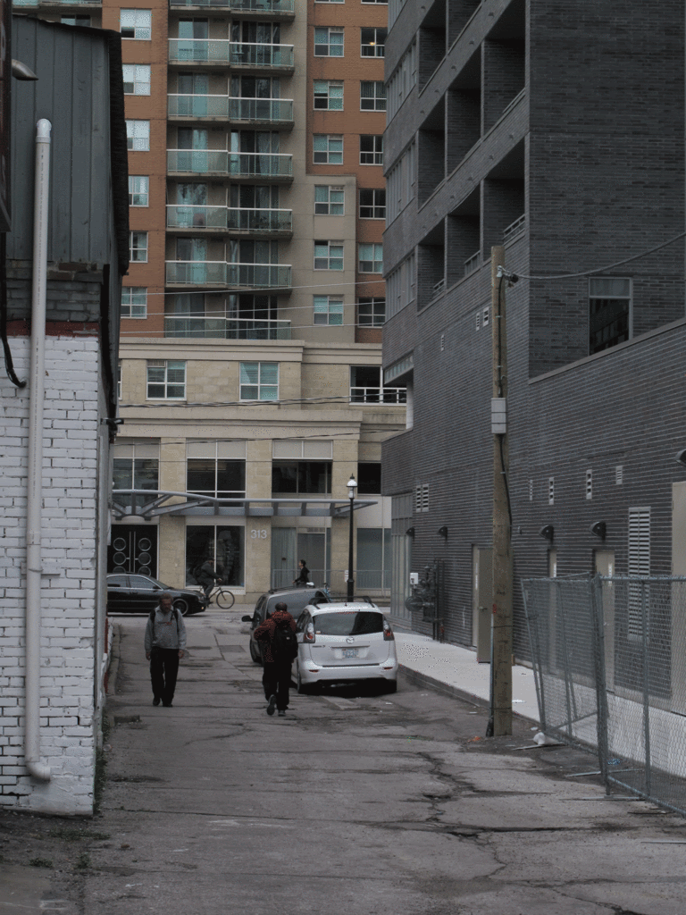
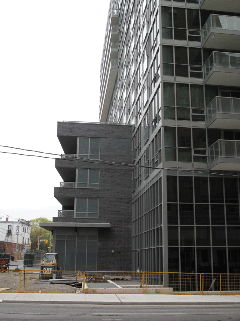
The balconies from a distance look like an above ground parking garage.. Kinda bunker like and heavy.

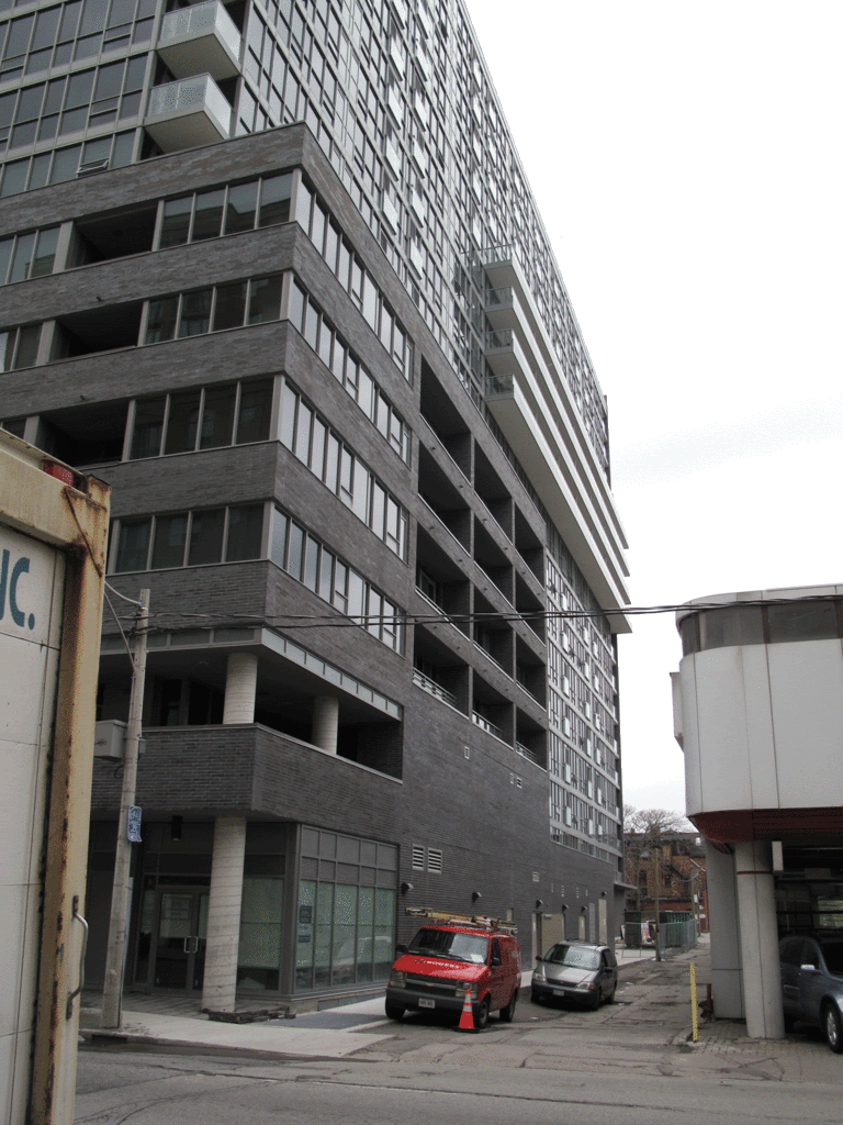
However, I like the idea of having outdoor living spaces close to the street to domesticate the street away from its current transient nature.
Not sure if glass balconies would have worked..

But in all, nice addition to the neighbourhood.
 
All in all in think this is a good development, but the lower few floors are a bit bunker like, I'd have to agree. Perhaps I'd also like a bit more colour contrast in the building. It's nice, quite modern. Maybe a bit bold.
 
You keep making this point as though this phenomenon is somehow exclusive to Toronto. Most recent developments anywhere in the Western world are utterly dominated by the same two colours: blue and grey.

http://skyscraperpage.com/diagrams/?searchID=53784001

No, I didn't realize that. When I was in NYC recently, I didn't notice a huge amount of new, grey buildings. I'm not saying they are not there, I'm just saying It wasn't obvious to me, the way it is in Toronto. I wasn't born with an aversion to the colour grey but it's just that too much of anything tends to make me tire of it and since Toronto has more new grey buildings than practically anywhere, it's just hard to not notice it. Variety is the spice of life, I just wish that developers (and Torontonians) would think that.
 
New York is fortunate in that so much of their cityscape is made of older stone and earthy brown tones which help to balance the colder blue and grey colours that tend to dominate these days.
 
b415d4f1.gif
c7769c6d.gif

fe3f15e7.gif

9cb4b5ef.gif

204af967.gif

78104f7b.gif

985e954e.gif

21f62a59.gif

7a2e3045.gif

9f176307.gif

2c5f9edd.gif

fb24d46d.gif

f88a4761.gif

a96229c0.gif
.
 
Great photo update, thanks. It's certainly monotone, but overall I think it's pretty crisp and a nice addition to the area. There's lot of red brick around, so it doesn't feel overwhelmingly grey in context.
 
Hey, great photo tour update.

Popeyes chicken + that pathetic shack = new boutique condo within the next decade? Plz and thank you. The current condo boom has benefited many parts of downtown but Sherbourne Street appears to be most in need of progress.
 
Last edited:
Personally, I find this to be one of the most dreary, oppressive, uninspired and monotonous new developments in this area. I'm tired and fed up with grey brick/spandrel and glass. With 8 months or so of grey, miserable weather why do we need to add more of the same to our already dull palette? Someday, when colours are back in fashion, people will wonder about this era's collective mental state.
 
Personally, I find this to be one of the most dreary, oppressive, uninspired and monotonous new developments in this area. I'm tired and fed up with grey brick/spandrel and glass. With 8 months or so of grey, miserable weather why do we need to add more of the same to our already dull palette? Someday, when colours are back in fashion, people will wonder about this era's collective mental state.

i tend to agree with you in this case. it is truly a giant gun-metal grey monochrome slab, and not all that well constructed i'm afraid. i think the design itself could have been OK, but there definitely were some corners cut along the way.

it's also in the strangest location. there isn't a condo in the city in a rougher part of town. standing on the corner of Queen and Sherbourne looking at The Modern; surrounded by the indigent, troubled, addicted and transient souls who swarm around that huge Salvation Army shelter is a very surreal experience....

so, while absolutely no one would miss those shacks, or Popeye's chicken, it's very difficult to imagine a condo on that corner. (Brad Lamb obviously thought it was doable with Kormann House--until it wasn't). the only less likely corner for a boutique condo would be one major street north, at Dundas and Sherbourne.
 
Glass portion of cladding sucks. Rendering was much better. But I guess for the location you can't expect quality like The Florian.
 
I just wish this building had some white and black spandrel to make it more interesting. It's an OK building but the all grey exterior on this slab just makes it too overbearing. There is no visual interest in this building at all. Some nice retail spaces could help. That big grey wall facing Queen Street is unfortunate. These huge all grey slabs have to come to a stop.
 
Last edited:
My mom wanted me to buy here. I'm so happy I didn't. If you're going to do grey, you better make it somewhat interesting. East lofts just a couple blocks down was done well. So was Thompson Hotel & Residences. This thing is a major disappointment.
 

Back
Top